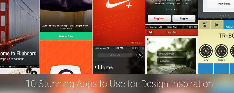
10 Stunning Apps for App Design Inspiration
Looking for some App Design Inspiration? Something to kick start your ideas and give you direction.
Below, I’ve outlined 10 Stunning Apps for App Design Inspiration, to borrow or steal some ideas and rev up the creative engine inside your mind.
“Good artists borrow, great artists steal.” – Picasso.
The following apps are rated on content, information qualities, visual qualities and overall effectiveness:
Recommended: Infographic: Breathtaking Mobile App User Interface Design
1. Yahoo! Weather

Content – Yahoo! Weather uses a ‘less-is-more’ approach, with incredible background images, which makes it not only very effective and easy to use, but also provides a beautiful experience.
Information Qualities – The app design is clear and easy to understand. It has accurate and useful weather information with dynamic, animated content to add to its overall beauty.
Visual Qualities – The full screen images make it a very visual experience. They make great use of typographic hierarchy, and simple icons with a semi-minimalistic design.
Overall – The overall user base of Yahoo is quite broad however in this case the audience is likely to be a sophisticated business person with a regular international/interstate travelling schedule. The Yahoo! Weather app won the App Store Design of the Year Award, which makes it absolutely ideal to use for app design inspiration.
2. Artsy

Content – The Artsy name speaks for itself. It’s all about saving artwork, artists and getting personal recommendations.
Information Qualities – The brave use of serif type, oversized fonts and presentation of information suits the artistic content of the app and makes it incredibly unique.
Visual Qualities – Painted in a black and white colour scheme gives Artsy a very classic look and feel.
Overall – The stunning app design is targeted towards a sophisticated art enthusiast.
3. Dots

Content – Dots is a game, which doesn’t quite suit the theme here, but it’s just so beautifully simple that we couldn’t leave it off. The name speaks for itself: Join the dots.
Information Qualities – It’s clear and simple how to play. The interface is intuitive, and it is graphically concise.
Visual Qualities – Dots has an iconic game interface that appeals to a more sophisticated gaming audience. It’s less about the gamification and more about the simplicity. A very interesting yet effective approach.
Overall – Dots stands out for its beautifully understated game interface, simple gestures, subtle animations, and nostalgic sound design. A similar look and feel is used in the popular ‘Lumosity‘ application which is also a great app design inspiration.
4. Figure < — Awesome app design inspiration!

Content – Call me wrong but the ‘Figure’ name doesn’t exactly describe its core function. It’s a loop-style music composition application, and comes with significant learning curve for first time users. So perhaps ‘Figure’ stands for ‘Figure it out for yourself’? But hey, that doesn’t take away from the hours of fun that comes with using it, and after having used it on-and-off over the last 30 days I still haven’t produced any work of genius!
Information Qualities – The content is set around the navigational functions and sound design.
Visual Qualities – The flat colour style, and circular animations make this app visually stunning and incredibly interactive. Every element on the screen has a unique animation and function.
Overall – It’s a fun and novel way to pass time…. even to create something cool.
5. Path

Content – Path is an app that allows you to instantly search memories of friends, seasons, birthdays and more. If you’ve never used the app you would still be a bit unsure about exactly what it does.
Information Qualities – The information qualities of the app are highly card based, which is trending design for organising information into ‘bite-sized’ and easily digestible bits of information at a time.
Visual Qualities – The stunning photography backdrops and unique animations makes Path an incredibly visually pleasing experience.
Overall – Path is a stunning app with recurring use of the branding colours (white & red) but could be improved in terms of relevance and ease-of-use. In fact, I’ve been on Path now for over 2 years and I still don’t really know how it works… Regardless, it’s here on my list of 10 Stunning Apps for App Design Inspiration because it has a truly unique and beautiful style.
6. Flipboard
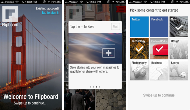
Content – Flipboard grabs all your content from different places and gives it to you in an ‘all-in-one-place’ format.
Information Qualities – Built around information content it uses it very sparingly which is one of the uniquities of the app.
Visual Qualities – The design, like many of the other stunning designs featured in this article, uses a lot of imagery to make the user experience intuitive and easy to navigate.
Overall – The ideal user of Flipboard is someone who spends time trawling the internet looking for great content…makes me wonder why I don’t use it more often!
7. Lootsy
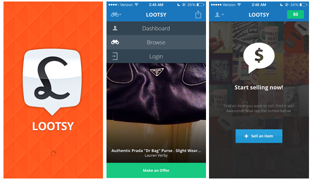
Content – Lootsy is a place for people to buy and sell fashion.
Information Qualities – The information is highly visual and based around ‘products-for-sale.’
Visual Qualities – Lootsy has a bright, colourful interface. The designer has used drop shadows, gradients, and other effects sparingly.
Overall – It does a great job of targeting a broader market of people – both men and women. It’s neither feminine nor masculine which can be a hard feat to achieve as a designer. The downfall of that is that the way women shop for items compared to the way men shop for items are two very different processes, and so the navigational process of Lootsy can’t possibly accommodate both users…and it doesn’t. Not a great user experience design but it looks absolutely stunning and therefore it makes for a great app design inspiration.
8. Partly Cloudy
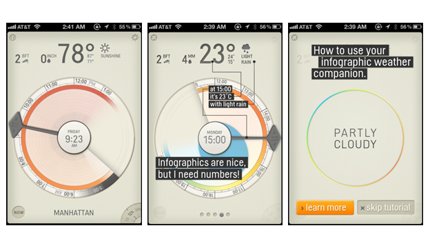
Content – Partly Cloudy is a Weather app that gives you the weather in a graphical way. The content draws conclusions of data and gives you some perspective of the weather ahead, then displays it to you as an infographic. That’s very creative!
Information Qualities – People can digest a lot more information QUICKLY through a graphic than we can from a set of paragraphs of block text. Partly Cloudy knocks it out of the ballpark when it comes to visual information display.
Visual Qualities – The interface is a novelty with great functional relevance. It’s visually pleasing AND serves and incredible purpose.
Overall – Overall this app is intended to be used to tell the weather, but it’s far more novel in its approach than other similar apps that do the same thing.
9. National Geographic
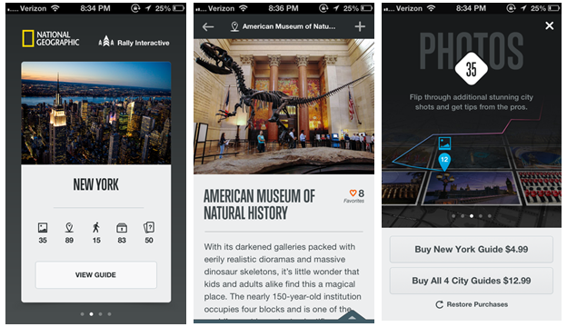
Content – National Geographic is a world wide recognised brand. The app is text driven, and uses it dynamically to provide the user with a richer, interactive experience than their traditional publications.
Information Qualities – It utilises a clear, and easy to read sans serif fonts, nothing too out-of-the-ordinary, but cuts it up with great use of space, intuitive infographics and stunning imagery.
Visual Qualities – Simple to use with plenty of imagery makes this an engaging, entertaining and educating medium.
Overall – Satisfying the information appetite of the National Geographic readership isn’t a great feat to master – these guys are used to block-text. but never-the-less NG have taken the time to produce an interface that is not only attractive but incredibly easy to use.
10. Nike+
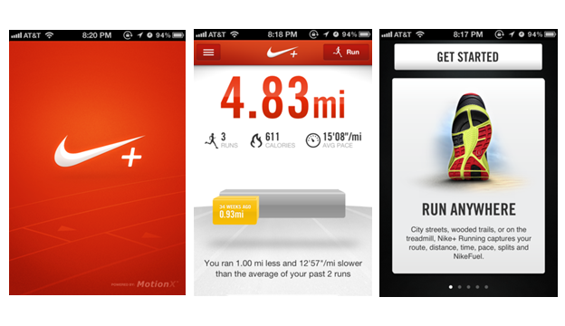
Content – Nike + Running app content is almost a gamified spin on running. You are encouraged to log running metrics and challenge yourself to improve results.
Information Qualities – The information is presented in a dashboard format. It’s stunning in its simplicity.
Visual Qualities – Nike relies heavily on its branding and identity for success. It already has one of the most valuable, and recognised brands in the world—which helps. The app is an extension of the brand and acts as a useful tool for their audience…and guess what, next time you’re in a position of needing a new pair of runners, what brand are you going to choose?
Overall – Overall a stunning app that increases Nike’s brand awareness by delivering a useful and valuable app to the user. And a very handy tool!
So, what makes a stunning mobile app design?
Based on the list above, stunning app designs seem to have similar characteristics:
- Visual – Yahoo! Weather, Path, and Flipboard create sophistication and class through photography and type.
- Novel – Figure, Dots, and Partly Cloudy capture attention with unique style.
- Iconic – Nike, and National Geographics leverage existing brand equity to maximum effect.
- Focused- Lootsy, and Artsy focus on designing for niche audience, or subculture… it they don’t try to be everything for everyone, so designs are able to be more bold and authentic to the topic.
What do you think? Is there an app that you think deserves to be on this list? Which app did you like most on this list and why?
Where to go next
How To Create A Memorable UI Design Concept
How To Design A Memorable App Icon
The Art Of Building An App With 360 Design

Latest posts by Logan Merrick (see all)
- Ep 18: Collective Campus’ CEO on Intrapreneurship and Corporate Innovation - December 20, 2016
- 50 User Engagement Strategies For Planning Memorable Mobile Experiences - December 19, 2016
- Latest Data: App Monetisation Trends And Drivers 2015-2020 - November 25, 2016


