
Are you considering ‘Mobile Accessibility’ in your App Product Planning?
I know that I am not alone when I say I can list 3 or 4 recent experiences I’ve had on the web or using an app which have left me feeling frustrated.
While I am a UX Designer — and perhaps hyper-sensitive to bad design — I do fall into the pool of what I would refer to as an ‘average user’.
I understand technology, I have full functionality of my hands/limbs, adequate cognitive function and ability, and no conditions which affect my ability to see, hear, or read — Yet I am still struggling to navigate certain apps and websites. And it made me wonder how users with disabilities are impacted by design, and what can I do as a designer to respect everyone’s differences, create equal opportunity, and design inclusive and accessible products. Am I designing for mobile accessibility?

Disability Equality Index
Disability is an umbrella term, defined as ‘a physical or mental condition that limits a person’s movements, senses, or activities.’ It’s an impairment that may be cognitive, developmental, intellectual, mental, physical, sensory, or some combination of these.
In Australia there are over 4 million people who have some form of disability – that’s 1 in every 5 people. Of this 4 million 83.9% have a physical disability, 11.3% have mental and behavioural disability, and 4.8% have an intellectual or developmental disability.
Behind these technical terms and statistics, people with disabilities are their own unique individuals; they’re employed, have social lives, go shopping, go on holidays, access information and contribute to society.
The difference however, is that people with disability face significant barriers in their day-to-day lives and use of the web which many of us simply take for granted.
These barriers can be things like:
- Someone who is colour blind having trouble distinguishing the text on a button from the button’s background colour
- A user with dyslexia who cannot easily read through large blocks of text
- Someone with impaired motor skills who cannot use a mouse adequately or struggles to tap small buttons on the screen of a smart phone
- A user with an intellectual disability or a senior user who cannot process or memorise complicated instructions
This should give some context to why it’s so important to design with mobile accessibility in mind — To ensure that 20% of the population (a rather large opportunity for market share) aren’t alienated and prohibited from having a good experience when using your product.
Accessibility is the practice of removing these barriers that prevent users with disabilities from accessing information and functionality. We can implement principles of Web Accessibility to enable people with disabilities to perceive, understand, navigate, interact with and contribute to the web.
“The power of the Web is in its universality. Access by everyone regardless of disability is an essential aspect.” ?– Tim Berners-Lee, W3C Director and inventor of the World Wide Web
A good place to start is with the guidelines created by The World Wide Web Consortium (W3C). The Web Content Accessibility Guidelines (WCAG 2.0) has a comprehensive set of design principles, standards and techniques created for UX and web designers, content creators, and developers for accessibility on the web.
In this article, I’ve listed my top tips for design mobile apps for accessibility which I’ve separated into four categories; See, Hear, Move and Think to cater to a wide variety of users.
4 Areas to Consider when Designing with Mobile Accessibility in mind
See
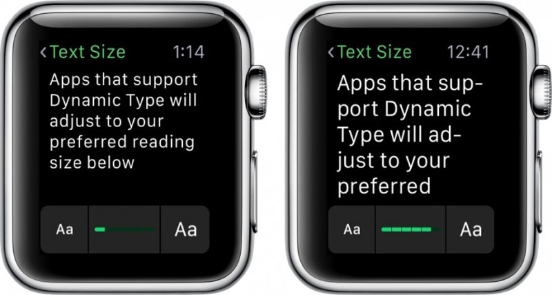
Apple’s Dynamic Type
- Use labels and visual cues to guide users to enter the right information into the right place.
- Colour blind users may require additional cues in the form of icons and text alerts to see and identify error states when filling out forms.
- If the use of colour enhances meaning, such as coloured hyperlinks, avoid red and green, which are the most common colour deficiencies. Tooltips, thick borders, bold text, underlines, and italics are some ways to signify actions without using colour.
- Senior users and users with low vision may benefit from larger text size and higher contrast between text and background to increase readability. The choice of typography can have an impact, so anything that has low readability isn’t recommended.
- Provide text alternatives for images, especially if they are conveying content. Consider clearly denoting links to assist screen readers in identifying navigable elements.
Hear

Grey Singapore App
- Including multimedia elements in your product (videos/audio) to convey content can exclude users with auditory disabilities. You can ensure an accessible auditory experience by including text transcripts or captions.
- Provide text alternatives for any non-text content (such as audio) so that it can be changed into other forms people need, such as large print, symbols or simplified language.
Move

Mouse Navigation
- Users with reduced motor abilities may have restricted muscular control which can limit their range of motion. Users with these impairments may face difficulty when attempting to make precise movements, such as navigating a mouse to click a small button, and often rely on keyboards to navigate websites.
- For this reason, it’s important to make sure your site is keyboard accessible and that all functionality is available via simple and familiar keyboard shortcuts. Ensure that your site is easily navigable with a keyboard and that links are clearly indicated. This can be achieved by implementing changes to front-end code.
Think

Cognitive Functionality must be considered in design
- Designing for users with cognitive disabilities can be difficult as there is such a wide spectrum of behaviours, ranging from clinically diagnosed impairments, such as Down Syndrome and Autism, to more general disabilities, such as difficulties with reading comprehension, memory and attention.
- Keep content and designs clear and legible. Clean designs mean less visual distraction and allow users with low attention spans to focus on the content or task completion.
- Avoid tech-speak, or language which uses jargon or advanced vocabulary, as some users may struggle to comprehend.
- Match user’s mental modes and their expectations about the placement and functionality within your product. This reduces the impact on cognitive load and keeps interactions familiar and consistent. Provide ways to help users navigate, find content, and determine where they are.
- Avoid large blocks of text, as users with dyslexia may struggle to read through chunks of information.
The crux of a UX Designers role is to design with the end user in mind, however we can often fall into the trap of designing for those whose abilities match our own, simply because we are not aware of the challenges non-accessible designs may present to some users.
The thing is, no one else on this planet will see, hear, move or think the same way you or I do, so by equipping ourselves with an understanding of Accessible Design principles we are more likely to design inclusive products which don’t alienate users.
Holly McKee
Latest posts by Holly McKee (see all)
- Are you considering ‘Mobile Accessibility’ in your App Product Planning? - May 11, 2017
- 6 Fast Tips For Mobile User Experience Design - April 13, 2017
- UX: 5 Do or Die Tactics for Successful Mobile App Onboarding - February 24, 2017

