6 Hot Tips For Designing A Magnificent User Experience
Have you ever downloaded an app and found it “too hard to use”? For most smartphone users the answer is yes.
Interestingly 1-in-4 apps are downloaded and never used again.
If someone’s motivated enough to download an app, then open it, BUT never use it again, you can almost assume that either the app wasn’t really what they were looking for…or it was just too hard to use.
The first reason is generally caused by the lead-up to getting the download, e.g. app description, marketing collateral, etc. Which may need to be tweaked if you’re sending off the wrong signals.
The second reason comes down to the User Experience…
So let’s talk about User Experience
What is user experience and how do we improve it to increase user retention and drive higher revenue?
There are a number of factors that determine a user’s interest in your app.
Let’s start off by talking about…
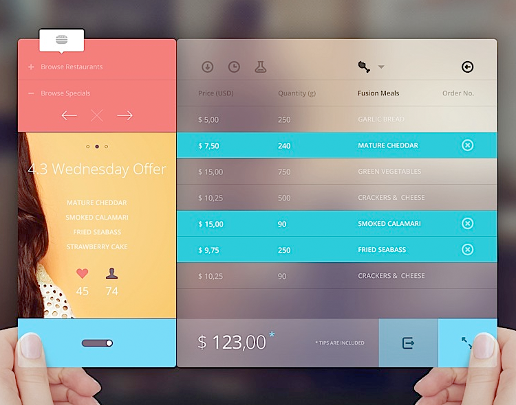
Designing Smart Mobile Apps
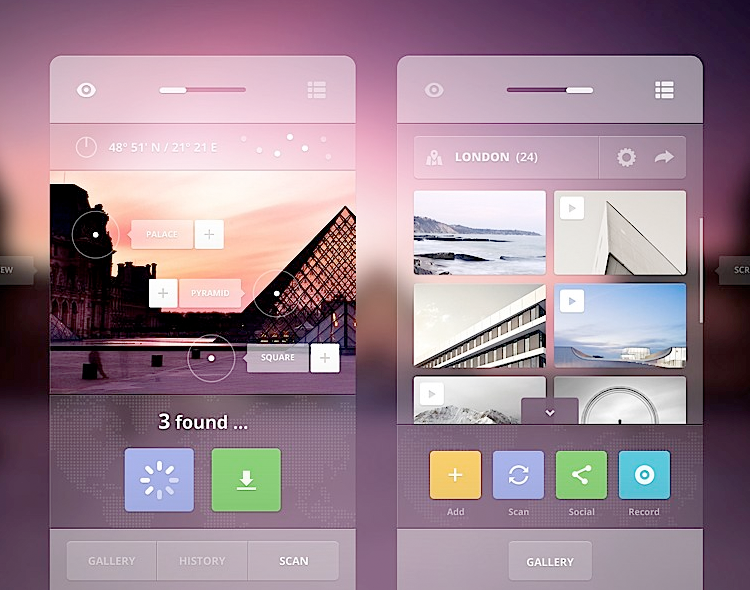
Source: Chooake Wongwattanasilpa – tumblr
Today, app developers need to focus on a heck of a lot more than just download numbers.
Downloads are important but they’re not the be-all-and-end-all.
“Tracking downloads is often a first step to gauging an app’s success, but download stats often provide an incomplete and inflated view. High download numbers always feel great, but if those customers never open the app or abandon it after just a few uses, those high download numbers are really part of a high churn rate.” – Localytics study
You can track the designing user experience within your app using a range of mobile app analytics tools. It’s suggested that you set that up properly before you launch your app to the app store. We wrote up a comparison of the 10 Most Popular App Analytics Tools.
The other article I would recommend is one in relation to Mobile App Optimisation. It’s about making ‘micro-improvements’ to your screen design through A/B split testing to increase your apps profitability (or user engagement).
The difference between User Interface & User Experience design?
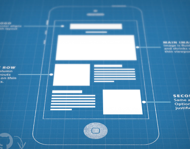
Source: Abzueedo – Cosmin Apitanu
Even to date most app developers don’t really understand the difference between User Interface Design and User Experience design, and so they tend to mixed them up or turn them into one process.
It’s important to understand the differences as they each contribute to the development process in their own unique way.
If the processes aren’t separated then the result is often a poor User Experience which tends to yield lower returns.
Essentially speaking, UI (short for User Interface) is the way that the user interacts with the application/software. For example, when you look at the images (pictures, text, buttons, etc.) on your smartphone screen you’re staring at the User Interface.
The UI is designed to include all the possible options and features so that the user can interact with the software in its full extent. But this in itself isn’t the complete science of intuitive designing.
Simply sticking all the possible features of your app into the screens doesn’t make for a very promising experience. That’s where UX design comes in.
UX (User Experience) is an extension of UI. This is the art and science of designing the screens to make them easy to use and totally engaging.
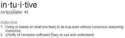
What makes an app intuitive?
Source: Abzueedo – Cosmin Apitanu
Directive Design:
There’s a series of elements that make an app intuitive. An important one is Directive Design – and the name says it all.
An app can be directive by any of the elements or words that are used. Even something as simple as using the word ‘comment’ instead of ‘post’ could make a massive difference to the users engagement with that particular text.
With the use of different colours, shapes, texts, buttons, call-to-actions, etc. we aim to create an experience that guides the user to the actions we want them to take.
When opening the app for the first time, your users aren’t just immediately unaware of how to use your app, but they’re also unsure of whether they need your app or not.
So your job is to ensure that your app is designed in a way that guides and directs through the use of colour, text and icons, and to make it abundantly obvious how the app can benefit them.

Instagram app design
Top dogs of app development like Instagram design a beautiful, intuitive experiences. So feel free to copy ideas from apps like these or use them as guides for good practices.
“We’ve always been shameless about stealing great ideas.” – Steve Jobs
Familiarity:
Another important element is ‘familiarity’. Using icons, words, button shapes that people are familiar with will boost the user experience by removing some of the guess-work.
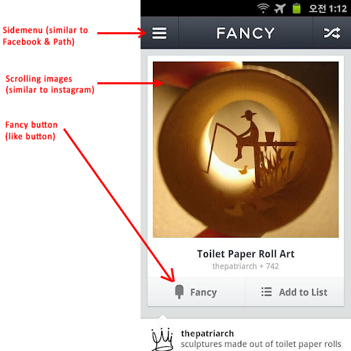
Fancy app design
Fancy uses many of the same features that most people are familiar with.
It’s designed this way to remove any confusion. At the end of the day, navigation really doesn’t need to be overly unique. It just has to be clear.
Beautiful Design:
Using the right colours/graphics in your design can also have a big impact on the users experience of your app.
A beautiful design will usually get a much higher engagement than…an ugly app (for the lack of a better word).
Just watch out that you don’t sacrifice directive design and intuitivity for elegance.
For example, Audible is a ‘beautifully’ designed app. I downloaded this the other day from a recommendation. After opening the app my experience was that I couldn’t find anything I was looking for.
I couldn’t find the sign-up section because it was hidden in the settings page. I couldn’t find my existing audio books because they didn’t sync properly. I couldn’t even find where to search for additional audio books online.
In other words, I was confused…

Audible app design
I spent 15 minutes (on my way to work) trying to figure it out and nearly gave up. And this is coming from a guy who’s pretty clued on with apps.
A couple of minor tweaks here and there could drastically improve the mobile app user experience.
Minimalistic Design:
This can be a very powerful technique to use.
Effectively speaking, minimalistic design is all about simplicity and removing distractions. By removing options, texts and other elements that clutter the screens we can create a clean, easy to use design.

Apple – iOS7
“A cluttered workspace makes for a cluttered mind.”
The process for developing an intuitive app design?
Source: Eddie Lobanovskiy – Dribble
The first thing you want to look at when designing screens is your target audience.
An app designed for a demographic who’s totally non-tech-savvy generally requires a bit more ‘directiveness’. The same thing goes if you’re developing an app for a wide audience – expect a lot of non-techies to be using it.
Group your apps functionalities/features into the following categories:
- Core functionality
- Other popular options
- Your goals (in-app purchases, Facebook sharing, etc.)
- Less popular options (privacy settings, etc.)
Keep the core functionality (1) at the front of mind and make them very accessible and easy to find. Then design the other popular options (2) around that.
It’s always good to use a popular navigation framework from other apps that people are familiar with (like Instagram) to make your app easier to use.
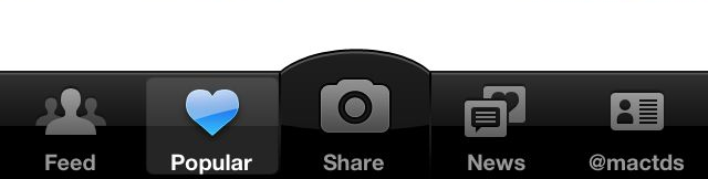
Instagram use a very common navigation style.
After that, make your goals (3) available around the core functionality. Rarely will a user go looking for the Facebook share button or an in-app store so you need to make them very convenient and accessible.
Lastly, implement your less popular options (4) in places where they don’t get in the way of the more important features.
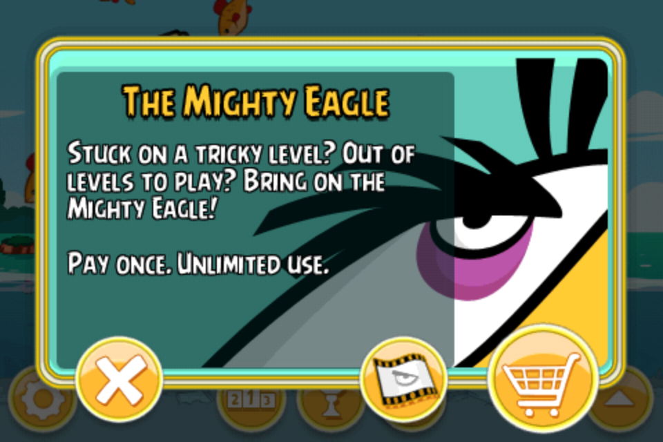
Angry Birds use pop-ups to make their goals accessible by the user. The goal here is to get the user to make an in-app purchase.
User Scenarios
When putting the screens together it’s always good practice to run some user scenarios. This exercise is meant to put your app design into a scenario of practical use.
For example, if you’re developing a type of camera application then taking photos is likely to be one of the core functions (1).
So a particular user scenario could be of how a user goes from (a) opening the app all the way through to (b) taking a photo, and every step in between.
Source: Windows Dev Centre
When you have all the scenarios laid out like this it becomes easier to identify less important functions that can be removed, or simply relocated to a less valuable part of the screen real estate. Or even to another screen!
User Testing…a MUST for every app developer

Source: YouEye
At this point we implement what’s often referred to as ‘A Ridiculous and Extraordinary Amount of User Testing‘.
Get testers of different age groups, sex, interests, etc. to test the app for you. This can be 10 of your closest mates/girlfriends/family members, etc.
Get them to send you ALL their thoughts and feedback.
Everything that’s negative is good. You’re not looking for “oh, what a wonderful little idea” from an over-generous aunt. You’re looking for “YOUR APP SUCKS BECAUSE OF X Y Z.”
The frustrations of your users can be turned around and made into a really positive experience. So make it abundantly clear to your testers that you want lots and lots of negative feedback.
The Wrap
Design your app with the user in mind. Not just to be beautiful but functional as well.
“Good design is design that’s in service of the experience.” – Apple, iOS7
Latest posts by Logan Merrick (see all)
- Ep 18: Collective Campus’ CEO on Intrapreneurship and Corporate Innovation - December 20, 2016
- 50 User Engagement Strategies For Planning Memorable Mobile Experiences - December 19, 2016
- Latest Data: App Monetisation Trends And Drivers 2015-2020 - November 25, 2016


