
10 Steps To Branding Your App
If you haven’t met Pete before, he’s our branding guru at Buzinga!
You’ve come up with a great idea, and it’s now being developed into an app.
Awesome! The way I see it, this is the beginning of your new brand.
When designing your app, you should always keep in mind the message you want to send users about who your app is.
Yes, I did say ‘who’ not ‘what’.
What many of our clients fail to understand in mobile app branding strategy is that establishing a brand is pivotal to your app’s success, because it gives human values, attributes and meaning to your app.
Let me demonstrate this with a classic example, the beauty industry.
This industry is so saturated with competitors (like the app industry) the only real way to stand out is through branding.
What do you think of when you see this?
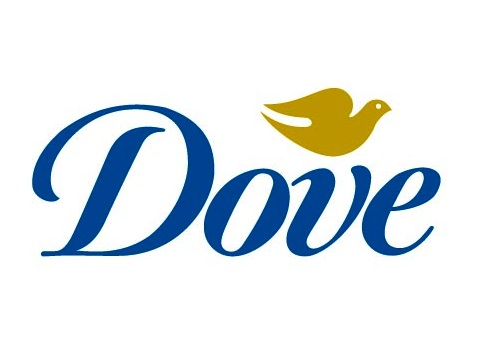
Source: Dove
Is it different to what you think of when you see this?
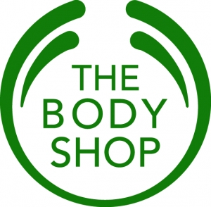
Source: The Body Shop
Dove’s brand values are sincerity and family, while The Body Shop stands for ethical consumption.
Both brands demonstrate this in every aspect of their communications, from their packaging to their celebrity endorsers.
By communicating your app’s brand through its design, you’ll be able to create a shortcut in user’s minds.
Branding gives you control over the associations that are triggered whenever users see your app icon, hear its name, smell its…I dunno, it’s basically just those 2.
Here are the 10 most important points to consider when branding your app.
1. It’s all about the user
It’s not about you, as hard as this sounds.
9 times out of 10, you are not the target audience for your own app or your new brand.
A lot of people aren’t open to new design ideas because they’re stuck on a brand using irrelevant logic:
It’s “what I like” or “I showed my friends and they agree with me”.
App design should always be based on who has been identified as the target audience, and you won’t know this without doing some pretty intensive research and concept testing.
From this, the question should always be: How can I build a brand that resonates with these users?
What are their needs, values, lifestyles?
Is your app aimed at children, or for adult gamers?
Here are two apps with pretty similar concepts, but they have created totally different brands based on their user:

Source: Google Play Store
Once you’ve zeroed in on your user, you’ll have a better idea of what your brand will be and how you can communicate it most effectively.
-
First impressions are everything
The rule ‘don’t judge a book by its cover’ is one that humans break all the time, even if it is subliminally.
Long before users engage with your app or read your content, there is a short moment where they will prejudge its value by its outward appearance.
We are all superficial when it comes to our purchase decisions.
It’s not because we’re mean. It’s just because we don’t have time to weigh up all the pros and cons.
Knowing this, you have a very short amount of time to convince people to download your app, or to keep using it once they install.
Here comes design!
It’s the hero (or villain) that will dictate your app’s success on every level.
It’s therefore important that your app’s splashscreen, login and homepage are selling the socks of your brand.
Source: AppCoda
These are the screens users will see first and most frequently.
Putting your best design forward will go a long way to acquiring new users.
-
Know what you’re competitors are doing
To give your designer informed insight and direction, have a look at what’s out there already.
Find apps or brands that will be your direct competitors, and note down elements you like and dislike.
In particularly saturated markets (like productivity apps, for example), there is little room to differentiate based on product features alone.
If everyone else in your category uses minimalistic design, this might inform your choice to use bright colours and snappy text.
References like this will only improve the collaboration process between you and your designer.
Up Coffee is just another coffee app, but it refuses to look like one.
Its competitors all choose similar colour schemes of black and brown, so Up Coffee’s design makes it stand out.
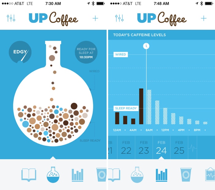
Source: Mac Rumors
-
Keep it simple, stupid
We often have clients come to us with ideas that are:
- Complicated
- Confusing
- Limited
- Irrelevant
A design may make sense to you because you’ve spent hours thinking it up, but it probably won’t make sense to the user. Refer to point 2.
Designs should actually be:
- Simple
- Unforgettable
- Enduring
- Applicable
Here’s a classic example that ticks all 4 boxes:
Source: Phaidon
I don’t even need to say the name, do I?
That’s brand power right there.
-
Avoid clichés
Light bulbs for ideas, puzzle pieces representing problem solving, stylised stick figures…
We’ve seen it all before.
These images are usually the first things that come to mind when you think of a category, and will not separate you from your competitors.
Spend some time at the drawing board with your designer to come up with designs that stick.
A brand that did this is Snapchat.
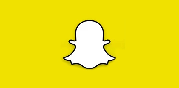
Source: ioshacker
It’s in the photo sharing category with a ton of competitors, like Instagram, PicTransfer and Shutterfly.
Instead of designing around the generic idea of a camera or a photo synonymous with the category, it went way out on a limb and chose a ghost.
At first glance it seems irrelevant, but it actually makes total sense for their brand. (The pictures disappear completely, like a ghost).
It takes a bit of thinking to understand it, and more time thinking = more brain real estate = more easily your brand is triggered in users’ minds.
It’s also clean, simple and fun.
-
Don’t think literally
This is a simple tip on app branding strategy to help you avoid cliches.
Instead of getting tied down to your initial ideas, use them as a springboard to elevate that idea to something personal and unique.
So you like the idea of using a colour wheel as your icon for a paint app?
Go further and brainstorm other possible icons that bounce off this design – an artists’ palette, a splash of paint, painters’ overalls…
The sky’s the limit!
(Sorry, that was a cliche.)
-
Don’t confuse the logo with the app icon
They are similar, but there is one key difference:
Logos are scalable, while icons are not.
This mean that icons are subject to changes in resolution when sized up or down.
Icon design is highly influenced by technical dimensions and the restrictions of the systems that display them.
![]()
Source: Pixel Resort
See how this icon design has been altered slightly to ensure it’s optimised for every possible interface?
A logo, on the other hand, could be any shape, colour or dimension.
BUT it should be able to maintain its integrity at any size.
It shouldn’t matter whether it’s used on a 12 foot billboard or on the label of T-shirt – your logo should always cause instant brand recognition.
For new brands it’s a good idea to include your app’s name in the logo, then you can drop it later once users know who your are.
These brands all did this once they hit the big time. Their brand was so memorable they eventually didn’t need any text in their logos:
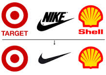
Source: 5th Colour
8. Just because it’s attractive doesn’t mean it’s a good logo
One of the most celebrated designers of the modern age, Milton Glaser, said “The logo is the entry point to the brand.”
It’s no use having something beautiful that doesn’t communicate your brand values.
The whole point of building a brand is making it easier for users to understand who you are.
If you send them mixed messages with your design, it will only confuse them.
9.There’s no rush
You don’t rush art.
No one stage in the app development process can be half-arsed or skipped, or your app simply won’t work.
Design often gets the short end of the stick when it comes to development, because developers spend all the time and money working out bugs and optimising features.
Give your design process the respect it deserves by setting aside time.
The details may seem irrelevant now, but trust us, in the long term it will make a world of difference.
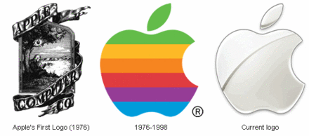
10. Think of your logo as a long-term investment
This harks back to another point we made earlier: Your logo must be endurable.
A good logo should last between 8-10 years.
Some logos last much longer and other fall terribly short.
If you and your designer are able to collaborate and successfully identify the right audience to communicate speak to, you will go long way to creating a prosperous brand.
10 years for a well-considered logo is a great investment.
Small touch-ups are perfectly acceptable over the years to keep up with changes in culture and societal preference (how naff does Apple’s first logo look now?).
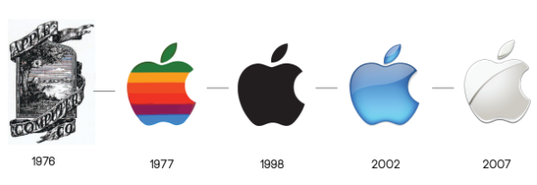
Source: ColourBlind
The key word here in mobile app branding is SMALL.
There’s nothing worse you can do for your brand than dilute it’s meaning by totally changing the logo.
It will only confuse users and hurt brand recognition and recall.
The only time this is acceptable is if you’re doing a total brand repositioning like Apple did in 1977, and fundamentally changing what your brand means.
Otherwise, stick to what you’ve got!
Give your designer as much input and research as possible in the preliminary stages to let him/her work their magic.
With the right design and a clear idea of your user, you’ll be able to create a brand that stands the test of time.
Related articles:
- How to create a great UI concept
- Infographic: Breathtaking Mobile App Design Inspiration
- How To Design A Memorable App Icon
- 50 UI Tips For Designing Beautiful Android And iOS Apps

Pete Flannery
Latest posts by Pete Flannery (see all)
- 10 Steps To Branding Your App - June 23, 2015


Pingback: How To Choose The Right App Monetisation Model To Get Filthy Rich()