A User Experience Review of the New myGov Website
The new myGov website was rolled out over the weekend, a joint project between the Department of Human Services, the Digital Transformation Agency and the Australian Tax Office.
The myGov website has over 10 million users, giving Australian’s access to manage their government services including Medicare, Centrelink and the ATO from one portal.
Political conversation has been heavily skewed towards technology and innovation over the past 2 years, with the #ideasboom agenda putting Malcolm Turnball on the map as the ‘digital’ Prime Minister.
So you’d assume the highly anticipated redesign of the myGov website would play a large role in facilitating a simple and easy to use digital experience for the diverse Australian society.
IT Wire quoted in July last year that “myGov is a disaster waiting to happen” with high concerns around security and privacy. This update has been a long time coming.
According to the government the new website has multiple benefits including simpler design, simpler language and (thank god for this…) a more prominent Government Crest!
The Press Release included the following 5 points as their most proud achievements with the new site:
? The design is simpler and navigation is easier so you can find the services you need quickly. For example, the member service logos are now more prominent when you are logged in.
? We’ve rewritten our content so it is clearer and uses simpler language.
? We’ve reduced the amount of information on the site so you can find the information you are looking for.
? The site is more mobile-friendly with a responsive design, you can do your government business on the go with your mobile or tablet.
? We’ve made the government crest more prominent so the site is clearly identifiable as an Australian Government website, giving people certainty and trust in the site.
“The public will ultimately judge us when they go on to the myGov website, when they pay their tax or ask for a refund, when they come through immigration, when they are engaging with the industry portfolio as a small business, they will judge us on how that goes.”
The public (well, Buzinga) have judged and this is our verdict:
1. The Sign-In Process
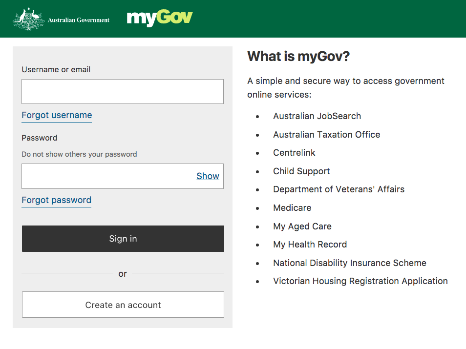
According to the government, previously the signing in process was so difficult that within just a few days they’ve already increased sign-ins by 37%. The new signing in process allows users to login with their allocated Username – a long string of numbers (previously the only option) or your email. Passwords are now easier to recover.
After signing in and out several times to see just how easy it is, we realised that it doesn’t remember your username. If a bank has security measures that securely remembers your username for a simpler and easier experience, why can’t the government use those same security features?
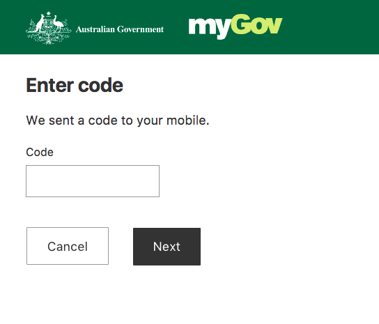
Adding another step to sign-in process is mobile verification. Having to put in a phone verification every time to sign in, is not the best experience.
Similar to online banking, we’d recommend not having mobile verification sign-in until you’re accessing information such as your ATO information.
We aren’t 100% sure if this measure is taken for every account, but we are hoping that this process takes into account those who do not own a mobile phone.
If the government were to have a mobile application for the myGov portal, they could use simpler sign-in processes such as a finger-print sign in similar to the Westpac banking app.
2. Linking Services
One of our UX Designers wrote an article for us last week on designing for accessibility.
In Australia there are over 4 million people who have some form of disability – that’s 1 in every 5 people. Of this 4 million 83.9% have a physical disability, 11.3% have mental and behavioural disability, and 4.8% have an intellectual or developmental disability.
Behind these technical terms and statistics, people with disabilities are their own unique individuals; they’re employed, have social lives, go shopping, go on holidays, access information and contribute to society.
The difference however, is that people with disability face significant barriers in their day-to-day lives and use of the web which many of us simply take for granted.
These barriers can be things like:
- Someone who is colour blind having trouble distinguishing the text on a button from the button’s background colour
- A user with dyslexia who cannot easily read through large blocks of text
- Someone with impaired motor skills who cannot use a mouse adequately or struggles to tap small buttons on the screen of a smart phone
As an Australian Government initiative, we would hope to have seen designing for accessibility a core focus of the user experience and user-interface design.
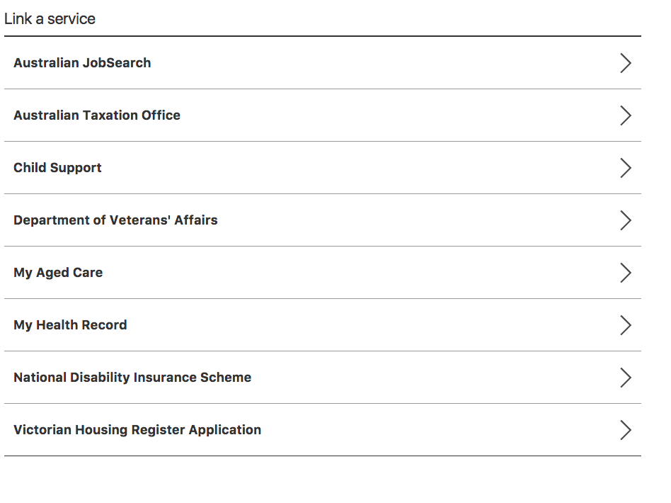
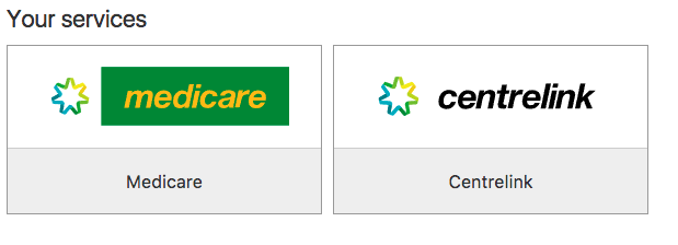
The government has claimed: “The design is simpler and navigation is easier so you can find the services you need quickly. For example, the member service logos are now more prominent when you are logged in.”
Whilst the logos are more prominent if you have an account already linked(see below), viewing a new account is a black and white text experience with no logos at all.
This site has been built for the entire Australian population and they’ve completely removed any visual cues.
Those visually impaired or dyslexic will struggle more than others to identify which service they are trying to link.
Our recommendation would be to have all services displayed the same way it is shown for linked services (see below).
3. Data Duplication
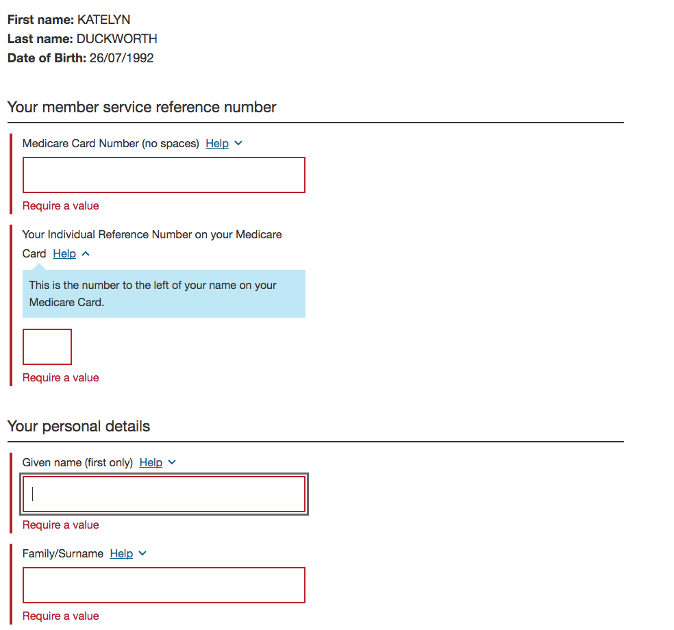
Spot the data duplication? It clearly states at the top of this screen shot Katelyn’s name and date of birth, yet asks her again down the page to fill in her name and date of birth.
This is not best design practice and is adding an unnecessary step to the process. They clearly have the details above, why do we have to fill it in again?
4. Load Indicators
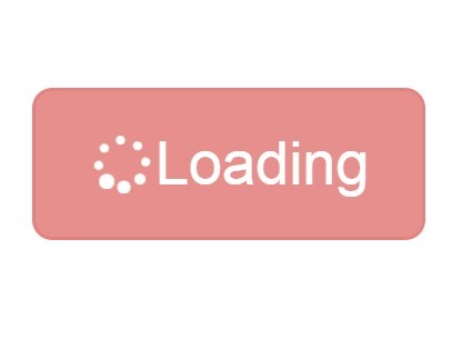
The government has claimed to have spent hundreds and thousands of hours researching how an ‘average’ person would use this website in the form of focus groups, yet no-one took into account the fact that there are no loading indicators on the website.
When a form is submitted, nothing happens. When using the portal and hitting next, we were not sure if the form been submitted. An ‘average’ person might refresh the screen or press back and lose all of their data, resulting in frustration.
We’d recommend implementing a loading indicator like the one above.
The overall process has dramatically improved from what is was before, however the standard it has been brought up to is far from a highly intuitive and engaging user experience.
It meet the expectations of users circa 1999. It’s black text on a white background. As quoted in Governmentnews.com.au “It’s as vanilla as it can get.”
The government had an awesome opportunity with the millions it had to spend on this product to build something for the Uber and Airbnb generation – the future of Australia. We could’ve designed a much better user experience for a fraction of that cost.
What we’d like to see in the new myGov website:
- Evidence of proper Usability Testing. This is where an ‘average’ user is given tasks to complete while they are timed and any difficulties noted and comments taken on board to measure their experience and suggest improvements.
- A more engaging user-interface.
- Web standards and best practices adhered to
- Loading indicators on form submissions
- No data entry double-up
- Skip Patterns (cursor skips to next field automatically) to make data entry quicker
- Agency icons when linking accounts to help with accessibility
- A further simplified sign-in process
- A mobile app
- Simple to access language translation
Latest posts by Joe Russell (see all)
- A User Experience Review of the New myGov Website - May 25, 2017
- 9 Most Popular Mobile App Analytics Tools - May 4, 2017

