50 User Engagement Strategies For Planning Memorable Mobile Experiences
As the business world steadily moves towards mobile, experience is the #1 factor that will distinguish your brand from your competitors.
It’s one thing to build a mobile application with a strong business model and ‘pretty’ design, but it’s another to keep them coming back from more.
Buzinga are Australia’s leading user engagement-focused app development agency. To date, over 300 businesses from all over Australia and in 23 different countries have worked with us to create NEW revenue streams, find NEW customers and enter NEW markets utilising the latest strategies, tools and tactics in UX design.
We’ve compiled 50 of the most powerful engagements strategies in this blog so that you too can plan and create memorable mobile experiences.
As a manager, if you’re considering introducing mobile to better engage with your customers, then this article is for you. Make sure you have a pen and paper next to you as you’ll be taking lots of notes.
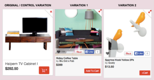
1. Conduct A/B split tests
Compare two different versions of a screen or page against each other to determine which one performs better in terms of your app goals – conversions, revenue, time on screen, etc.
Best tool: Optimizely.

See also: 4 Tips For Conducting Tight Mobile App A/B Tests
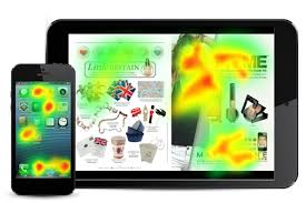
2. Use heat maps
Heat maps are visual representations of where customers are spending time in your app. Find out which parts of the interface they’re interacting with, and make educated changes to UX and UI to direct the customer to new paths you want them to take.
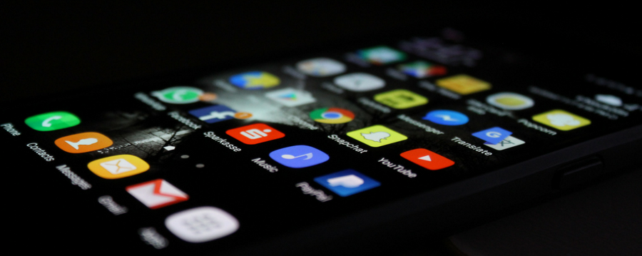
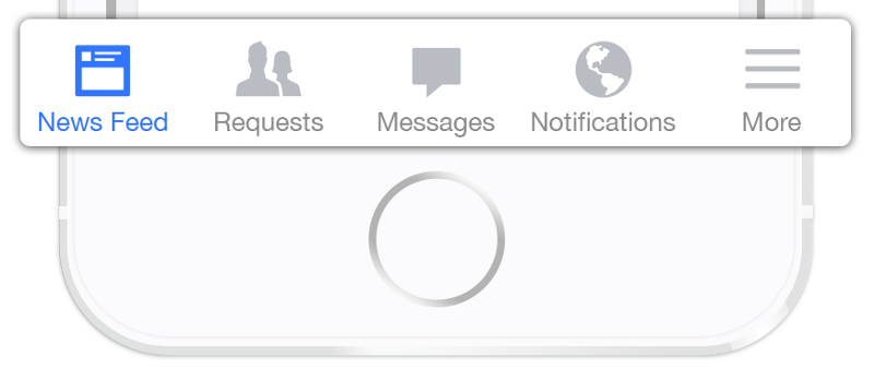
3. Use bottom navigator on all main screens
Research on mobile device usage has found that 49% of people rely on one thumb to get things done on their phones. As thumb reach differs greatly person to person, it’s important to place top-level and frequently-used actions at the bottom of the screen so they are comfortably reached with one thumb.
4. Create user personas
Create 3-5 user personas based on who is in your target audience. Give them names, research their needs, behaviours and preferences. Use these personas to create targeted, personalised user experiences for EVERY app user.
See also: User Persona Template:Marketing To A Mobile Audience
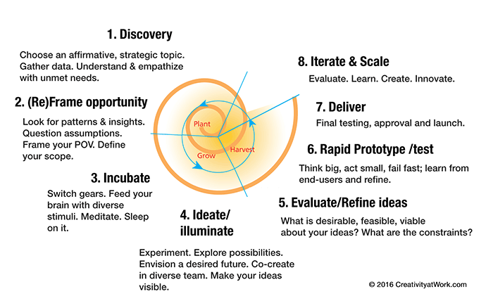
5. Adopt a design thinking approach
Design thinking is how leading companies like Apple, Nike and IDEO are creating engaging products time and time again. Rather than focusing on problems and how to solve them, design thinking is future oriented. It starts with the best possible solution for the end-user, and figures out how to reverse engineer a product or process that creates a desired outcome for the customer.
6. Craft meaningful ‘micro-interactions’
Latest customer data shows that flawless and functional app performance is a minimum expectation from customers. To gain a competitive edge in app design, it’s all about creating meaningful ‘micro-interactions’ that delight the user.
These are tiny, contained moments within a tech product that usually revolve around a single task. For example, the ability to delete emails in the Gmail app with a single swipe, without needing to open them first.
7. Take advantage of free user testing
Hop onto websites like X and Y to find beta testers who will give you qualitative feedback on your product as well as quantitative app data you can analyse to get insights on potential bottlenecks in your UX flows.
See also: 5 No-Cost Ways To User Test Your App
8. Use face to face user testing
Super old school, but any user testing is better than none at all! Take your MVP product and put it in the hands of some people on the street. See how they use it and gather insights from where they may have had trouble completing a goal!
9. Prototype before MVP
Create a prototype (4-5 workable screens) before building an MVP. A prototpe is built as quickly as possible to prove or disprove the feasability of a concept, and demonstrates the usability and features of the product before it is actually built.
As well as minimising the risk of wasting money on a product that will need to be redesigned, a prorotype is something you can take to investors to gather funding for development!
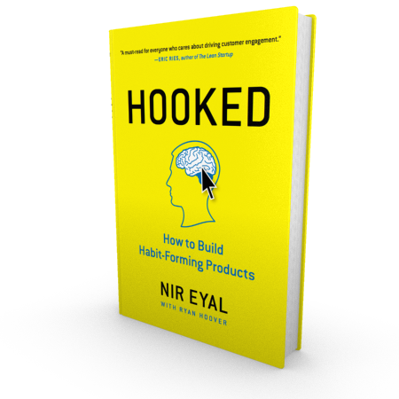
10. Read Hooked
Hooked: How To Build Habit Forming Products is a book filled with practical tips for designing tech products that customers can’t put down.
With strategies taken directly from Dropbox, Uber and Google, you know these are best practices for engaging customers.
11. Make it fast
Speed of UI responsiveness and screen loading time is the number 1 frustration that causes customers to exit apps. Before launch, test your app’s performance in conditions of limited connectivity, as well as load tests with different numbers of users.
See also: 9 Crucial Things To Test Before Your App Goes Live
12. Join the cloud
Cloud-enabled platforms take into consideration that we live in an omni-channel world. The average household in Australia contains 8 internet-connected devices that are accessed in different user situations. Ensure your product has the flexibility to offer a fantastic experience on every device.
13. Ensure accessibility
Almost 20% of Australians have some form of disability. Mobile design should take into consideration users with limited eyesight, hearing and motor functioning.
Small ways to do this include captioning for audio and video, adding alternative text to images, including explicit labeling on all form fields, and testing your app with assistive technologies that people with disabilities commonly use.
14. Be persistent
In the context of storing data in a system, persistence means that the data survives after the process with which it was created has ended.
In other words, for a data store to be considered persistent, it must write to non-volatile storage. There are several design approaches that a persistent data store can take, with various tradeoffs on performance and durability.
Ask your developer for more information on the persistence of your data store.
15. Deep dive into deep links
Deep linking means that when someone is directed into your app from a link on an external site, like Facebook, the app will open on the correct page the user has indicated interest in.
This bypasses the frustration of opening the app, landing on the homepage and manually finding the content you’re looking for.
Deep links offer a much better experience for the user as it connects your app to the rest of the web seamlessly.
16. Make customer service easy to access
Complex, multi functional platforms should have easily accessible information for contacting support.
Some common examples include Livechat within web apps, chat bots, in-app email enquiry submissions, and clickable phone numbers to contact a support centre.
17. Use onboarding sparingly
A full onboarding tutorial shouldn’t be necessary if your app is intuitive and designed using best UX practices.
However, if you notice in your data that new users are typically struggling in a certain part of the funnel, or going back and forth from 2-3 screens searching for the right step to take, these are signs you should make changes.
Use directive design practices to point new users to take the actions YOU want them to take. Training users properly the first time will ensure they complete high-value actions the next time they open the app.
18. Deliver on your marketing promises
Following through on your marketing promises is the only way to retain customers. Thousands of downloads are all well and good, but these hard-won downloads aren’t worth a cent if users are abandoning your app after less than 3 visits.
Engaged, happy users are the ones who feel that the app delivers on the value it promises. Especially in MVP stage, you should invest more time and money into your product than your marketing.
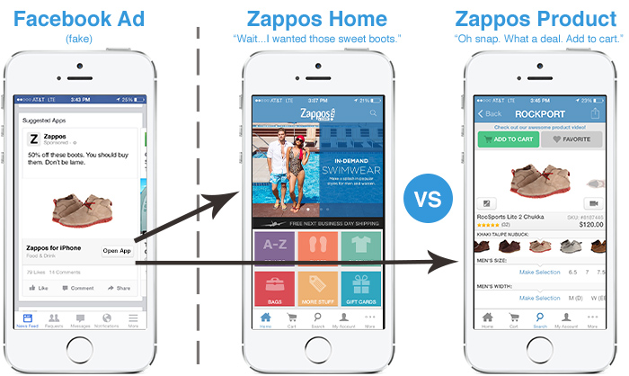
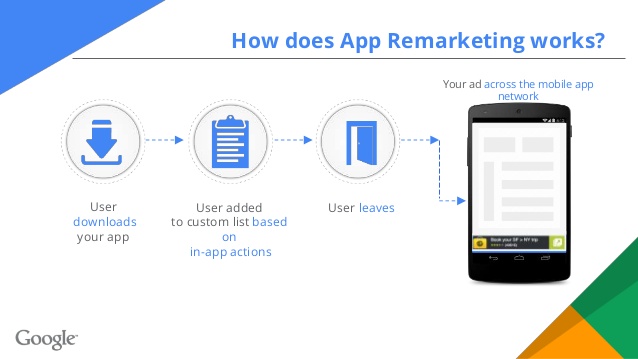
19. Use remarketing (with deep linking)
Remarketing is a powerful way to keep your app top of mind and draw people back in.
Remarketing best practices include bringing users back to the app if they haven’t yet completed the registration process, or reminding them they haven’t completed an app goal.
You can use platforms like Facebook, Instagram and Google Display Network to re-market your app to people who have already engaged with it.
Just remember to deep link to the specific content the ad refers to!
20. Go native
A no-brainer! If engaging users is your top priority, a native application will do this 5X better than a hybrid or cross-platform application.
Native applications are developed in platform-specific languages, which means they’re able to take advantage of native phone features (camera, GPS, etc) and leverage native device functionality.
This makes apps more intuitive, functional and engaging for the end user.
See also: Native Apps VS Hybrid Apps: Why And When To Use Each One
21. Use social proof
Social proof is proven to influence customers to convert on your offer. It involves showing people that credible 3rd parties use and enjoy the app, therefore reducing the perceived risk by first timers.
Use social proof in your app by showing users who out of their contacts or Facebook friends is already using the app.
Depending on the function of your app, you can also use social proof by:
- Showing who is using the app nearby
- Showing how many listings are available, or
- Showing lists of ‘most popular’ products.
22. Acknowledge the law of past experience
You don’t need to reinvent the wheel and make every design function unique.
In fact, you shouldn’t even try.
Using familiar frameworks and icons ensures the user intuitively knows what to do in your app.
Can you guess which of the follow 3 icons for ‘add to cart’ has the highest conversion rate on e-commerce apps?
The second – Add To Cart.
Amazon was one of the first websites to pioneer online shopping, and they have effectively ‘trained’ users to respond more positively to the add to cart text.
23. Analyse your data
Use analytics services like Crashlytics and Localytics to gather insightful data on your users and use it to propel future UX decision making.
See also: 4 Steps To Using App Data “The Uber Way”
24. Release regular updates
Just like your website, you must update your app regularly to keep it performing highly, free from bugs and providing fresh content and updates to existing users.
25. Integrate artificial intelligence
Applying AI technology to your mobile app personalises and streamlines the user’s experience at a level in-achievable by a ‘one size fits all’ interface.
You can use AI to predict user behaviour, show preferential content, and make strategic recommendations to your user base.
See also: 4 Ways To Transform The Customer Experience With Artificial Intelligence In Mobile Apps
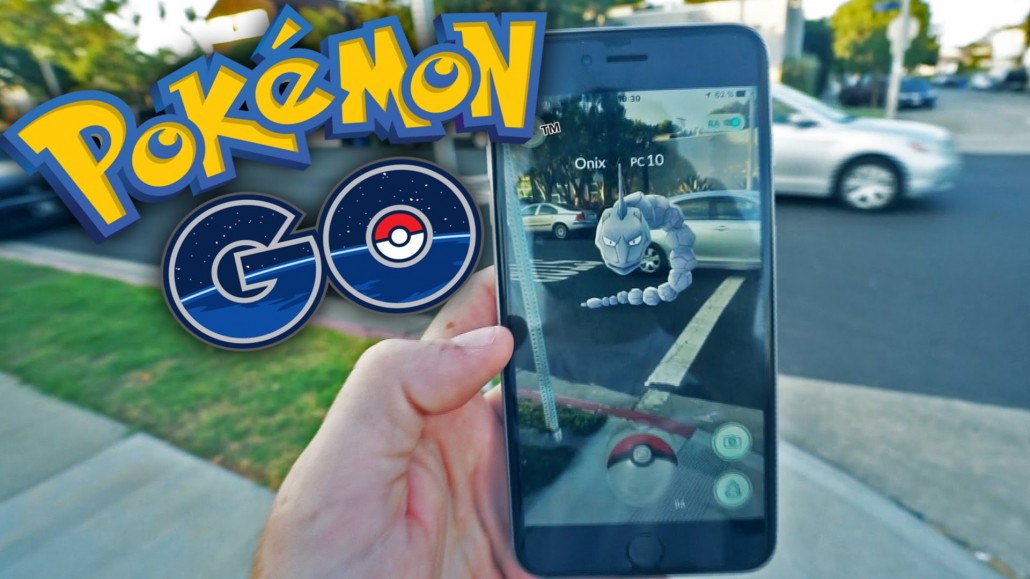
25. Integrate augmented reality
Augmented reality is not as futuristic as it sounds. Industries like retail, health and real estate are already using simple forms or AR to deliver virtual experiences to customers.
Particularly for apps that use native camera functions, augmented reality can be a powerful way to deliver more value throughout app usage.
See also: Beyond Pokemon Go: Real, Profitable Applications Of Augmented Reality
26. Integrate beacon technology
Customers now expect offline and online experiences with brands to be seamlessly integrated.
Collect rich customer location data and deliver timely notifications to customers by incorporating beacon technology into your app.
See also: 5 Powerful Australian Examples Of Beacon Technology In App Development
27. Engineer viral loops
We all dream of our apps ‘going viral’, but virality isn’t a feature, it’s a design principle that should permeate throughout your app.
To create your own viral loop:
- Identify your media,
- Design your funnel steps,
- Find your ‘hook’
- Specify places where new people will enter your loop.
See also: How To Build An App Born To Go Viral
28. Reduce functions
Most people start building their app with a wishlist of 15-25 actions that the user can complete.
Reducing this amount of choice will not only make the UI sleeker, but will also reduce frustration in the user journey.
29. Make everything a task
Every function and text choice in your app should be designed to:
- Show users how to complete their task, or
- Complete their task
There is no time or space to waste with ‘nice to have’ information and graphics that don’t contribute to the user completing that task!
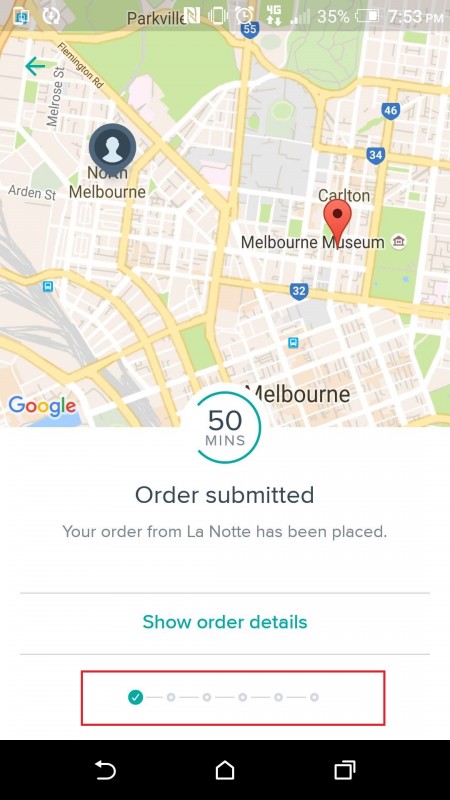
30. Leave breadcrumbs
Make long processes like checkout and signup less arduous by using breadcrumbing.
This is a design technique that shows users where they are in the process and how many more steps there are until the complete the process, reducing the chance that users will exit the app.
31. 80/20 it
80% of app users will use just 20% of its functionality.
First of all, identify what is the vital 20% in your app’s functionality. The next (and much harder) step is to take actions that make the vital 20% as accessible and seamless as possible.
Consider burying the less necessary components in the ‘settings’ function.
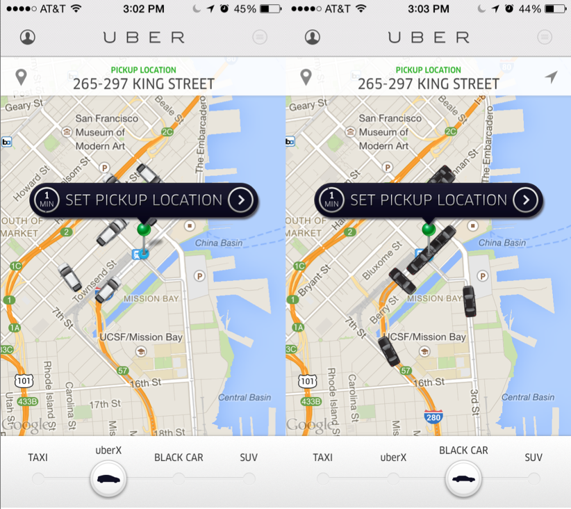
32. Reduce screens
Every screen in a user flow is another screen that the user can exit from.
A current trend in UX is to use sliders to move through screens rather than requiring the user to tap on options that take them away from their current screen.
This lets users easily toggle between related choices to complete the task at hand.
See how Uber uses sliders for their 4 different car types below:

33. Don’t request info that isn’t immediately necessary
Give the user time to trust you before you ask for personal information like email, DOB and credit card.
A/B test to find out when is the optimal time to ask for this information – perhaps after they’ve completed a certain action, or on the 2nd or 3rd user session.
34. Choose the right platform
Mobile apps tend to work best for applications that require data input by people who are on the go, whereas complex management portals are better serviced through a web app or dashboard that is accessed via desktop.
Look at your target audience and make a platform decision based on their known behavioral tendencies.
35. Use positive reinforcement
Customer retention is a serious problem in the app market, and one of the best ways to combat it is to ensure every customer finishes an app session satisfied with their experience.
Make small UI choices that act as positive reinforcement along the app journey – animations, ‘success’ copy and tick boxes are all examples of how to achieve this.
36. Optimise the funnel
By including in-app analytics in your first release, you’ll be able to see:
- How many people enter and complete the funnel
- What is the drop off rate for each screen in your funnel?
- How long does it typically take to complete the funnel?
This information will allow you to optimise your funnel for higher conversions.
37. Avoid ‘swiss army knife’ thinking
Only include core features in your MVP and keep the purpose of your app clear for users.
The ‘swiss army knife’ approach fails quickly when you try to branch out too early and take on too much.
Spoon-feed new users with information in bite-sized pieces so they don’t feel like a failure when they try to use your app!
38. Test all assumptions
If you’re collecting data you have no excuse to be making assumptions that aren’t grounded in fact.
Take a leaf out of Uber’s book and use your data to drive constant, never-ending improvements in your app.
Remember, what looks and feels good to you might not be the best solution for your customers.
39. Set a 60 second goal
When designing your app’s user experience, ensure all main UX flows can be comfortably completed within 60 seconds.
If your app is simple in functionality, uses directive design and has short funnels, 60 seconds is very manageable!
40. Integrate with 3rd party applications
Integrations with other customer-focused platforms show a commitment to delivering ongoing value to the user.
3rd party applications like Paypal, Braintree and Facebook make your app experience much more seamless and enjoyable for the end user.
Do customer research to find out which platforms your customers typically use in relation to the problem your product solves.
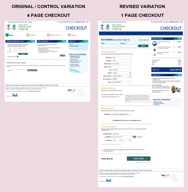
41. Reduce friction
Use psychological principles to make it ‘easier’ to complete the target action. For example, turning a 4 page checkout process into 1 long page doesn’t reduce the amount of information required from the user, but psychologically it feels like less effort and has been shown to increase conversions by up to 200%.
42. Increase incentive
Every product decision you make should first answer the question ‘does this add value to the end user?’
Creating a better benefit for the customer is the overarching goal of all engagement strategies.
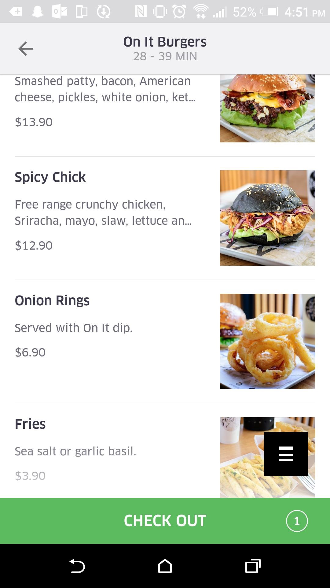
43. Make target objects bigger
You can increase click through rate to a desired action (like ‘submit’ or ‘purchase’) by making the button large and placing it near the expected thumb location.
See how UberEats does this with ‘check out’:
44. Make undesired actions smaller
Inversely, you can decrease undesirable actions (like ‘cancel’) by using smaller text, buttons and placing it a fair distance away from the expected thumb location.
45. Make social sharing convenient
If there is emotional value attached to your app (through sharing of photos, achievement of goals or milestones, etc), users will typically want to share their feats with their network.
Facilitate sharing within your app and externally by placing sharing prompts in strategic places. Apps like FitBit and Instagram are leaders in social sharing if you want to follow some best practices.
46. Offer mobile specific rewards
18% of people download apps to receive special offers and discounts. While this is a great way to score some quick downloads, these users will be largely passive if you’re not regularly offering deals that are exclusive to mobile.
Special offers are also the most effective way of resurrecting inactive app users and sparking new interest in your application!
47. Focus on first impressions
1 in 4 people abandon mobile apps after only 1 use. First impressions are everything!
What actions do you want a user to make in their first ever app session? What key goal should they complete in order to showcase your app’s usefulness and ensure they come back for a second date?
Create a UX flow specifically for this ideal first session and make design choices that best serve this funnel.
48. Use push notifications sparingly
Push notifications can be effective when used appropriately, but aren’t necessary for every application.
Remember, Apple provides the ability to ask for push notifications only once. If a user opts out of notifications from you because you’re abusing your privilege, you won’t get another chance to ask!
49. Communicate in-app when a new feature is introduced
Don’t make the user go searching around the app themselves! Explicitly tell them when something new has been added to the interface, and make sure you the communicate the benefit to the user, not just the feature itself!
50. Solve the problem
Following best practices for UI and UX will significantly increase conversions and in-app engagement, but the most effective way to engage users is to simply solve the problem the app was built for. If you can do that better than anyone else, you’ll have a market leading product.
Latest posts by Logan Merrick (see all)
- Ep 18: Collective Campus’ CEO on Intrapreneurship and Corporate Innovation - December 20, 2016
- 50 User Engagement Strategies For Planning Memorable Mobile Experiences - December 19, 2016
- Latest Data: App Monetisation Trends And Drivers 2015-2020 - November 25, 2016

