
15 User Experience Design Tips For Building Lean, Profitable Mobile Apps
Making the decision to build a mobile app isn’t a cheap one, which is why taking a lean, MVP approach to app development is the best way to minimise wasted resources and deliver your app on budget.
User experience design is a critical component to building lightweight app that first and foremost solve the customer problem (and do it meticulously well!).
Here are 15 of our team’s favourite user experience design secrets to take with you when designing your own mobile application.
Employing these will ensure your app is well positioned for a profitable first launch and beyond.
1. Reduce functions
When you’re first wireframing your concept, there will be one overarching function of the app itself.
Take Taasky, for example. Its overarching function is ‘managing tasks’.
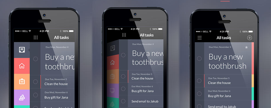
From this, the UX design can be reduced to a maximum of 4 actions:
- View tasks
- Add task
- Edit task
- Remove task
Most people start their journey with a wishlist of 15-25 actions that the user can complete.
Reducing this amount of choice will not only make the UI sleeker, but will also reduce frustration in the user journey.
2. Leave breadcrumbs
If there are several steps involved in a process (ie checkout, long sign up processes) you can use a technique called breadcrumbing.
This means that users are shown at the same time:
- Where they are in the process, and
- How many more steps there are until they complete the process
In UberEats VS Deliveroo: Which App Has The Better User Experience? I spoke about how this technique is crucial for keeping hungry app users at bay during the delivery process.
You can see how Deliveroo does it below, clearly showing that the user is at Step 1 in a 6 step process:
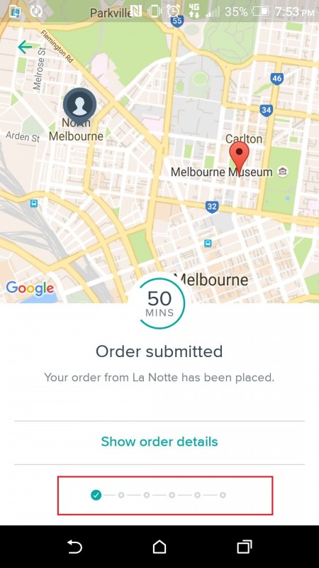
This is a clever psychological hack for showing users that the end is in sight, reducing the likelihood that they will quit the process in frustration and impatience.
3. The devil is in the detail
Meaningful ‘micro-interactions’ are what gives user experience design a competitive edge in today’s landscape.
If you think about the apps that you love to use, it’s probably because of their micro interactions.
These are tiny, contained moments within a tech product that usually revolve around a single task.
Some of my favourite micro-interactions:
- The suggestion to post a recent photo in my camera roll when I go to upload an image in Instagram.
- The ability to delete emails in the Gmail app with a single swipe, without needing to open them first.
- How Google Maps saves businesses and restaurants I’ve previously been to and automatically displays them as a reference point when I’m searching for a nearby location.
These interactions may seem insignificant, but when they save the user time and frustration like these ones do, they’re powerful tools for improving retention and overall user experience.
4. 80/20 it
The ‘Pareto Principle‘, or 80/20 principle, describes the phenomenon that roughly 80% of the effects come from 20% of the causes.
This law holds true in user experience design.
80% of app users will use just 20% of its functionality.
Think of the apps you use regularly – do you use all of their features? I know I don’t!
First of all, identify what is the vital 20% in your app’s functionality. The next (and much harder) step is to take actions that make the vital 20% as accessible and seamless as possible.
Consider burying the less necessary components in the ‘settings’ function.
The 80/20 principle also works the other way for identifying bottlenecks in your design.
Jennifer Aldrich of UX Magazine found that 18% of her core product areas were causing 83% of our clients’ frustrations.
When analysing your user behaviour, keep an eye out for where you can apply this thinking.
5. Make everything a task
App users want to use apps to accomplish tasks, whether they be broad (like browsing restaurants) or specific (add an item).
Every function and text choice in your app should be designed to:
- Show users how to complete their task, or
- Complete their task
Mobile users are time poor. There is no time or space to waste with ‘nice to have’ information and graphics that don’t contribute to the user completing that task.
6. Don’t reinvent the wheel
You don’t need to be truly unique in all your design functions. In fact, if you want fast user adoption, you shouldn’t try to be!
Using familiar frameworks and icons ensures that the user will intuitively know what to do.
Take the LinkedIn mobile app below:
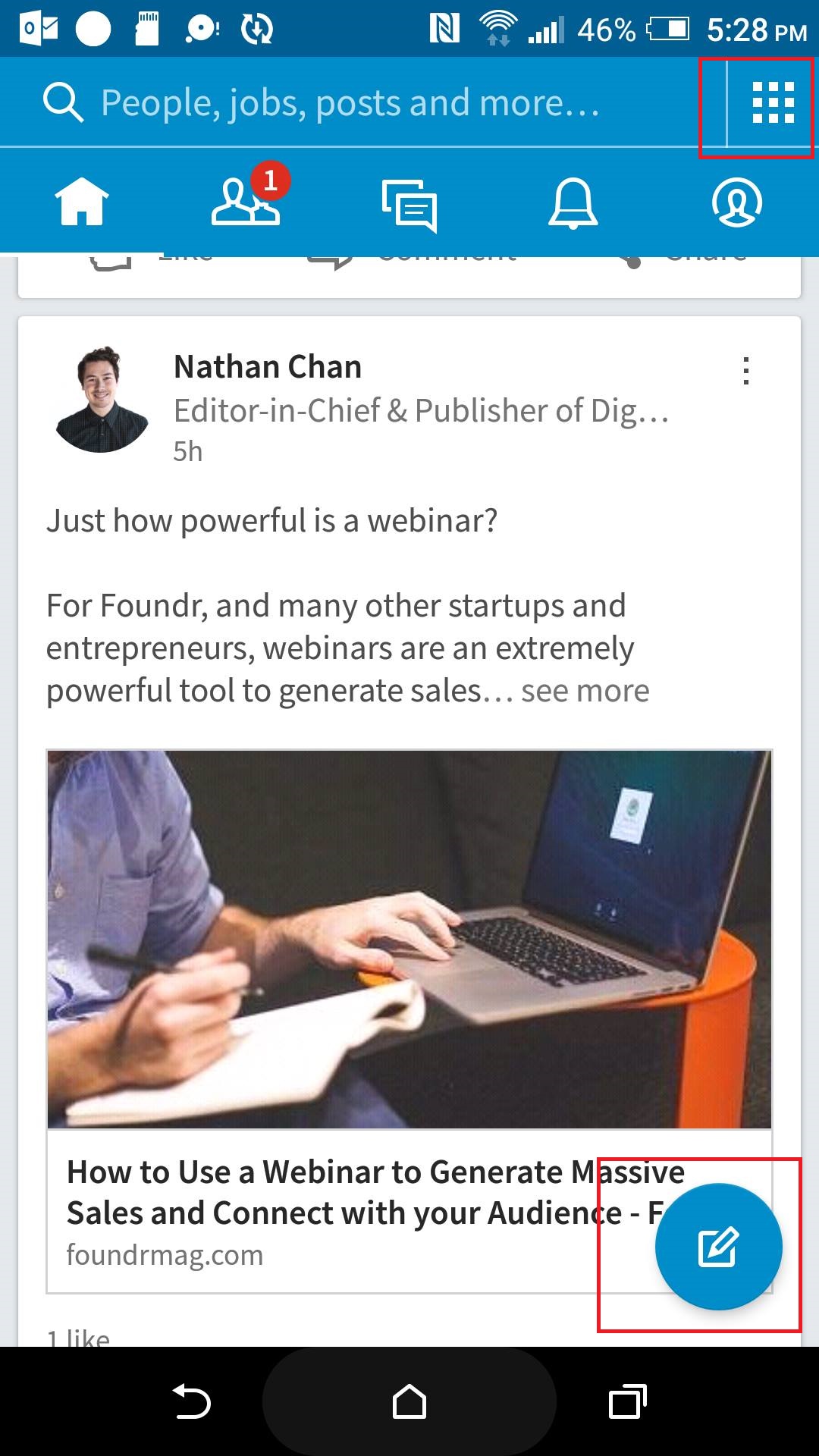
Even someone who has never used LinkedIn before could open this app and intuitively know that the pen on paper icon will allow them to write a post, and that the 9 dots on the top right will take them to menu/settings.
Why do we ascribe 9 dots to mean menu/settings without any text prompting this? Because it’s the same UI design choice we see in every other app on our home screen!
Hot tip: Use ‘directive design’ to make people take the actions YOU want them to take.
If we take the same screen above as an example, they have used the words ‘Search jobs, posts and more’ to direct the user to search for the things that LinkedIn wants them to search for.
They could have just left this field blank, but instead they chose to direct me to take this action.
Similarly, the big blue ‘write post’ button is given the most visual prominence on the screen. This tells me that LinkedIn wants me to share content as my key session goal.
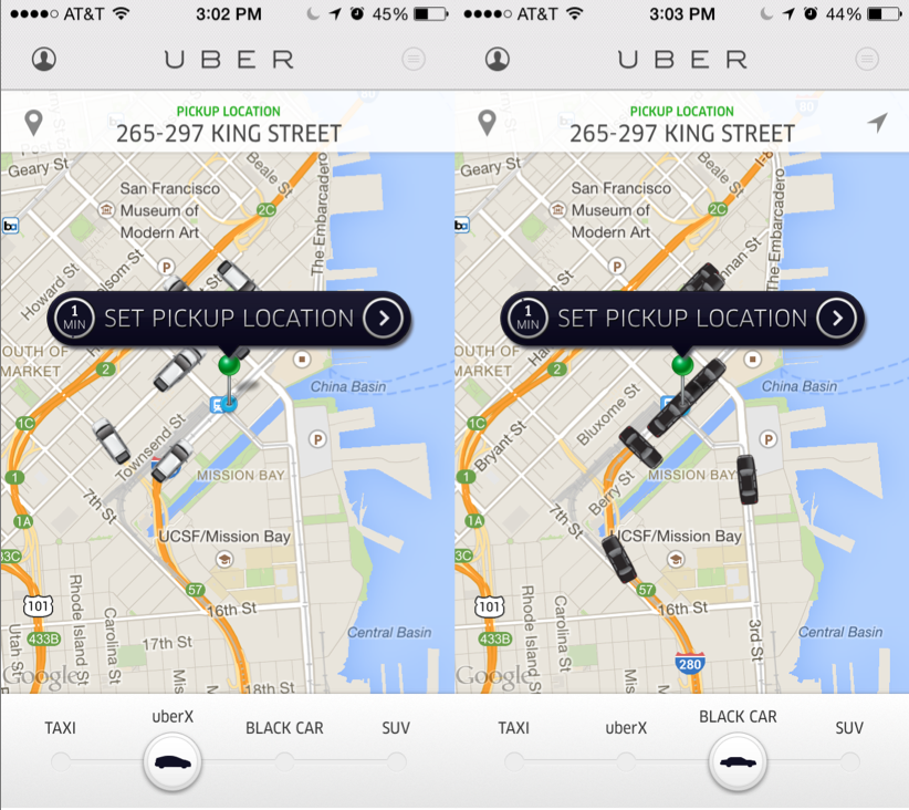
7. Reduce screens
Every single screen in a user flow is another screen that the user can exit from.
External factors like poor WIFI connection and slow loading time make moving through screens an arduous task.
Wherever you can, take out a screen. Got a 5-screen flow you can squeeze into 3? Do it!
Hot tip: A current trend in UX is to use sliders to move through screens rather than requiring the user to tap on options that take them away from their current screen.
This lets users easily toggle between related choices to complete the task at hand. See how Uber does it below to deliver the 4 types of car across 1 screen.
8. Don’t request info that isn’t immediately necessary
Users want to see the value offering before they decide whether they want to sign up.
Remember, data is a privilege and is the main form of currency your users have to give.
You wouldn’t expect a stranger to relinquish their personal details like email, DOB and credit card information in the first conversation with you, would you?
Give the user time to trust you before you ask for this information. A/B test to find out when is the optimal time to ask for this information – perhaps after they’ve completed a certain action, or on the 2nd or 3rd user session.
You’ll increase conversions and see your drop off rate significantly improve.
9. Choose the right platform
As technology evolves, the average number of devices a person owns is drastically increasing.
Different devices and platforms exist to cater to consumers’ different behavioural needs.
We know, for example, that mobile experiences must be cleaner and less feature-packed than the same application on desktop.
This is because mobile users are using these applications on the go and need to be able to complete app goals in shorter time frames.
It’s common to have a bias towards a certain platform. It’s important to address this bias early on and assess:
- What information is being provided
- Where do you see this information being accessed?
- How can you deliver this information to best address the above 2 conditions?
Mobile apps tend to work best for applications that require data input by people who are on the go, whereas complex management portals are better serviced through a web app or dashboard that is accessed via desktop.
Look at your target audience and make a platform decision based on their known behavioural tendencies.
10. Use positive reinforcement
80% of apps are utility apps – that is, they are designed for a user to complete a task.
This is opposed to gaming or media apps which the user engages with to entertain themselves for a period of time.
Customer retention is a serious problem in the app market, and one of the best ways to combat it is to ensure every customer finishes an app session satisfied with their experience.
One way for utility apps to make users feel happy is to make small UI choices that act as positive reinforcement along the app journey.
This could be as simple as a little animation at the end of a funnel to signify they have completed their goal, or words like ‘success!’ when they input data.
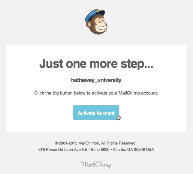
See how Mailchimp uses fun text to increase satisfaction during a long sign-up process:
 11. Optimise the funnel
Depending on your app’s complexity, its design will consist of 1 or more key ‘funnels’.
Some examples of familiar funnels:
- “Sending an email”
- “Reviewing a to do list for the day”
- “Buying a pair of shoes”
These funnels will consist of several screens that essentially ‘push’ the user down the funnel to complete the final goal.
By including in-app analytics in your first release, you’ll be able to see:
- What % of people entered the funnel?
- What % of people completed the final conversion step?
- What % of people completed each individual step? In other words, what is the drop off rate for each screen in your funnel?
- How long it typically takes to complete the funnel, and which screens are they spending the most time on?
With this information, you’ll be able to run informed app A/B tests that will optimise your funnel for higher conversions.
See also: How To Gain Actionable Insights From The Top 4 App Metrics
12. Avoid ‘swiss army knife’ thinking
Push away that need to please everyone! Your app will not (and should not) be perfect for every possible user.
When releasing an MVP, only include core features and keep the purpose of the app clear for users. The ‘swiss army knife’ approach fails quickly when you try to branch out too early and take on too much.
“What’s the minimum solution you can build that solves the customer problem?”
Once you’ve figured this out, design the user experience in a way that doesn’t overwhelm the user.
Spoon-feed new users with information in bite-sized pieces so they don’t feel like a failure when they try to use your app!
See also: 6 Simple Principles For Implementing A Bulletproof Mobile Strategy
13. Test all assumptions
Uber isn’t a taxi company. It’s a data company” – Matt Denman, City Lead for Uber Melbourne
It’s exciting that we now have so many tools at out fingertips to objectively analyse in-app user behaviour.
Yet, most businesses either don’t collect data at all, or they don’t do anything valuable with it due to ‘analysis paralysis’.
Getting over this data hurdle is key to driving constant, never ending improvements in your app.
Uber is famous for self-proclaiming that their key differentiator is the effective use of their proprietary data to deliver value to users.
This analysis of all steps in the user journey has allowed them to come up with profitable app updates including UberPool, as well as informing UX decisions regarding the signup process and surge pricing.
Learn more about how to use app data like Uber in this blog here.
It’s important to not be precious about any functions, flows or designs in your app.
Until you test your assumptions, you have no way of knowing that your UX and UI choices are the best ones for your application.
14. Set a 60 second goal
A great goal to set when designing your app’s user experience is to ensure all main UX flows can be completed comfortably within 60 seconds.
This sounds incredibly short, but really it isn’t with the right design.
If your app is simple in functionality (MVP thinking), uses directive design and has short funnels, 60 seconds is very manageable.
Set this as a test for new users before you launch!
15. Remember it isn’t perfect, and probably won’t be for a long time
Your app’s user experience design in its first version will not be perfect. Neither will the second version, in all likelihood!
Even with the best user experience designers in the world, an app cannot know for sure where the bottlenecks will be until it’s in user’s hands.
Following best practice and taking cues from the leading apps on the market are the best place to start designing an intuitive user experience.
After that, allow time to collect feedback and iterate on your flows.
Ross Gillespie
Latest posts by Ross Gillespie (see all)
- 15 User Experience Design Tips For Building Lean, Profitable Mobile Apps - September 5, 2016
- UberEats VS Deliveroo: Which App Has The Best User Experience? - August 25, 2016
- User Experience Design: 7 Steps To Making The App User The Hero Of Their Own Experience - July 20, 2016

