10 Step Checklist For A Mobile App Onboarding Process That Will Get You A Second Date
The first time a user launches your app is like the first time you meet an investor.
You need to make a fantastic first impression.
No one doubts how important user experience is for mobile apps – we all know we should be building products that are intuitive to use!
However, the chances are that a completely new user won’t be able to open your app and instantly know how to use every important function.
You need to show them round, providing them with a roadmap that pushes them to complete the actions that you have identified as most valuable to meeting your KPIs.
That’s where customer onboarding (or ‘walkthroughs’) comes in.
This post will run you through the best practices you need to know for an intuitive customer onboarding process in 2015.
Follow this checklist for mobile app onboarding and you’ll funnel your users where you want them to go, highlight your app’s most important features, and above all else, PROVIDE EXTRA VALUE.
That’ll definitely get you a second date with a customer.
What exactly is mobile onboarding?
It’s essentially a series of screens you show to users when they first enter the app, giving them a little tour of your house so they don’t wander around trying to find the bathroom.
Now, clearly the aim of mobile onboarding is to provide direction for the new user so they don’t get overwhelmed and confused when they first enter the app.
And yet, so many apps have such poorly designed onboarding processes that they just end up confusing the user more.
Why it’s important
Retention is a huge problem for most apps – the latest stats are pretty bleak, with analytics firm Localytics finding that 58% of app users churn (become inactive or uninstall your app completely) in the first 30 days after they download your app, on average.
Even worse? Over the first three months, 75% of app users will churn.
Bonus: 6 Reasons Why Customer Are Leaving Your App (And What To Do About It)
Before you start crying your eyes out, thinking ‘Why did I choose this life, woe is me’, there is a silver lining!
Localytics also found that the more app launches you can get in the first 30 days, the lower the likelihood of churn.
Their proposed solution is the 3×3 rule: If you can encourage 3 app session in the first 3 days, only 29% of your users will churn.
This is why you need to nail the first session with an engaging onboarding best practices experience – otherwise you don’t have a chance of your app being opened the next day, or the day after that.
Using funnels and flows you can optimise a user’s first interaction with you so they’ll have a higher likelihood of becoming a high value, engaged user.
Types of onboarding
-
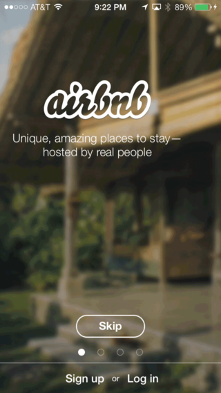
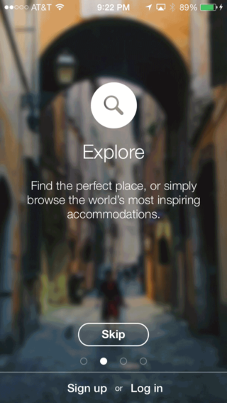
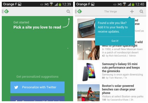
Benefits-oriented onboarding
In this type of onboarding, you display to the customer the benefits or value they will get from using the app.
You don’t explicitly state how to use the app, but you do communicate what the app does, how it does it, and how it integrates into the customer’s life.
When would you use it?
Many apps do this if they require the customer to signup or register before they can use the app.
These days app security is an issue for customers, so relinquishing personal email and social accounts can be daunting for a new user.
This technique shows the user how much value they’re going to get from using the app, to incentivise them to convert.
Check out how Airbnb uses this technique below.
2. Function-oriented onboarding
This technique focuses on the app’s core functionality.
Without explicitly stating why they should use the app, function-oriented onboarding teaches the user how to use the app.
This type of onboarding shows users how to get started and what the most common actions are.
When would you use it?
If your app is very task-oriented or otherwise complex to use.
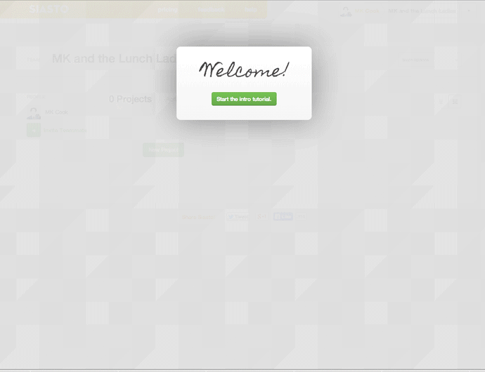
Siasto is a project management tool with many customisation options, so their walkthrough sets you up and does everything but click the buttons for you!
3. Progressive onboarding
This is becoming more and more popular.
This type of onboarding only shows the user information as they use the app.
For example, when they are on the dashboard or home screen, they will be displayed information about where to find things on that screen.
Then, if they tap on to a new screen, they’ll be displayed information about what to do on that screen, and so on.
When would you use it?
If your app has long and complicated workflows, this feeds them the information they need in digestible chunks.
If your app also has hidden functionalities (ones that don’t have visible buttons, for example), progressive onboarding is essential for ensuring they know that these functions even exist!
For example, telling a user that swiping left on a certain screen will bring up editing options.
Your checklist for a super simple mobile app onboarding process
-
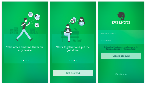
Start with an ‘app poster’
Get the onboarding process off to an enthusiastic start with a ‘welcome’ screen that delivers the unique selling proposition or functionality of your app.
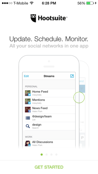
This could even be the same image as you’ve used in the app store as your first screenshot.
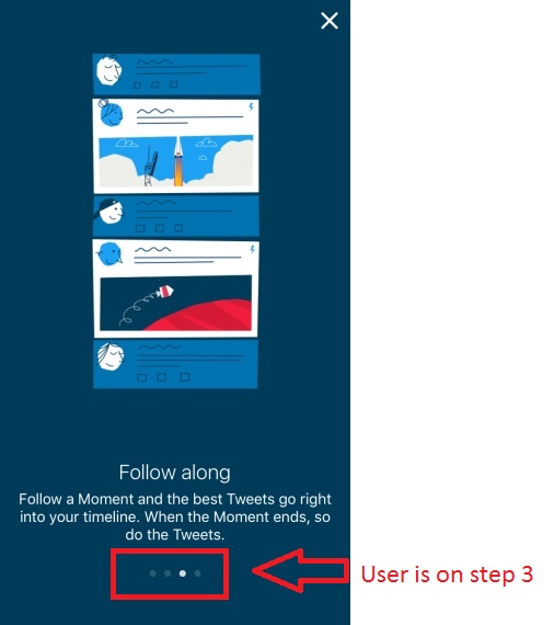
2. Show far along they are
People like to have an end point in site for completing any action, so use some kind of marker (like the one below) to show how many steps remain in the walkthrough.
Depending on how crucial your onboarding process is, you may also want to include an option to exit or skip the tutorial for the user who is in a rush.
However, this wouldn’t be a good strategy for an app that relies on personal information inputs to tailor the user experience, such as personal fitness trackers or media consumption apps.
As this information is essential, you shouldn’t allow the customer to skip entering it in the onboarding.
3. Keep it short
Keep the initial onboarding process to the absolute bare necessities.
I would recommend not going over 5 screens for function-oriented onboarding, and if you’re onboarding is benefit-focused, 3 or 4 is plenty.
If you find that you just can’t squeeze the core lessons into 5 screens, then progressive or hybrid onboarding might be the way to go.
This allows you to have an initial onboarding flow, and then you can build on what you’ve taught them.
Phase in new screens progressively to assist customer to dive deeper into your app features as they become more familiar (and engaged) with your app.
This makes onboarding an ongoing experience where you can educate your user, building their lifetime value and profitability.
It also reinforces what they’ve already learned!
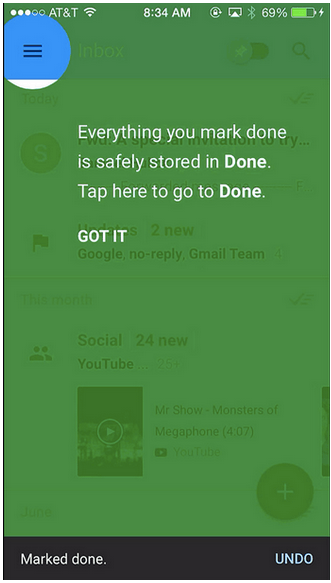
4. Stick to 1 concept per screen
Be human, but keep your sentences as short as possible so the reader can be like ‘right, got it, next’.
Stick to the ‘1 concept per screen’ rule. This may be just 1 sentence, or you can break it up into tiny little bites, like Gmail does:
Don’t do this:
![]()
That’s way too much information for 1 screen!
5. Make it interactive
Anywhere you can, SHOW DON’T TELL.
Learning by doing is a more powerful, memorable strategy than just providing instruction.
Interactive mobile onboarding is the perfect way to engineer default behaviour – basically, funneling customers to follow the pathways you want them to!
For example, if you want to encourage social sharing in your app so you can engineer virality, in your first interactive tutorial you can push them to share the activity you’ve just guided them through.
This helps users internalise that social sharing is the natural next step in the flow.
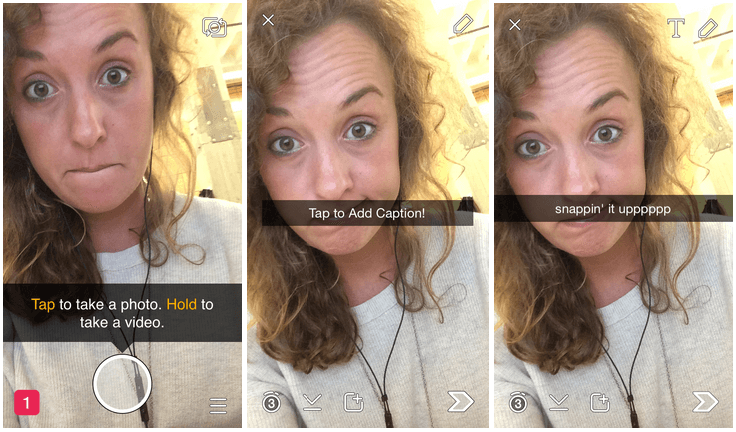
I love how Snapchat uses a customer’s first snap as their onboarding process (props to Robin from Optimizely for demonstrating this!)
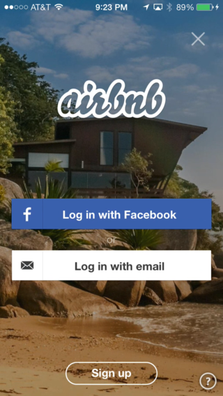
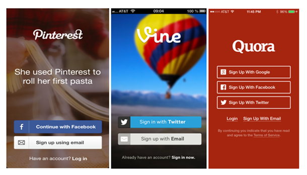
6. Offer multiple login options
Experiment with different login options – social logins, email log ins, or even no log ins!
What has higher conversions and sign ups?
The Facebook Login API can massively increase number of signups, because it means users don’t have to remember a new email and password for your app.
Trip Advisor saw a 27% increase in conversions and more than doubled their acquisition of new users by allowing people to quickly log in using Facebook across multiple devices.
It also makes Facebook sharing within your app a much more seamless process (and we all want to get shared on Facebook, don’t we?)
If you are using social logins, it’s still a good idea to give users the options to sign up using email.
Some people are fearful of syncing their apps with their social accounts, even if you do assure them that you won’t post on their behalf!
7. Track analytics on each screen
Your data will show you what screens (if any) users are exiting from in your onboarding process.
What is the conversion rate for 1st screen? 2nd screen? How many users actually make it to the end?
If it steadily drops off and only a small % are finishing the onboarding process, it’s probably too long.
Go back to your minimum viable product and figure out how to communicate it more efficiently.
Make sure you check out this blog on how to understand your app analytics and use it to drive decisions for more information!
8. Onboard before prompting registration
Onboarding shows the benefits and functionality of your app, so it makes sense to ask for a registration or log in AFTER you’ve shown them round.
Make the login screen the final screen in the initial onboarding process.
This way, when users log in they will already be educated and ready to look around freely without unnecessary interruption from you.
It’s also basically a sales pitch for why they should hand over their email, access to their social media accounts, access to their microphone, photo gallery, opt-in for push notifications…The list goes on.
There’s a lot of stuff you’re asking for, so a persuasive onboarding flow will increase the likelihood of getting new signups.
9. Assume your user is an intelligent human being
Your user obviously owns a smartphone. And they are familiar with how the internet works, because they stumbled on to the app store and downloaded your app.
They probably know that X means exit and a tick means confirm.
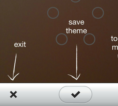
You don’t need to add unnecessary prompts and text explaining this in your onboarding process.
Stick to the stuff they don’t know, like how to use your app’s core features!
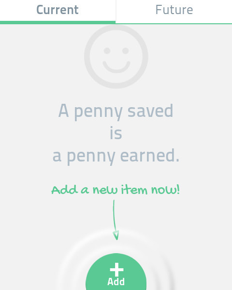
10. Don’t end on a blank screen
It’s disconcerting to finish the onboarding process all excited to start testing the functionality you’ve just described, and then…nothing.
If your app requires the user to input information (for example, a social media app with a newsfeed or dashboard), then the first session won’t have much to display.
Put just a little text on this screen pointing them to complete the first action, or remind them what the first step was again.
It’s possible they’ve forgotten where to start!
See how Splendee, a finance tracking app, does this below.
Need more onboarding flows for inspiration?
Check out these app design websites:
Where to go next…
Infographic: Breathtaking Mobile App Design Inspiration
9 Steps To Building A Stunning Pre-Launch App Landing Page
Latest posts by Logan Merrick (see all)
- Ep 18: Collective Campus’ CEO on Intrapreneurship and Corporate Innovation - December 20, 2016
- 50 User Engagement Strategies For Planning Memorable Mobile Experiences - December 19, 2016
- Latest Data: App Monetisation Trends And Drivers 2015-2020 - November 25, 2016

