
8 Golden Solutions For Reducing The Dreaded ‘Abandoned Shopping Cart’
We’ve all been there.
Added an item to the cart on an online retail website or mobile app, only to leave before completing the purchase.
According to Shopify, for every 100 potential customers you have on your platform, 67 of them will abandon their carts and leave without purchasing.
It’s a harsh reality affecting online retailers globally, as consumers’ desire to purchase is overridden by the effort it takes to actually place the order.
This begs the question; Why do customers so frequently abandon their shopping carts?
By analysing where users drop off in the checkout process, we can identify several aspects which are frequently cited as frustrating or arduous.
- Unexpected shipping costs or lack of shipping options
- Being forced to create an account
- Payment security concerns
- Confusing checkout flows
- Excessive number of forms when entering billing & shipping addresses
These areas suffer from severe usability issues and will frequently lead to unnecessary abandoned carts and frustrated users.
So, what are you going to do about this?
If you’re building an e-commerce app, the checkout process is THE most important funnel in your app.
Here are 8 data-backed solutions you can apply to your checkout process to relieve frustrated users, increase conversion rates and ultimately turn those lost opportunities into sales.
1. Unclutter the checkout page
As with any optimisation process, we start by seeing what we can take out.
Enclosing the checkout (removing the main navigation bar from the cart and the checkout) ensures that users are focused on the task at hand and less likely to be taken out of the checkout by links or distractions.
A minimal layout with clear call-to-action buttons will encourage users to checkout instantaneously and increases the chance of making a sale.
2. Streamline the checkout process
Don’t spread the process over several pages. This gives users the impression that there will be many steps involved.
The checkout should be streamlined to as few steps as possible – encouraging a continuous flow from cart to confirm order, while clearly illustrating the navigation steps so users are aware of where they are in the checkout process.
Everlane does this well in their checkout process, cleverly using tabs to illustrate the 4 steps of the checkout process.
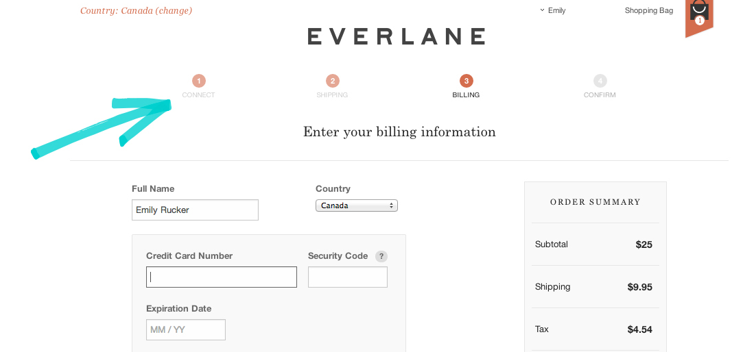
3-4 steps is ideal.
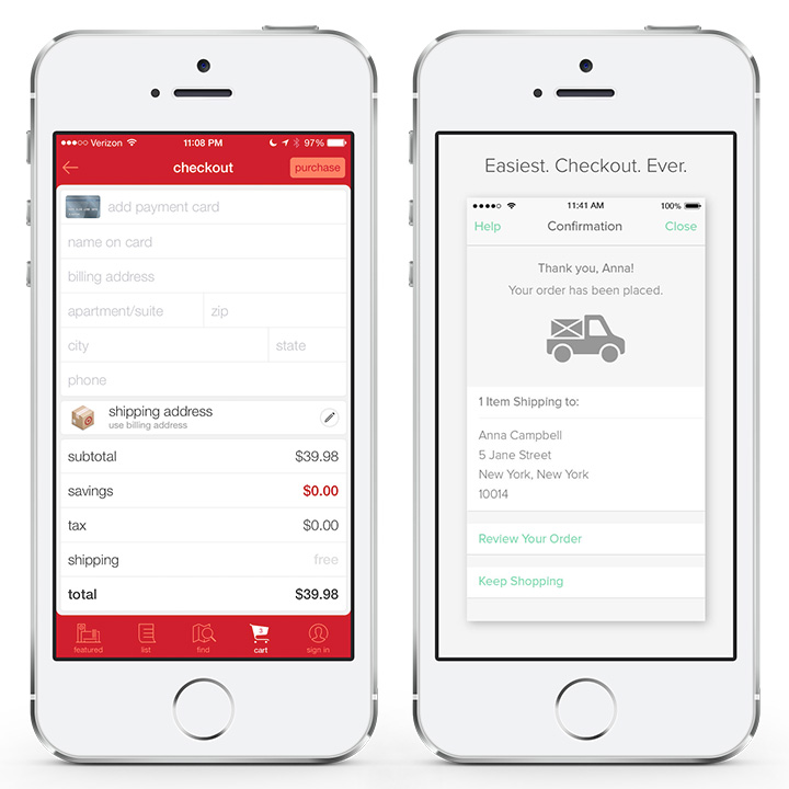
3. Display a persistent cart overview
Users should always be able to view the contents of their cart (and order cost) throughout the process of the checkout.
You want users engaged and on-track to complete the purchase.
Hiding the cart on a separate screen is essentially encouraging your users to leave the checkout to obtain this information.
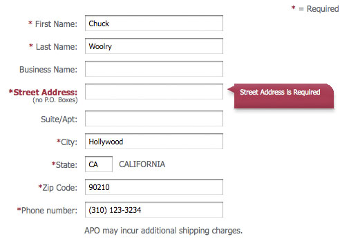
4. Provide easy form filling
People hate forms, so making it as painless as possible is the goal.
Correctly label forms, avoid ambiguous instructions and don’t ask for too much.
A good rule of thumb is to think about the MINIMUM amount of information you need from the customer to be able to fulfill the sale on your end. Only ask for that!
Expedia, for example, famously deleted the “Company name” field from its checkout form and increased profits by $12 million.
It’s also vital to make error messages clear, like the example below. Simple usability issues like these can be so severe that they prevent users from completing their purchases.
5. Be transparent with shipping and taxes
Apply shipping/tax charges to the order as soon as the user has entered their shipping details.
Nothing puts a potential customer off like feeling that they’re buying from a dishonest company or getting a nasty surprise on their bank statement.
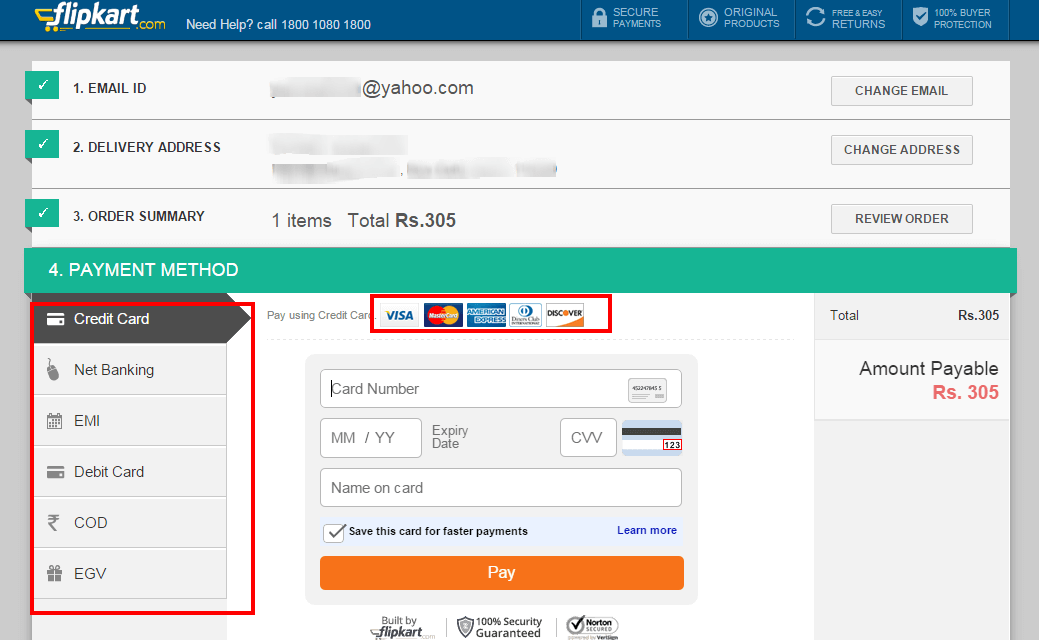
Including credit card logos and security seals will reassure your users that your site is secure and trustworthy.
6. Provide guest checkout and the option to create an account AFTER the purchase
You want to streamline the process, so it’s foolish to force your users into creating an account if there is no real need.
Allow for guest checkout, get the sale, and then worry about sign up! See how the app below has done this.
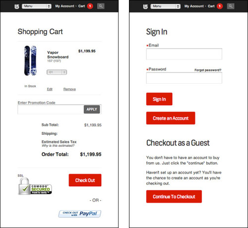
People are more likely to sign up to track an order than signing up to process an order.
However, if registering is imperative to your checkout process you should encourage users and incentivise – educate your user on what the benefits are of being a registered user as opposed to not.
Promotional offers can also be persuasive.
7. Show an order summary
Even if an order summary has been shown on every screen during the checkout process, it’s important to display it in its entirety before final payment is required.
The shopping cart should be clearly itemised and include any relevant shipping/tax charges.
Customers are wary of hidden costs and feel more comfortable when they can see the total cost in an order summary before proceeding.
This can avoid any potential post-purchase confusion.
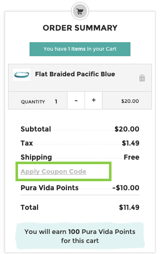
An order review/summary is necessary to ensures users know what they are buying and can amend anything before submitting their order.
8. Help options
It’s also advisable to offer non-intrusive help options in the checkout.
Potential customers may have questions about your products and the last thing you want them doing is leaving the checkout area to find contact details.
Make it easy for them to find the option to ask questions with a FAQ, size guide, live chat, or phone number.
Including a phone number for queries is not only helpful but also something customers find reassuring.
The takeaway
Users face a hoard of reasons to stop them from pursuing a purchase before they even reach the checkout area of an e-commerce platform.
So, once they have reached this step it’s imperative the experience is as painless and intuitive as possible.
Optimising the journey will ensure a great user experience, and open opportunities for higher value and repeat sales.
Holly McKee
Latest posts by Holly McKee (see all)
- Are you considering ‘Mobile Accessibility’ in your App Product Planning? - May 11, 2017
- 6 Fast Tips For Mobile User Experience Design - April 13, 2017
- UX: 5 Do or Die Tactics for Successful Mobile App Onboarding - February 24, 2017

