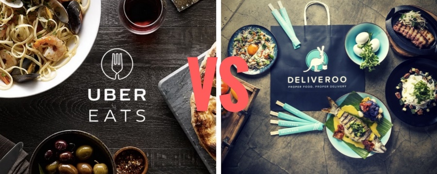
UberEats VS Deliveroo: Which App Has The Best User Experience?
On demand services are currently on demand!
The local on-demand food delivery market is a lucrative and highly competitive one, with big money being spent on acquisitions and restaurant partnerships to own the space.
Making the user experience of finding, ordering and getting food delivered MUST be as fast and efficient as possible. With the stakes this high, the end-to-end ordering process is a huge source of competitive advantage.
Not only does better UX reduce the likelihood of the user becoming frustrated and abandoning the app (very likely especially when the user is a hungry one!), it also streamlines the process from a logistical perspective on the courier and the restaurant.
Less confusion in the ordering process results in less complaints and strain on the delivery management side.
In this user experience review, we’re comparing the food ordering process of two of Melbourne’s most popular food apps, UberEats and Deliveroo, to see which one has the most seamless end-to-end process.
For this review, we’re going to focus on 3 main phases in the food ordering process:
- Which app made it easiest to find the right restaurant?
- Which app made it easiest to order food?
- Which app had the best delivery update process?
I’m a diehard Android user so the screenshots come from the Android UberEats and Deliveroo apps.
-
Which app makes it easiest to find the right restaurant?
The first step is to search for and pick a restaurant. Let’s find out which app makes this process the easiest.
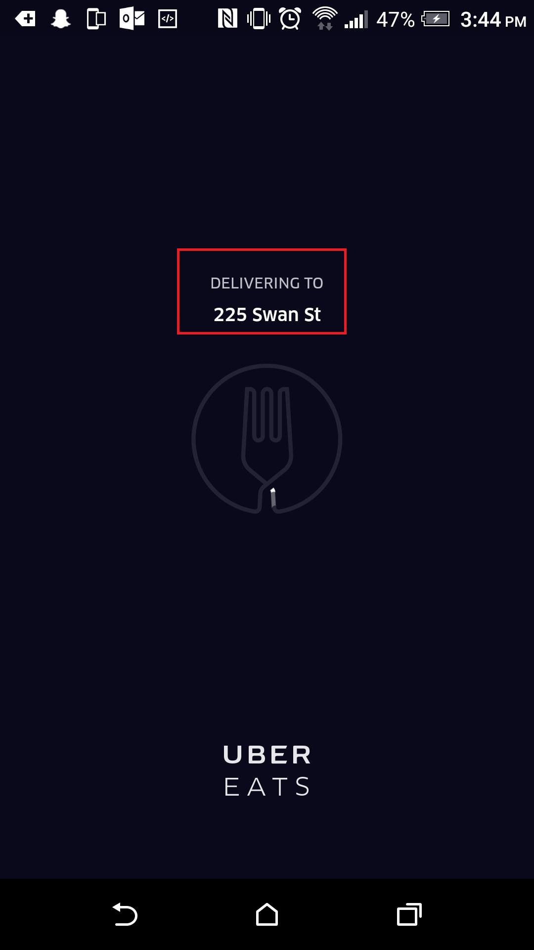
UberEats
I like the touch of having the ‘location delivering to’ in the loading screen. I often order food from different locations, so this keeps me informed in a non-intrusive way.
I’m now on the landing page. UberEats really stepped it up with the photography!
The images of food are well presented with footer descriptions giving most important details of the restaurant and cuisine.
Filtering orders is tucked away all in one neatly designed search bar that is always present at the top of the screen no matter where scrolled.
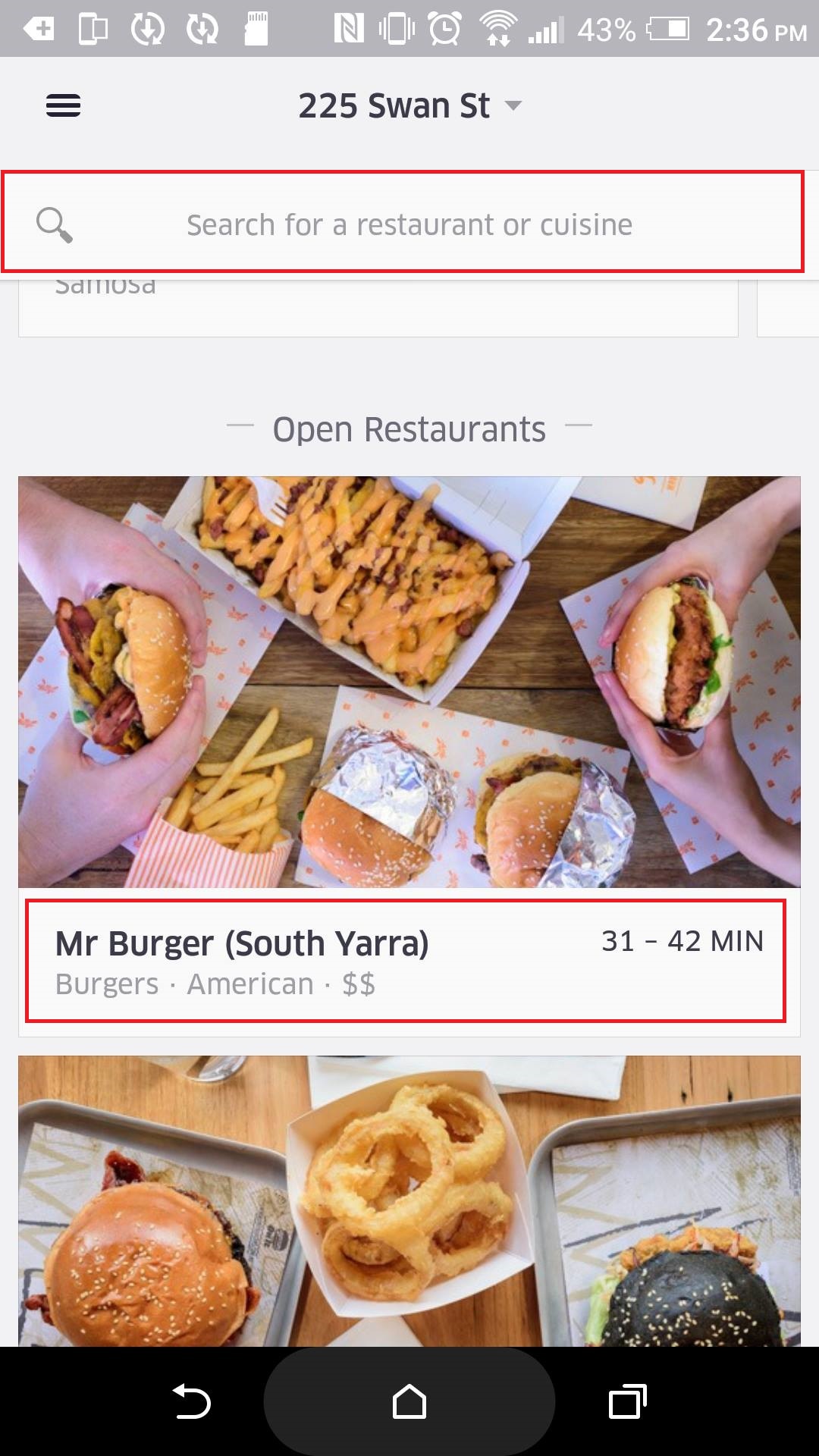
Taking influence from Google’s philosophy of ‘all in one search bar’, users can type in a restaurant name or a certain dish to filter results.
Gone are the filters and ‘sort by…’ controls. Uber has minimised the users’ control but maximised the ease.
For finding food, the less choice = the better.
Uber has a generalised a range of cost and delivery times (shown below) that fits most people’s demands, removing the need to allow users to control these elements.
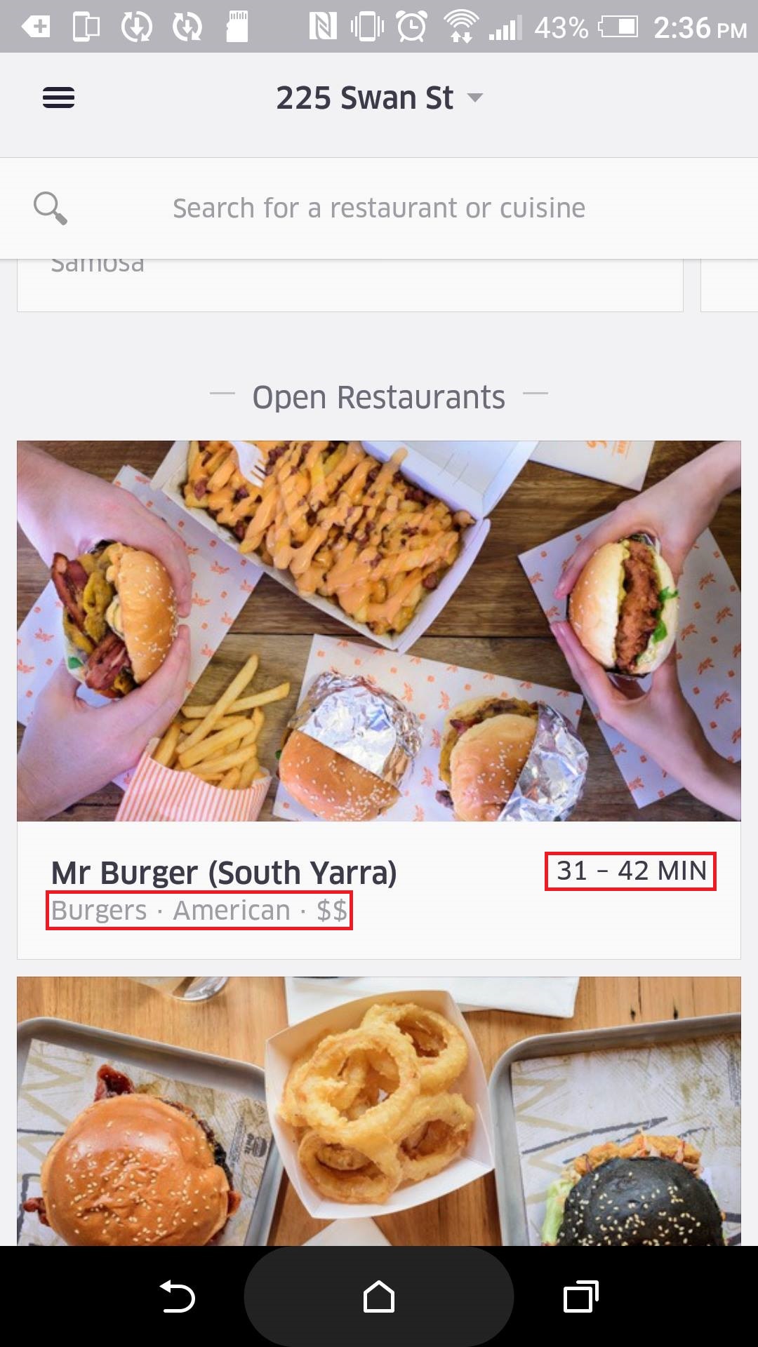
Again, the delivery address is shown at the top of the page but disappears when scrolling to give maximum real estate to the images on screen.
Cons:
UberEats clearly wants me to choose my restaurant by images, given their prominence over price and delivery time. This is fine, but the images do take a while to load…
‘On demand’ demands speed.
This is a huge first world problem, but if I have to wait 5 seconds for my screen to keep updating, that’s frustrating!
Another con is that the same restaurants keep appearing at start up. This doesn’t allow for diversity.
Let’s move on to Deliveroo…
Deliveroo:
At first glance when opening the app, what stands out the most is the emphasis on delivery time by circling the expected time and indicating it as a clock.
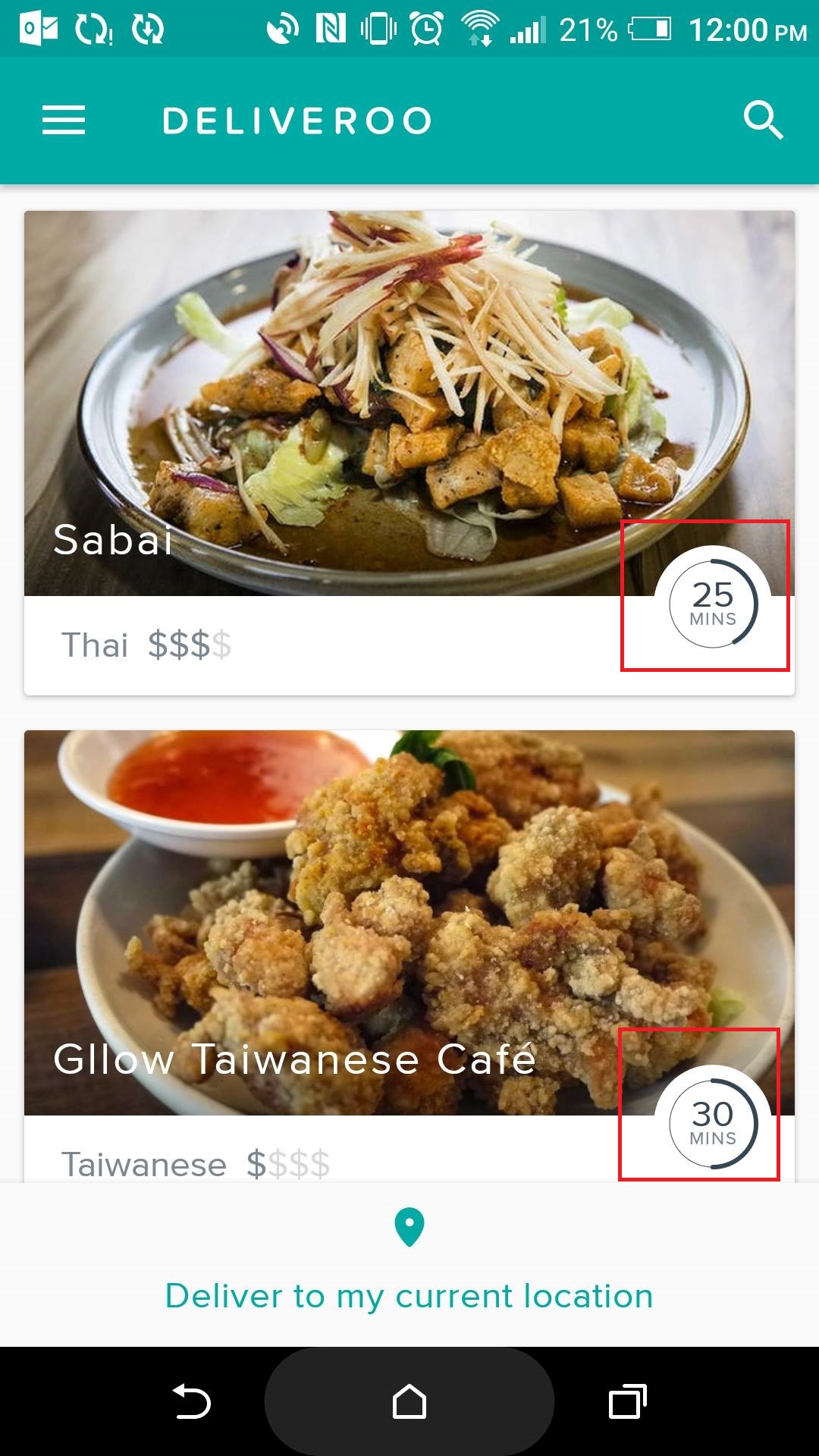
Given that Deliveroo’s marketing communications push their superior delivery as a key point of difference, this is probably a conscious design choice.
Restaurant names are not as clearly defined as Uber’s. In some images, the white text is hard to read.
Also, it’s pretty subtle, but these images have been overlaid with black gradient to mask in the white text.
This dulls the image by taking away from the vibrant colours! As images are clearly a selling point in this market, I question this design choice.
Opening up the search feature, I like that it has given me a drop down list of possible cuisines I might want to search for.
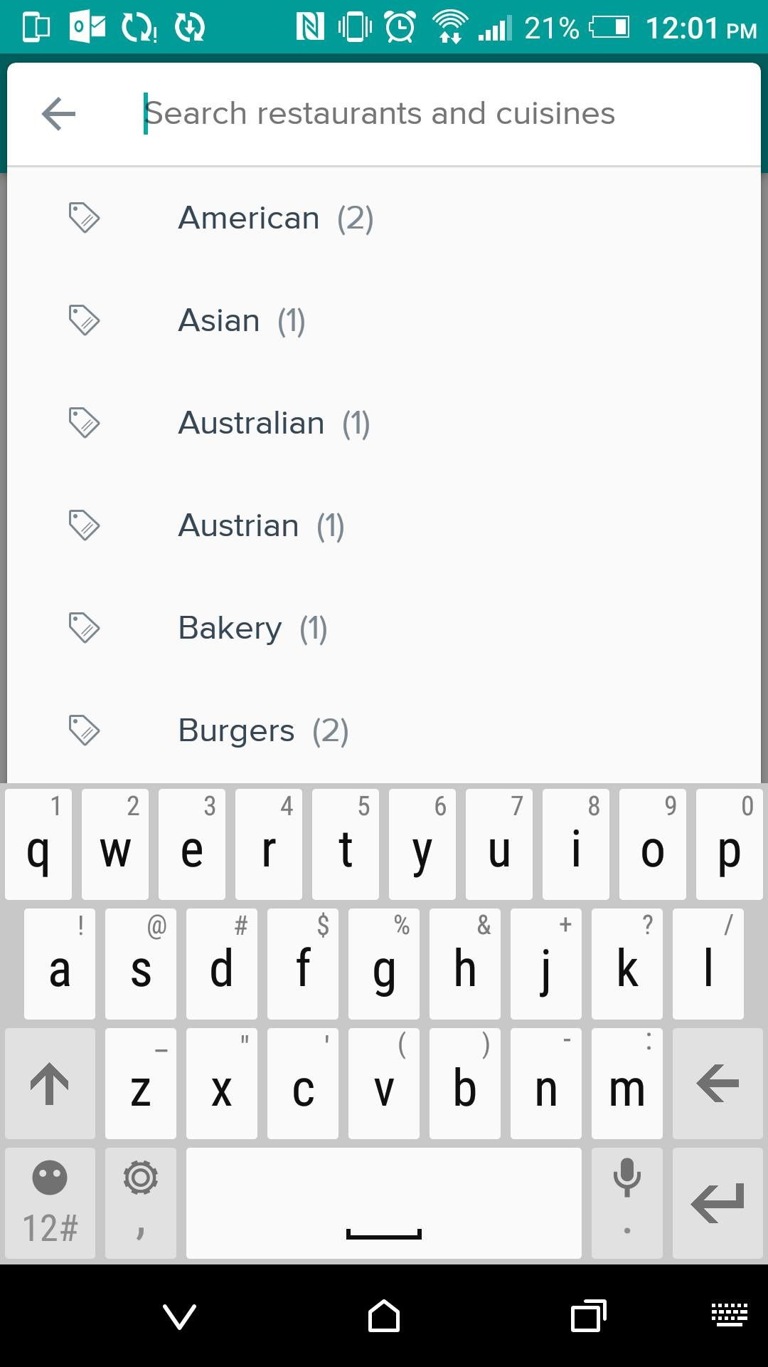
It also indicates the number of these types of restaurant next to the cuisine.
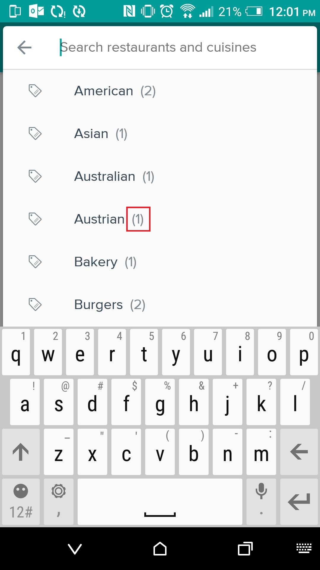
This is a clever psychological hack that removes that feeling of having an expectation denied to me when only one open restaurant appears under ‘Austrian’.
When I start typing a search query, you can see that search is overlayed (you can view the restaurants underneath).
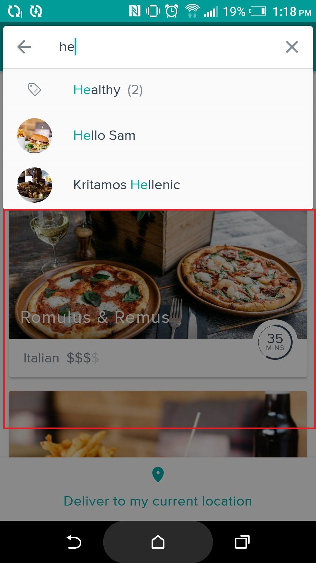
This draws attention away from what the user is doing in the first place. The images in the background are distracting.
Cons:
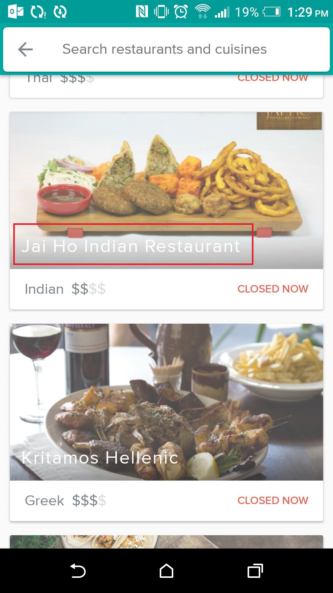
Whenever you scroll back up, there is a pop up to ‘Deliver to my current location’.
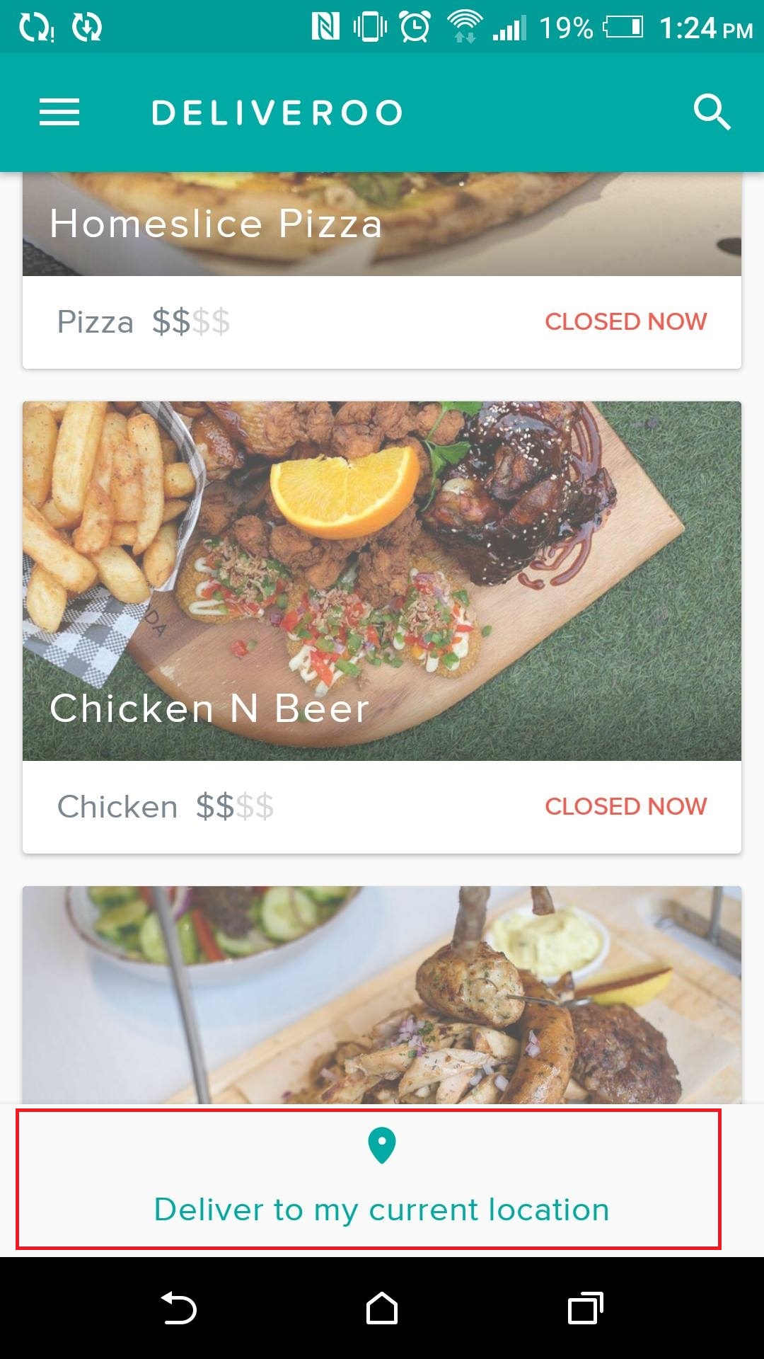
The positioning and UI colour choices of the bottom make it somewhat hard to read.
It’s also confusing as to why it’s there…Should I tap on it? Why would I when I haven’t even had a chance to order anything yet?
Usually popups are used to validate an action I made on the last screen – For example, Log Out (yes/no).
Deliveroo is using it to choose my action – Deliver to my Current Location.
This is why it feels non-intuitive.
The winner:
UberEats provides a much more intuitive experience for browsing and finding restaurants.
Their minimalistic, bright designs accentuate the food as the key selling point.
Deliveroos’ layout using delivery time in an hour circle takes away from the user’s natural line of vision. Eye goes from food to big round circle.
The only thing I think Deliveroo does better is their search suggestions. The numbers indicating open restaurants of that cuisine type were a nice touch.
Key takeaways:
When designing screens, only display information that is absolutely necessary. If your app involves a browsing experience, make sure the design is simple and minimalistic.
Try to make it as easy as possible for users to move to the next step by removing all distractions from the page that aren’t prompting the user to complete the action you want.
2. Which app makes it easiest to order your food?
This a hard line to tread for both apps. As a Product Designer, you want to make the ordering process as simple as possible and not bloat it with extra customisation features.
BUT at the same time, you want to give the user a good amount of freedom in ordering their food.
I’m going to test out how UberEats and Deliveroo let me order a burger with extra bacon…
UberEats
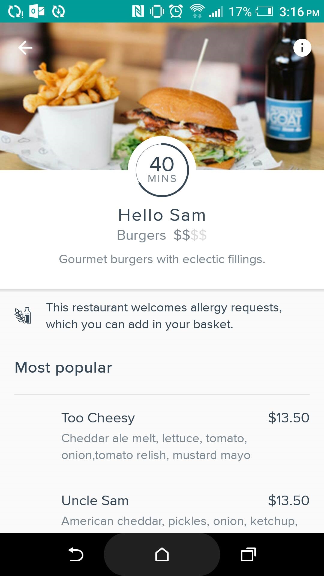
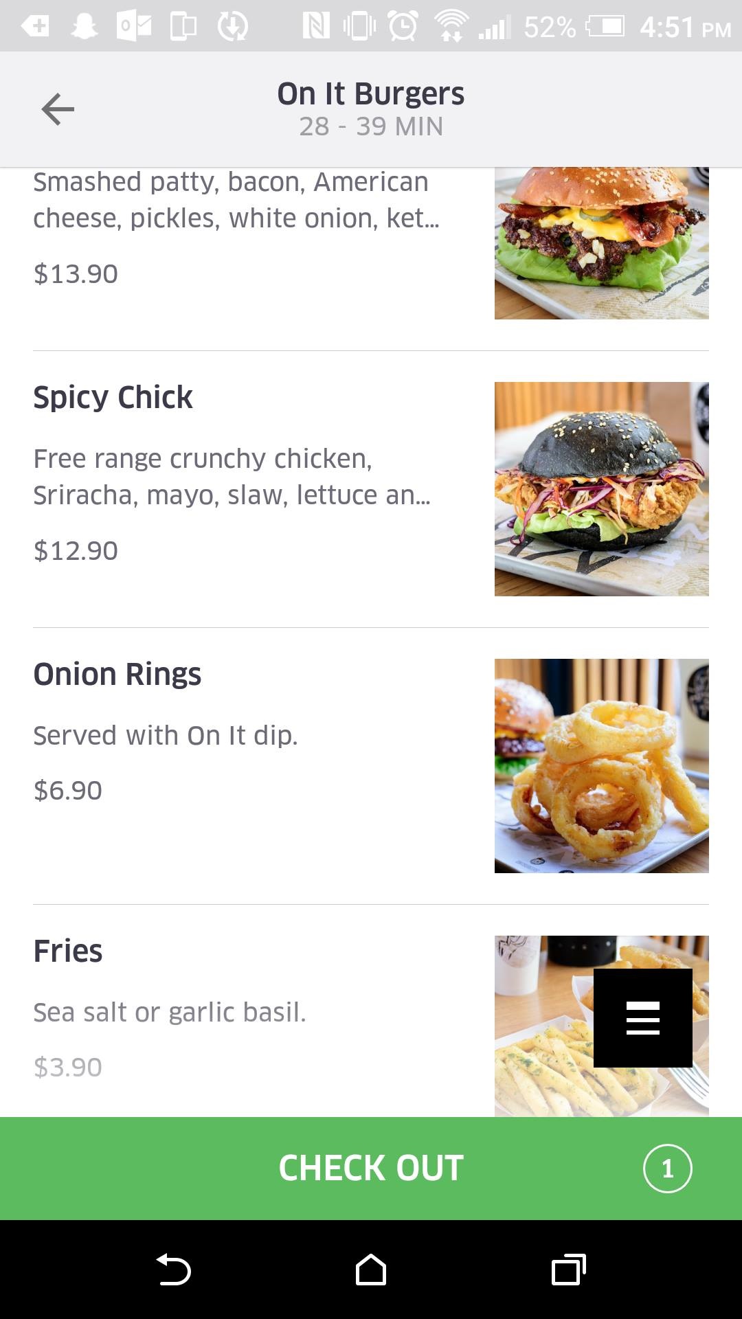
All the main dishes on UberEats have images. This makes me want to keep browsing (and drooling).
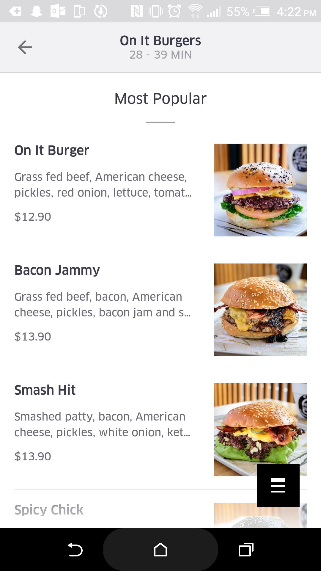
There also aren’t that many dishes for me to choose from, which is great! I know for a fact that this restaurant has a much bigger menu than this.
Too much choice is not a good thing, especially on an MVP, which UberEats is currently.
If you ask for qualitative feedback from users, they will say they want lots of choice. The data tells different! Too much choice is overwhelming. Less choice results in higher conversions.
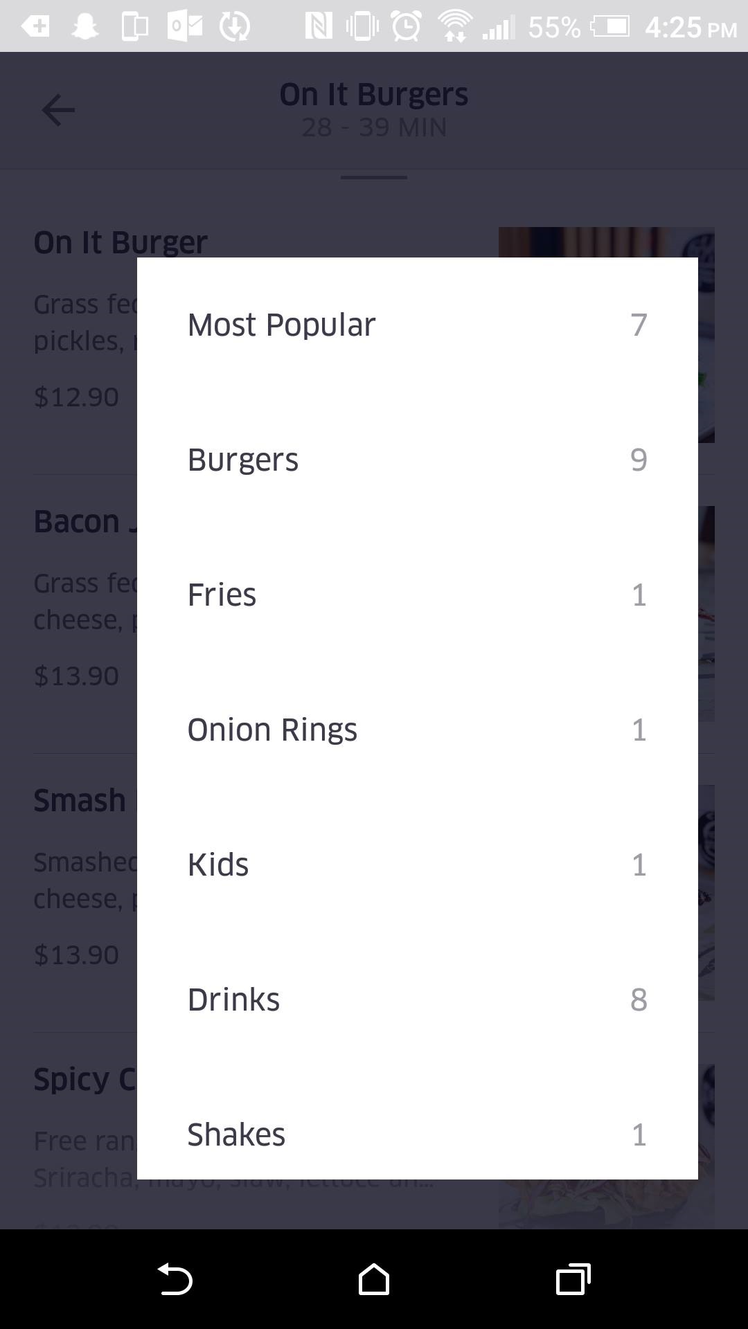
If I don’t want to scroll, I can press the menu button in the bottom right to get an overview of what ‘types’ of dishes are on offer, and select through here.
Once I’ve chosen a burger that looks appetising, I’m taken to a ‘product page’ that lets me easily customise my burger.
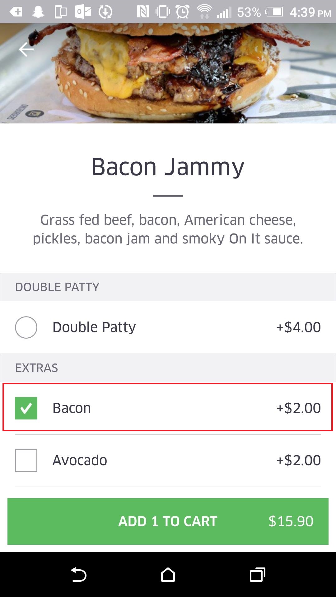
Customisation options are ordered under ‘extras’ and there is a field for special instructions that I can manually enter. I feel like this is a good amount of choice for me! Extra bacon, please and thankyou.
When I’m done crafting my perfect burger, it’s fantastically obvious where to go next:
The big green ‘ADD 1 TO CART’ button.
From a UI perspective, the rest of the interface is minimalist white and grey tones. The button is bright and large, begging you to tap it. The user intuitively knows what to do next.
As soon as I hit the button, it’s replaced by another 1 – CHECKOUT.
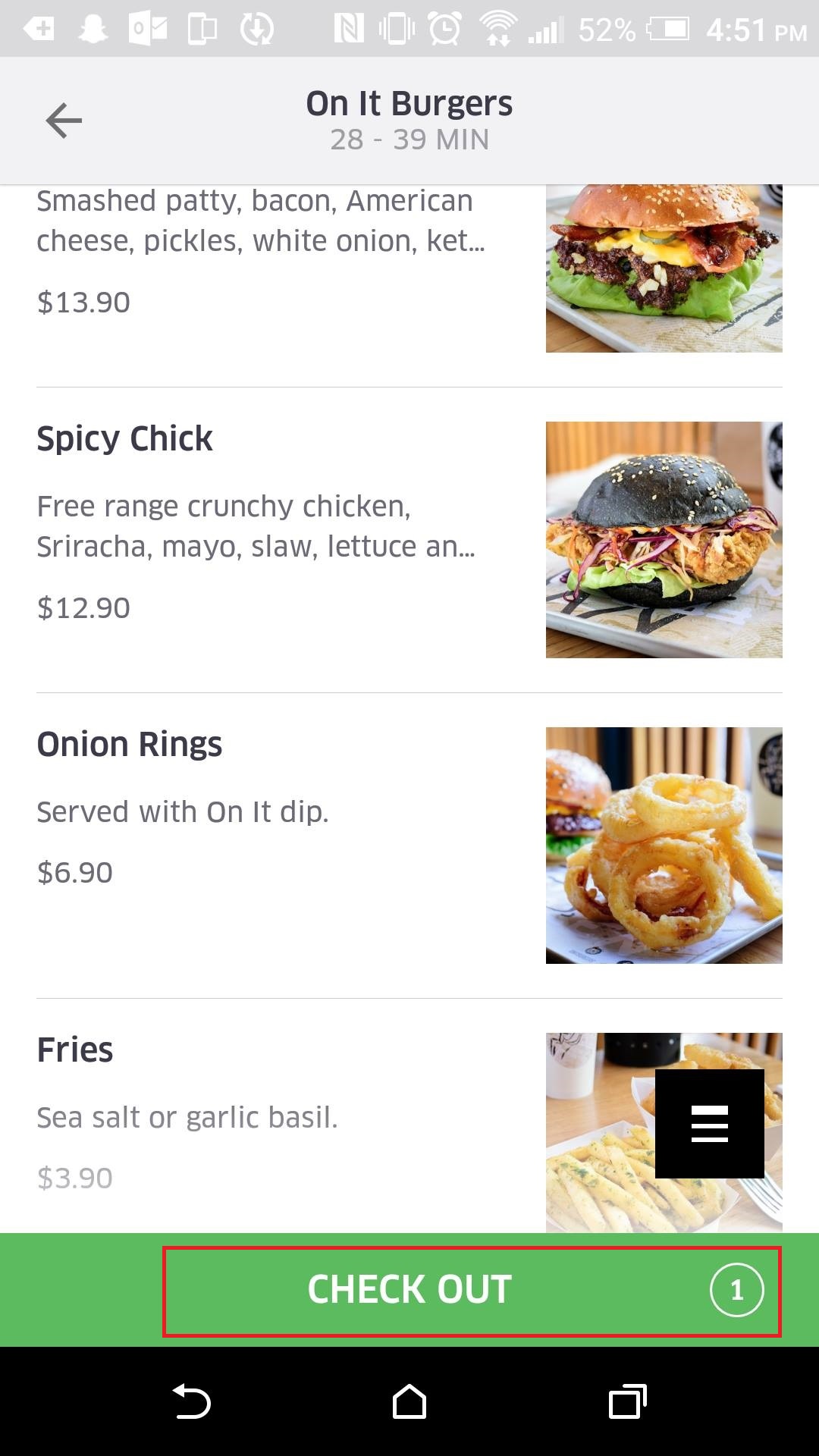
I can exit the product page and go back to restaurant description page to order my food, but now that there is something in my cart, this checkout button sticks to the bottom of my screen.
This is a constant reminder for the rest of my browsing experience that I have food waiting for me, minimising the likelihood of cart abandonment, which is a real problem for all eCommerce apps.
After hitting ‘Check Out’, I’m taken to a Your Cart page to review my order.
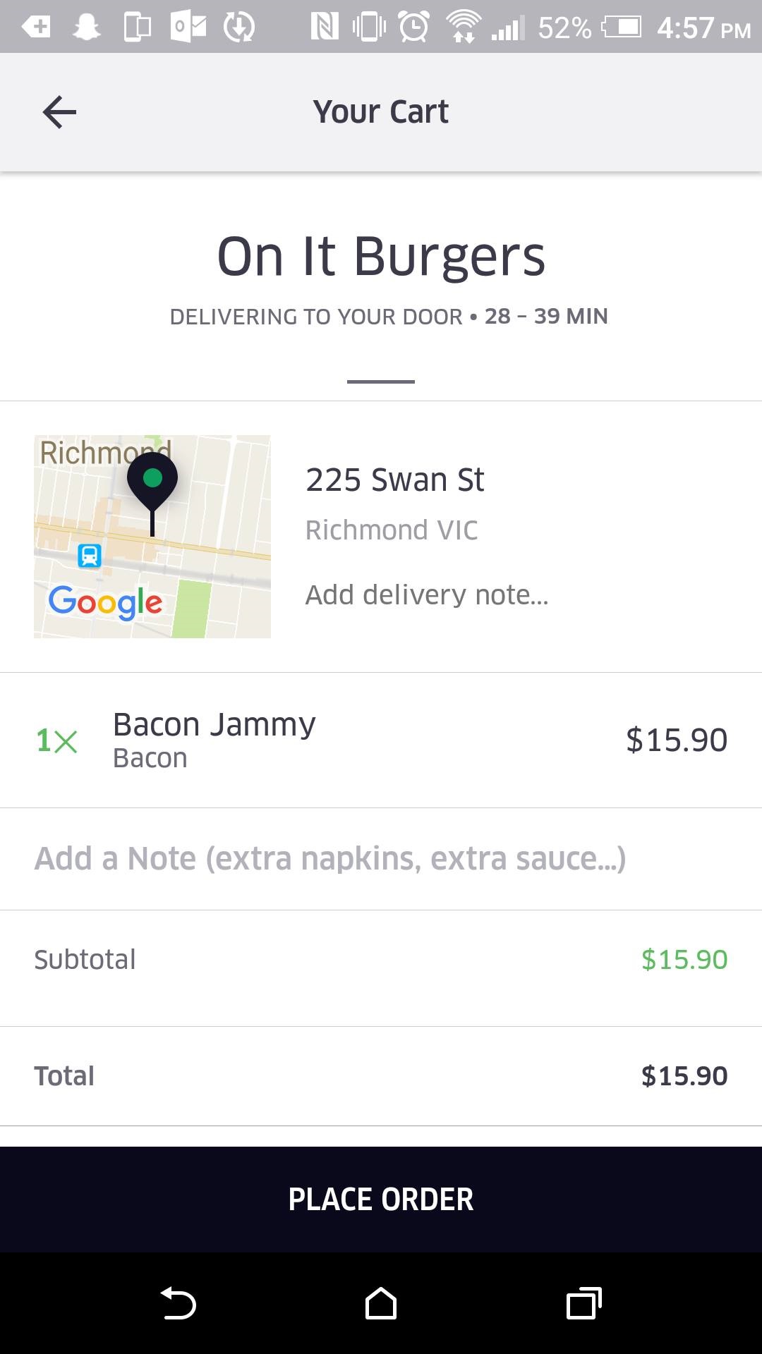
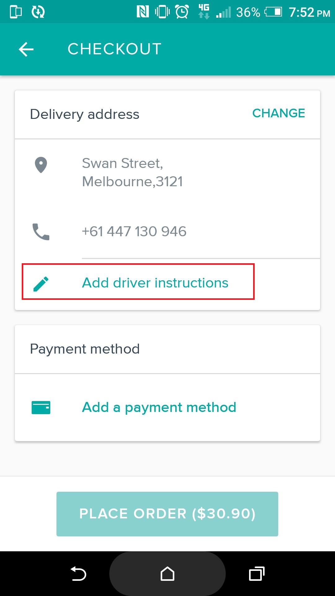
I like how they’ve displayed the delivery location through a Google map graphic. It’s not really necessary, but it’s in keeping with the rest of the app’s heavily visual UI choices. It also breaks up the receipt.
What I’m most impressed about on this screen is how clearly they’ve differentiated where to add notes regarding delivery and food, respectively.
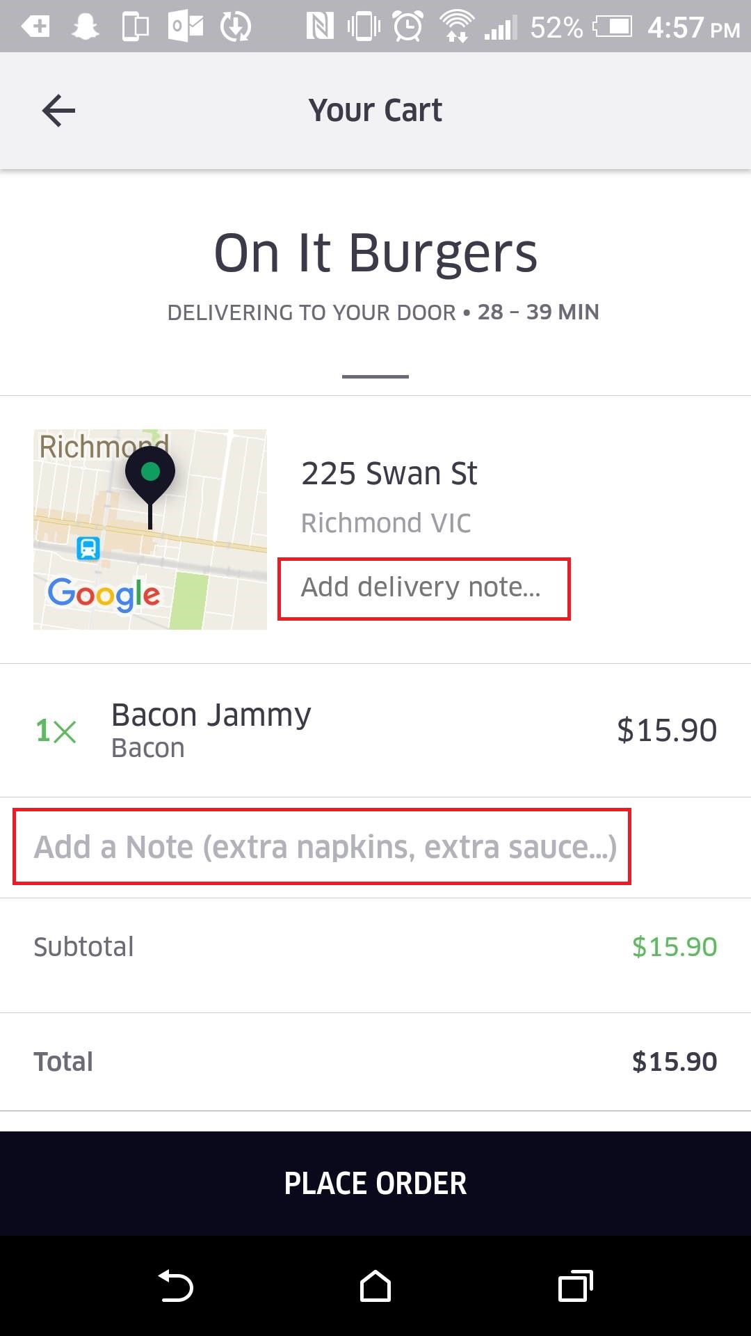
The hint about ‘extra napkins, extra sauce…’ is also helpful. It gives the user a chance to make minor customisations on their order that weren’t available on the product page.
If I were them, I’d also add a hint that this is where the user can add ‘dietary restrictions’.
From a backend perspective, these small adjustments are likely to save a huge amount of time and money. They minimise the likelihood that the driver is going to be getting notes regarding the food order, and vice versa.
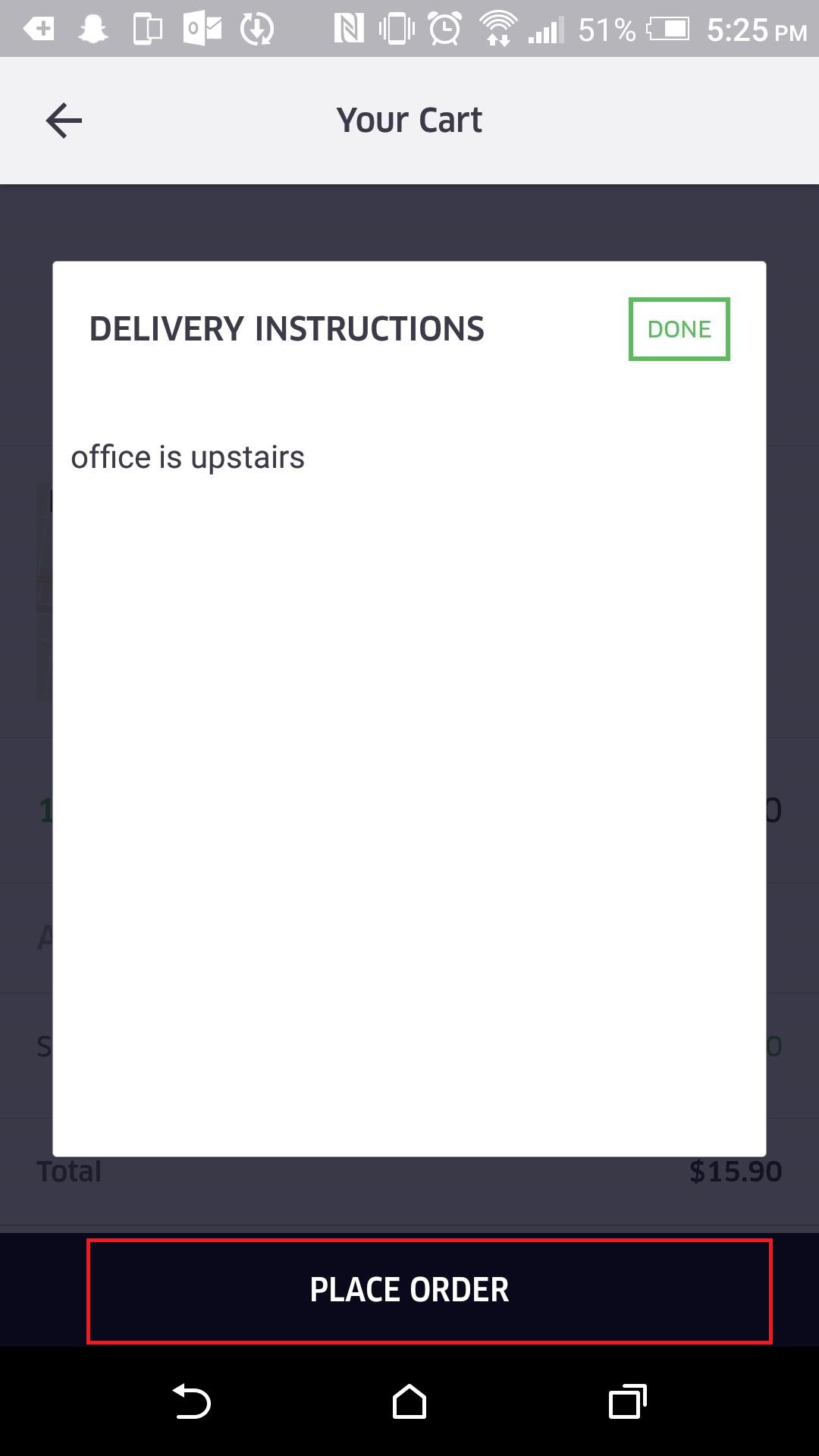
I need to add a delivery note. While I’m adding a delivery note, the Place Order button is still at the bottom.
This should disappear on this screen – it doesn’t make me feel safe that I could accidentally tap ‘Place Order’ before I’ve finished typing my delivery note.
Another positive of UberEats is that a sticky guide of how long the delivery will take has been hovering at the top of my screen since I started browsing the menu!
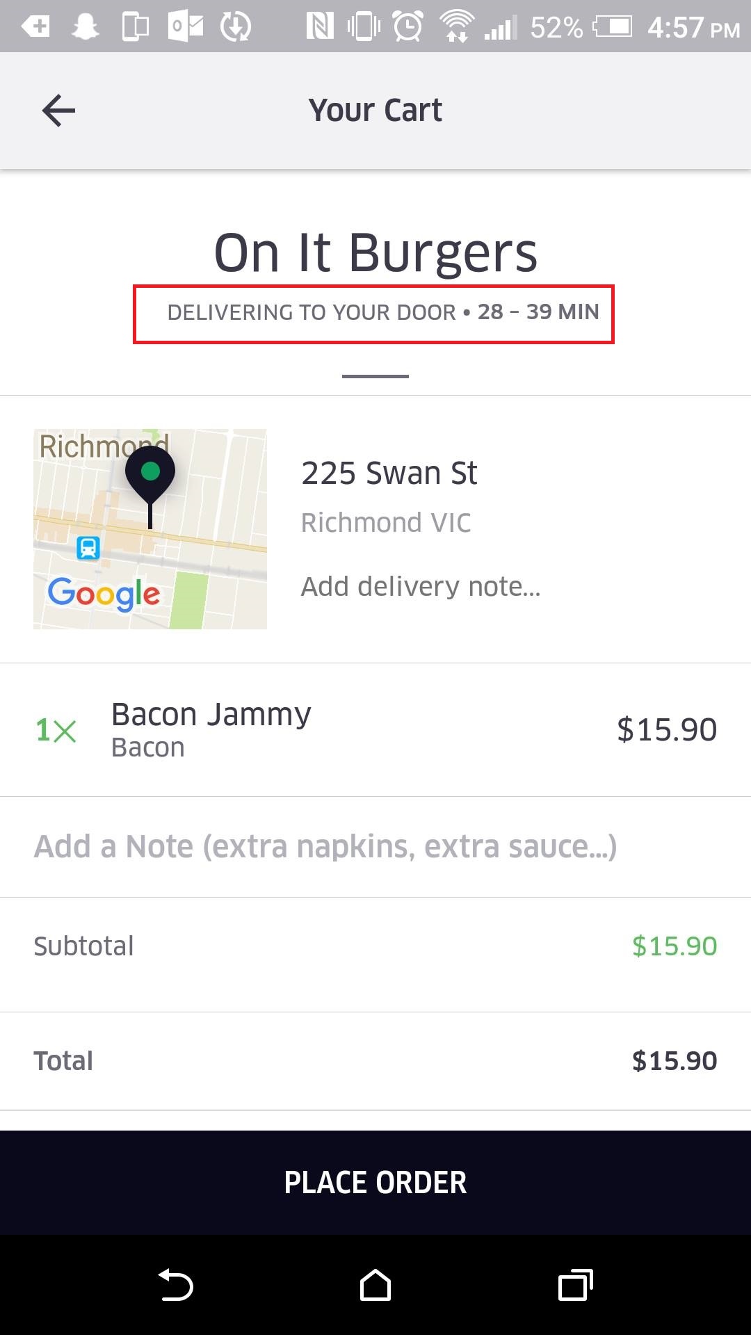
This keeps me informed if I’m on a tight timeline, and reduces the likelihood of me complaining to Uber when my order doesn’t arrive for 40 minutes.
Cons:
Although having photos for your meals was a pro, not all of the food options have photos.
It’s hard to choose a meal without a picture. I’m more likely to trust one with a picture if it’s right next to it!
That being said, UberEats is in MVP stage, and professional photos are expensive.
I expect they’ll roll out a full menu of photos in Version 2 when they have more data on the conversion rates to go off.
Let’s move on to ordering a burger from Deliveroo.
Deliveroo:
I’ve selected a local burger joint. This is what the restaurant page looks like…
No images for any of the menu items. Personally, I’d prefer images, but on the plus side this reduces the bias against menu items without images.
After I select a specific burger, I’m taken to a product page fairly similar in UX to Uber Eats:
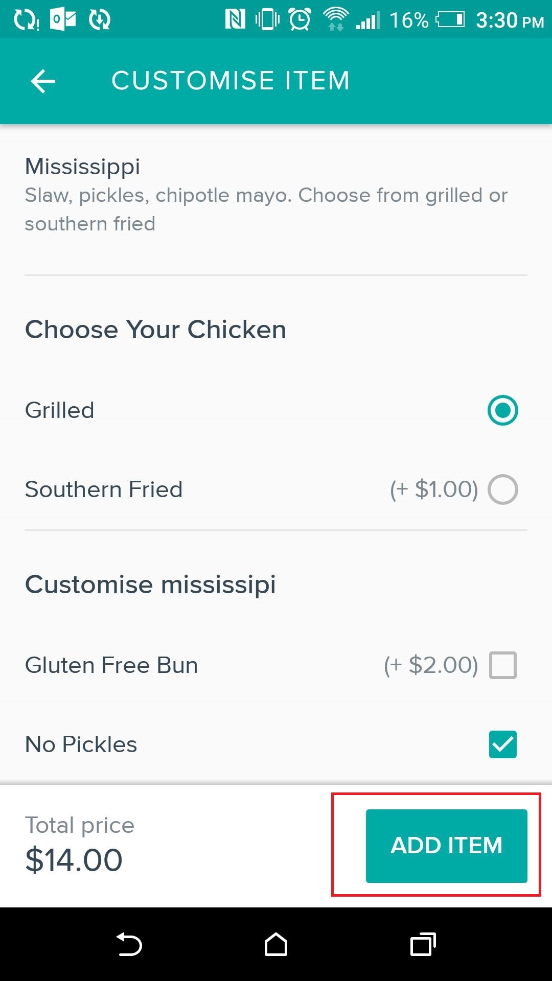
After I hit ‘ADD ITEM’ I’m taken back to to the restaurant’s page.
Here’s where they seem to really excel over Uber’s ordering process:
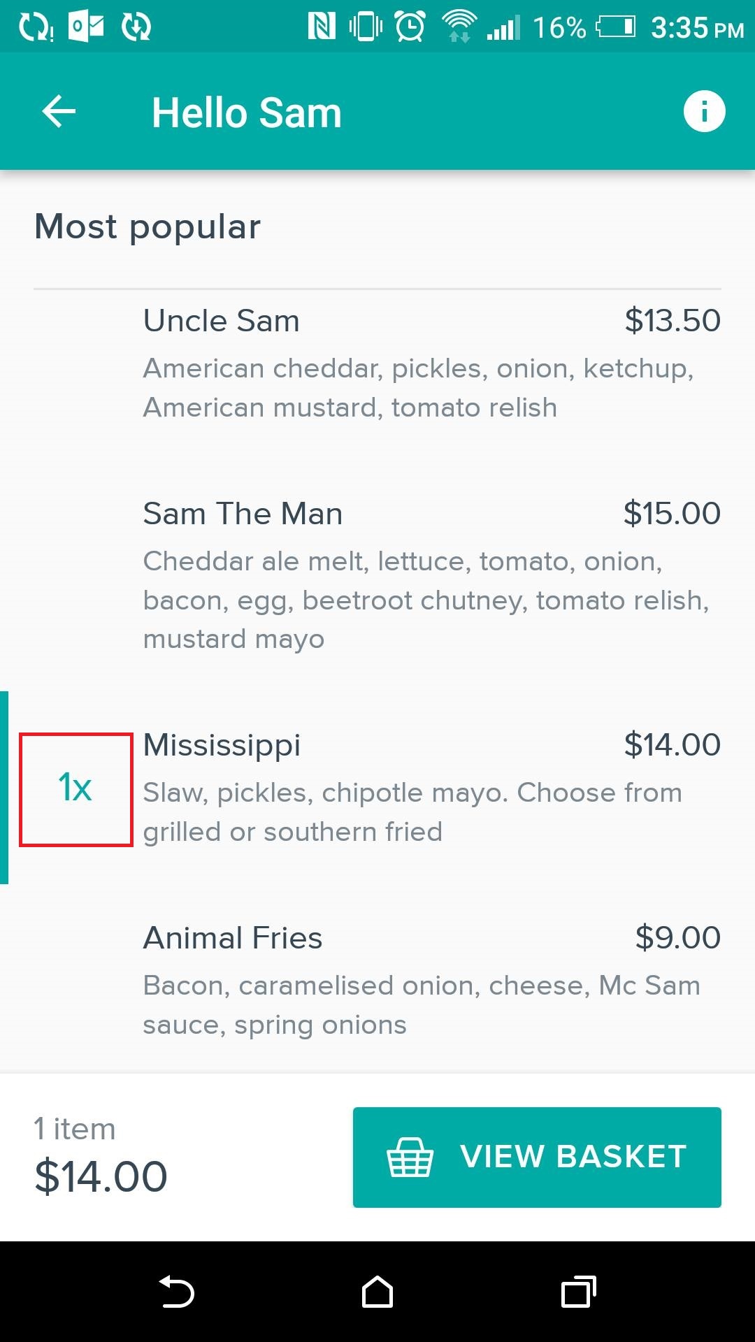
There is a clear indicator as to what I’ve already ordered by adding a multiplier next to each item in the menu (in this case, I’ve ordered 1x Mississippi).
I also like that next to the ‘VIEW BASKET’, it shows the $ order total that is in my basket, so I don’t need to go back and forth through the checkout.
This is definitely a leg up on Uber’s ambigious ‘CHECK OUT’ button.
I found a bit of an easter egg that allows you to manage your checkout from within the menu: Holding down the menu item allows you to delete the order.
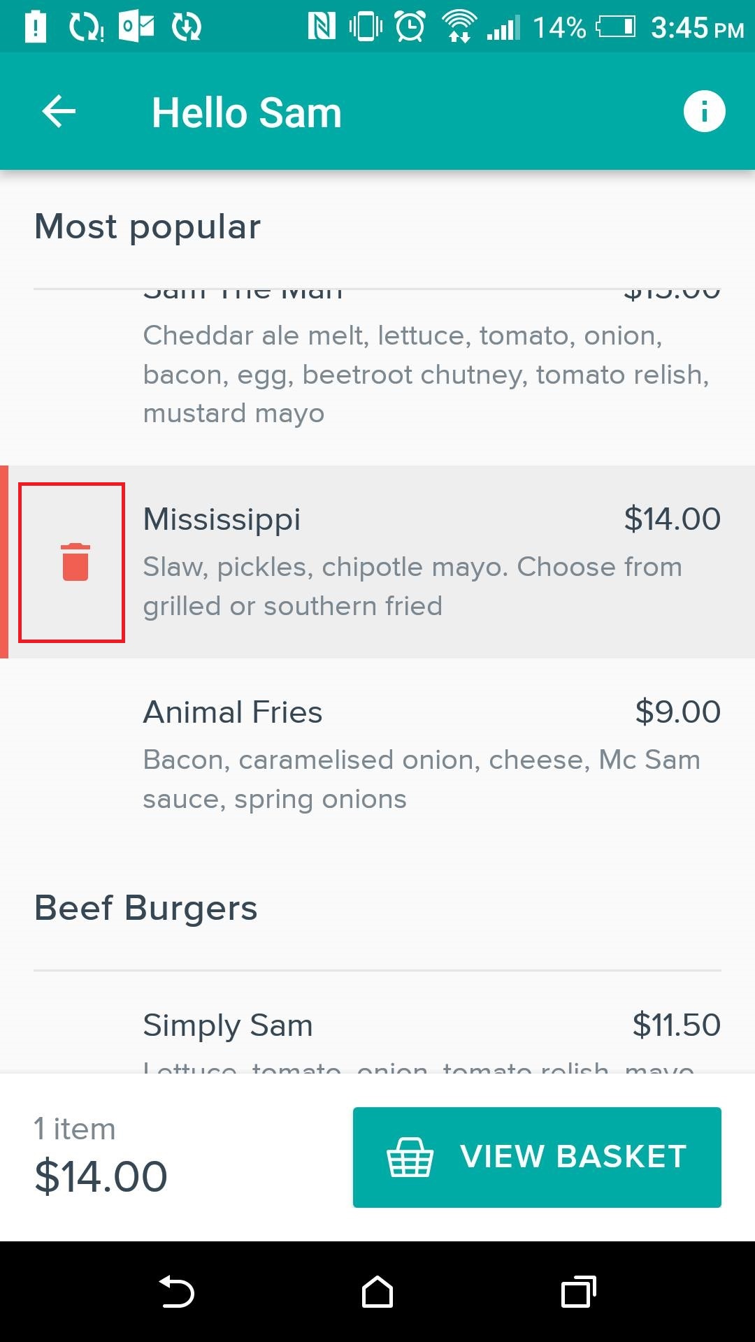
Swiping left would have been a bit more intuitive to remove items, but this is still a good feature to include.
You don’t want users to have to navigate back and forth from checkout constantly.
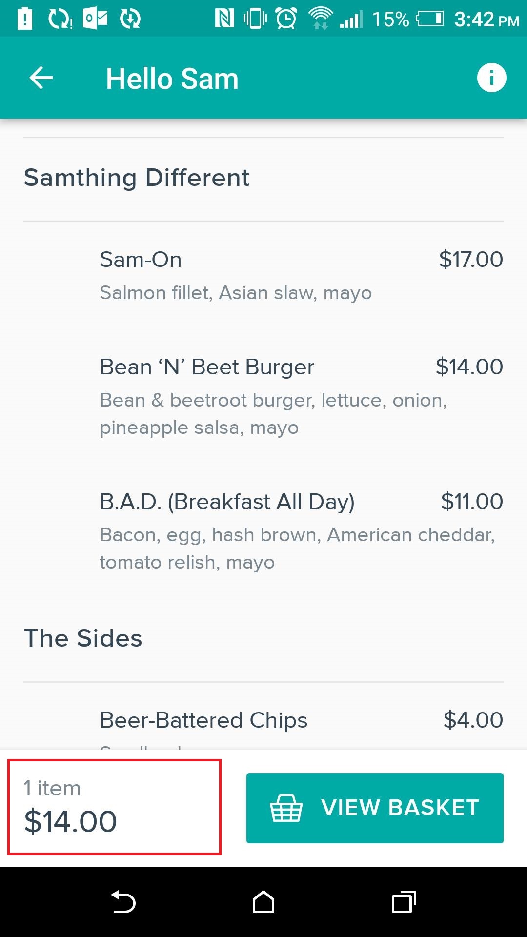
Alright, I’m pretty happy with my burger. Let’s checkout now by tapping the nice and obvious ‘VIEW BASKET’.
I’m taken to my basket, that shows the breakdown of costs in my order. There’s a 2-step order process as opposed to UberEat’s 1 step.
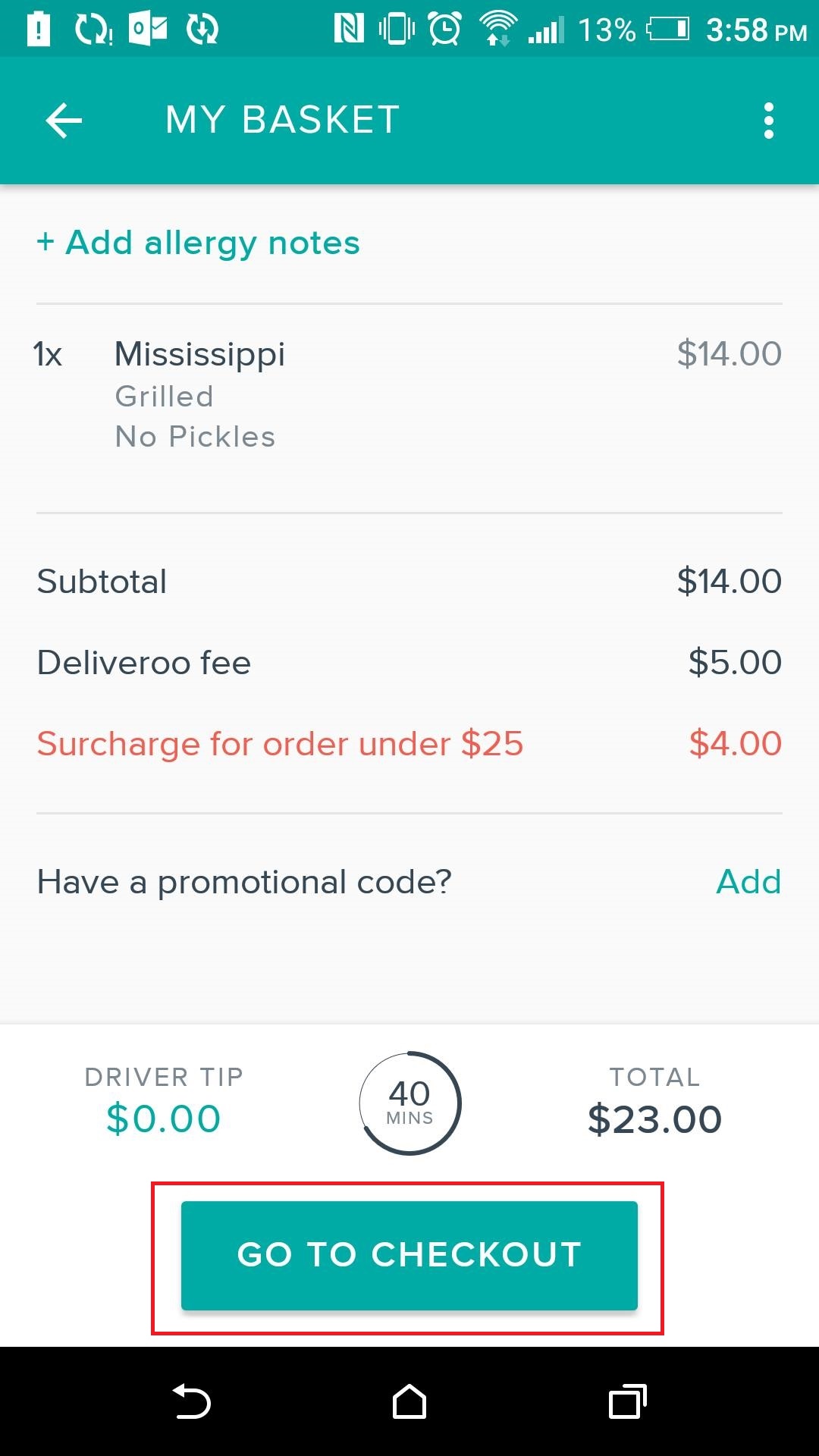
I have to tap ‘ GO TO CHECK OUT’ to be taken to a payment and delivery summary.
It’s a bit annoying. I’d rather have my order, delivery fee, delivery address and payment details all on one page to review.
Also, the layout of the receipt all over the place! My eyes are dancing from left, to right to middle. UberEats’ is all in line. Neat and nice.
The checkout page clearly shows delivery address and instructions. It’s intuitive that I have the ability to edit these if I need.
The Winner:
Deliveroo.
Even though Uber has better visual style and layout with its structure and positioning of elements on the page, Deliveroo informs its users at better placement within each flow.
I liked the knowledge of what was in the checkout and how much was owing without the need to go change screens.
Deliveroo clearly outlines its actions showing users how to edit fields. This is important, because unlike daily apps such as Instagram and Facebook, users need more guidance as this app will be used once a week/fortnight/month (not day to day).
You need to retrain.
Uber’s major downfall is that it’s just not acceptable to not give a clear indicator to price when going for the sale.
The Takeaway:
For a new app that will require users to ‘train’ themselves to get most value from, you need to give hints at the right time and place.
Reduce the amount of steps in each event sequence. Do you need a 2-step order sequence? Could it be done in 1 step?
3. Which app makes it easiest for me to keep track of my delivery?
Once the food has been ordered, you’ve got to keep the hungry user at bay. This step is crucial for keeping the user informed with status updates about their delivery.
UberEats
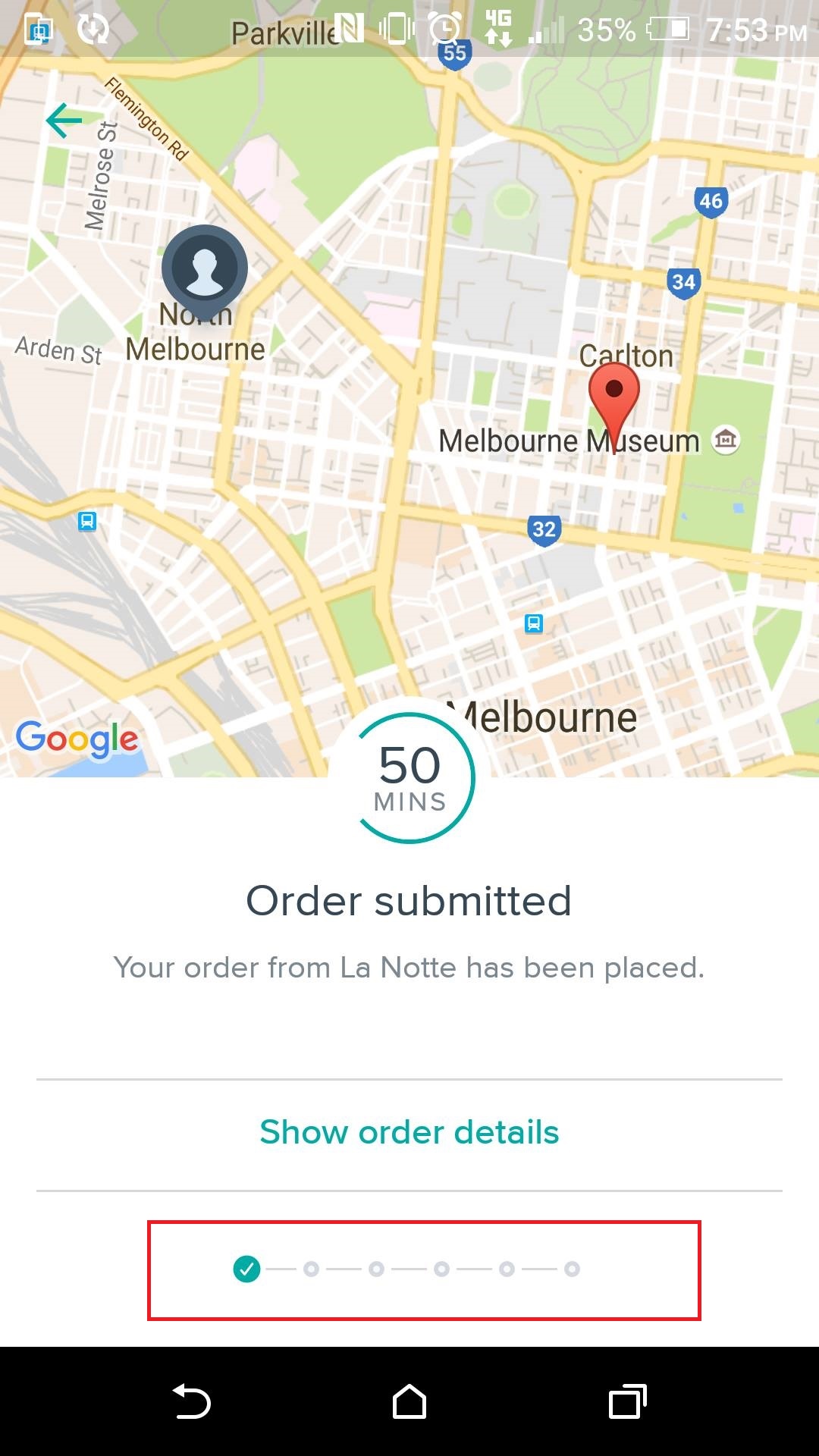
After processing my order, I’m taken to the delivery page:
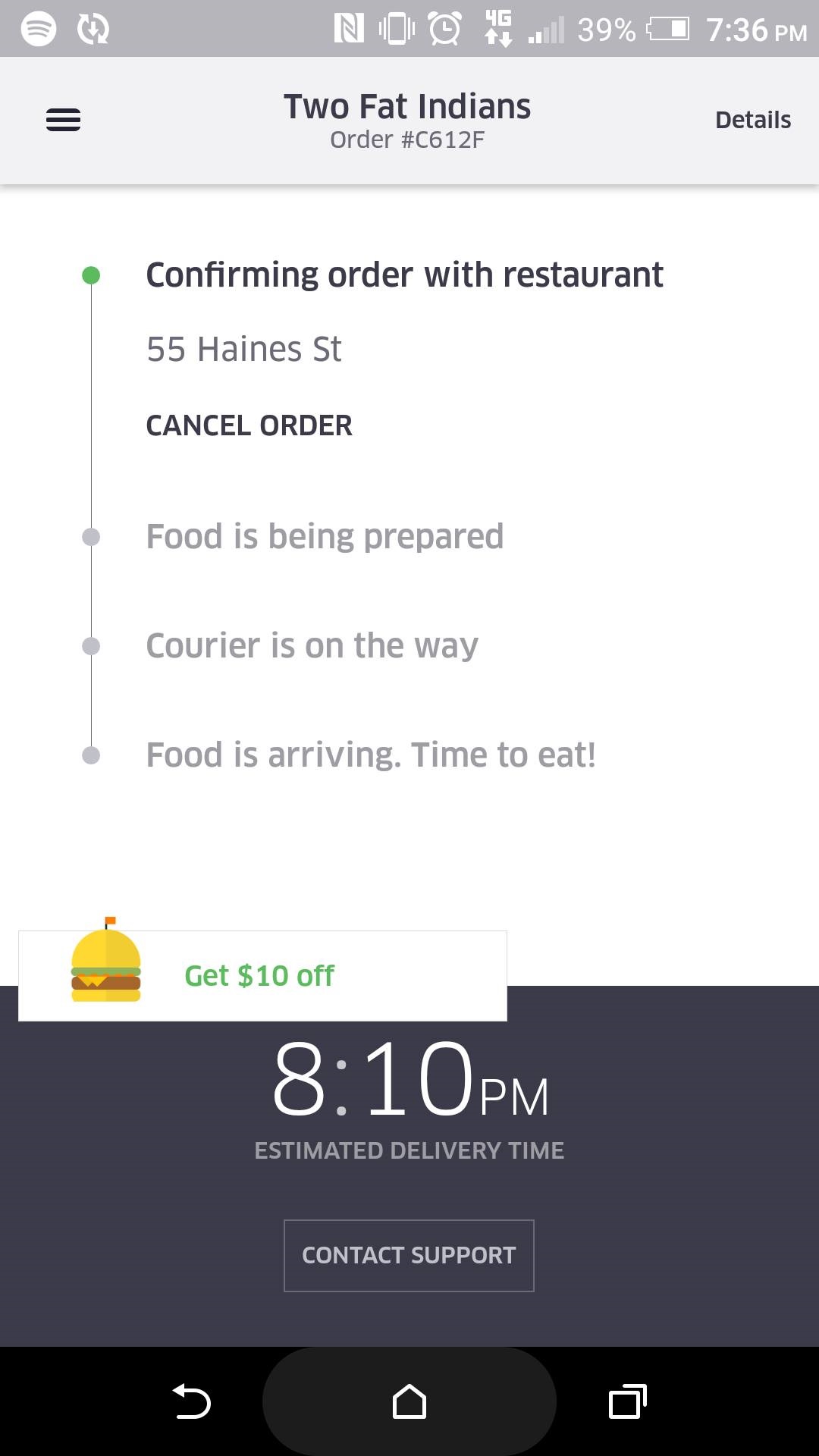
I like this linear design and the fact that it gives me an overview of all the steps, not just the step where I’m at currently.
The green filled circle and the blacked out text tells me where I’m at in the process – it’s very intuitive to understand how I’m progressing through the steps.
This screen stays in keeping with Uber’s design choice of green to accent key points.
The tick and blacked out text indicates that certain steps have already been completed, while the greyed out text indicates that this step has yet to be completed.
I eventually reach the step ‘Courier is on the way’. This triggers a Google map graphic of the driver’s location (symbolised by the fork and knife).
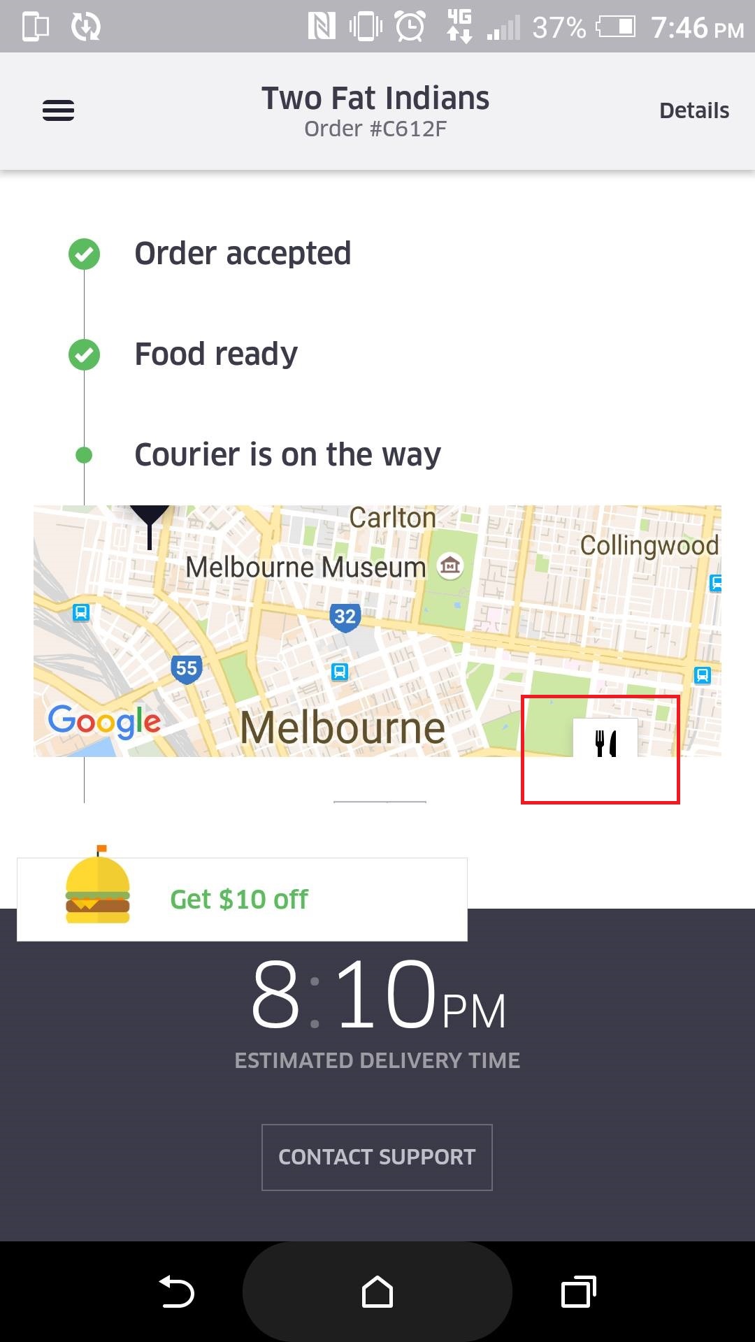
If I tap on the map, I’m taken to a full screen map graphic that lets me zoom in and out with the full functionality of Google Maps.
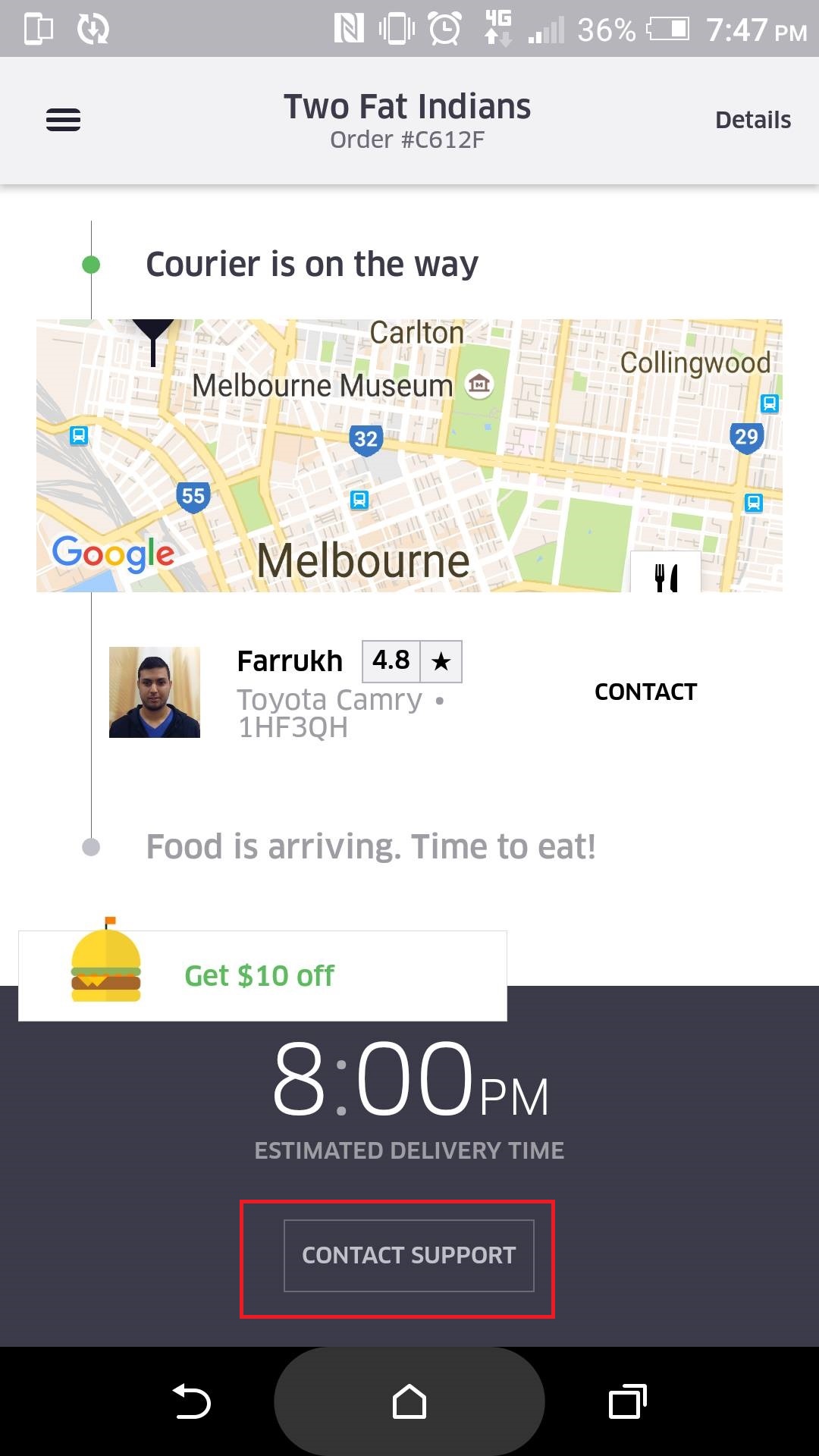
All in all, I can’t fault Uber on this delivery update process – it provides just the right amount of options. The only 2 options for the user are to cancel their order (only possible in step 1) and to contact support.
The estimated delivery time updates regularly and is fast loading.
Now, let’s see how my Deliveroo burger is travelling…
Deliveroo
It appears that the delivery process is where Deliveroo is most different to Uber. In fact, they’ve gone the complete opposite in their UX choices!
Where UberEats was a linear design, Deliveroo has chosen to display status steps horizontally.
They’ve also given me lots more detail about the step I’m at through the text at the top of the screen.
I don’t mind the choice to go horizontal, but where it does slip up is not letting me swipe left to see what the next steps are. This was the first thing I wanted to do!
There is also a daunting amount of steps – 6 compared to Uber’s 4. The fact that I can’t even see what these 6 steps are is frustrating.
The extra text about the stage I’m at is a more personal touch than UberEat’s, but it doesn’t make up for the non-intuitive process.
The Winner
UberEat’s has got this one hands down.
Their ability to show me all the delivery steps on the same screen, without confusing me as to which step I’m at now, was much more intuitive.
The Takeaway:
If your app requires you to complete an action that takes 3-5 steps, you need to inform them of where they are currently, and what is coming up so they can mentally prepare.
This isn’t possible in all situations (you don’t want to cram too much text on the screen), but if the user is likely to feel frustrated in this particular funnel, it needs to be a priority.
There’s always a workaround!
So who is the overall winner?
A recap of who won each stage:
- Which app made it easiest to find the right restaurant? WINNER: UberEats
- Which app made it easiest to order food? WINNER: Deliveroo
- Which app made it easiest to keep track of my delivery? WINNER: UberEats
Neither app was without faults, but UberEats overall had a more intuitive end-to-end process of ordering a meal.
Their design was more stylish, the functionality was simple to use, and their little touches and hints were useful.
Great work from Deliveroo as well, UberEats can learn a lot from their ordering process!
Ross Gillespie
Latest posts by Ross Gillespie (see all)
- 15 User Experience Design Tips For Building Lean, Profitable Mobile Apps - September 5, 2016
- UberEats VS Deliveroo: Which App Has The Best User Experience? - August 25, 2016
- User Experience Design: 7 Steps To Making The App User The Hero Of Their Own Experience - July 20, 2016

