50 UI Tips For Designing Beautiful Android and iOS Apps
Are you building an app and want to know the most important aspects of design?
Or worse yet, have you not even thought about this at all?
Well, let me help you out my friend.
User Interface (UI) for apps is a completely different beast to web design.
Here are 50 tips and industry secrets for designing beautiful Android and iOS apps, from our own UI specialists
They are leaders in the app design industry.
Have a read! We’re sharing with you some useful app design tips. And while you’re at it, feel free to share with your friends…after all, I spent a few hours getting these boys to spill their secrets.
What is UI?
UI can be simply described as the interaction between humans and the interface.
For apps, the user interface can be a web app, smartphones, tablets, phablets and wearables.
The visual elements that the users interact with are Buttons, Scroll Boxes, Sliders, Text, etc.
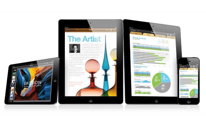
You need to design the interface to be optimised for each of the devices your app will be used on.
Did you know that there are 12,000 smart devices installed with the Android Operating system?
Each have different sized screens… Which can be portrait and landscape – How do you design your interface to be responsive so the design is the same for all sizes?
I believe that every product should be design for the way it will be used 98% of the time. e.g Photocopiers. You can do heaps of stuff with these machines, but all 98% of people really want to do is make a single copy. Which is why making a copy is as easy as putting paper on glass an pressing a big green button. Every app should be designed like this. Simple and User Centric. – Zac Dickerson UX Engineer
Why do you need a beautiful UI?
The design of the interface will make or break the success of your app.
This is why a lot of the design for apps is outsourced to professional UX/UI designers.
You need to know how to turn buttons, screens and sliders into an actual experience.
The User Experience (UX) is the ability to capture the user’s natural thought process in a functional design.
UI is unarguably one of the most important aspects of UX. (But not the only aspect)
UI is about combining the ‘users mind’ with that of the design.
If you stuff this up, then your app will most likely become quickly deleted.
To put things in perspective before we start spilling our secrets, think about this;
Buzinga App Development
A iPhone user knows how to use the camera function. It has become a completely intuitive action that they could do in their sleep.
Hell, we all know that we can use it after a few too many drinks.
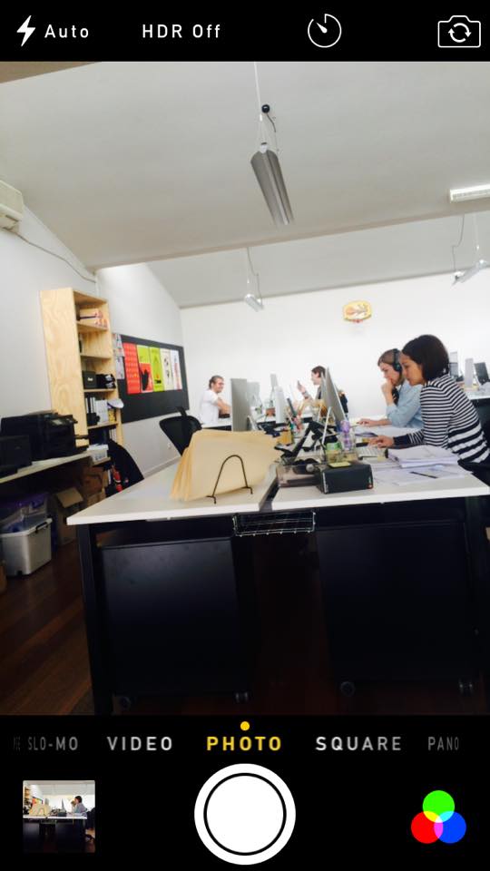
When the camera app is opened, iPhone users expect that the image they are trying to capture will fill up their screen. As you can see in the above image.
They know to press the white round button at the bottom of their screen to take a photo.
The size of the button is perfected to the size of a thumb for easy and simple tapping.
Any other functions are in the bottom corners, or are across the top of the screen.
Now, because this action has become so intuitive to it’s users, why would you not replicate this design for the camera function in your own iPhone app?
Facebook does this flawlessly. When you take a photo on it’s mobile app, it looks like you are in the camera app.
Why would you want to reinvent the wheel?
If it’s easy, they’ll come back.
Okay, time to start. I’ve broken the tips down into 7 categories. If you think of anymore as you are reading, add them to the comments!
Pre- Design
1) Make sure you begin with pen to paper before you even think about design.
2) Put together a mood board of colours, inspiration and feel.
3) Map out wireframes and the screen flow. You can download wireframe stencils for iPhone and Android devices online.
4) The easiest way to do this is by drawing a complete flowchart of your app, and then connecting up all the screens and dots. This will tell you the key features of what your app must do.
“Keep it simple, stay consistent and empower the user” – Pete Flannery
5) Tools such as Lucid Chart help you build functional mock-ups of the app before bringing it into Photoshop to finalise the look.
These are the sites our team uses for inspiration:
The Principles of Design
6) The fundamentals of app design are the same as the design principles:
Balance: Balance is the weight distributed in the design by the placements of your elements. e.g.; A large shape close to the centre can be balanced by a small shape close to the edge.
Proximity: Proximity creates relationship between elements. They should be visual connected in someway, not necessarily placed together.
Alignment: Align buttons, images and text to show users how information is related.
Repetition: It helps to create association and consistency through tying together visual elements. This can be repeating colours or an image within each screen.
Contrast: Contrast is the juxtaposition of opposing elements (opposite colours on the colour wheel, or value light / dark, or direction – horizontal / vertical). Contrast allows us to emphasise or highlight key elements in your design.
Space: The distance or area between, around, above, below, or within elements. Space can be both positive and negative.
The Screen
7) Don’t be afraid to use the whole screen.
8) But use the screen real estate wisely.
9) Follow the Law of Clarity.
10) Spacing is your friend.
11) Each screen needs to have the same experience, feel, theme
12) You never want users to scroll, the image must fit the screen.
13) Create an easy-to-read layout that puts controls close to the content they modify.
14) iOS canvas sizes vary from 1024×768 (iPad) to 640×960 (iPhone 4 and 4S) to 320×480 (iPhone 3GS).
15) Remember there’s no keyboard, a small screen and very few physical buttons.
16) When designing an app interface, particularly for touchscreen, you need to define a clear hierarchy and understand the important parts of each screen. If one particular button will be pressed constantly, place it nearer the bottom so a thumb can tap it more naturally.
User Experience
“Put yourself in the users shoes, what is the most intuitive way to navigate your app? The user experience is the key to designing beautiful & successful apps” – Pasquale Skupin, Senior UI Specialist.
17) Design with realism in mind, from texture, feel, shading to the realism of the functionality.
18) You never want to reinvent the wheel.
19) e.g.; Send buttons are in the same place as the send button in the text messaging function.
20) Or don’t use a ‘pinch’ gesture for anything besides zoom, collapse or expand, as it’ll almost certainly confuse users.
21) Users will ignore any icons / actions that they do not recognise.
22) Present your information as a hierarchy.
23) Lead your user around the screen, this empowers your user without them knowing.
24) Always make sure that the user can find the most important features in one or two clicks.
25) Users should never wonder what to do next, the designer must construct the screen to make sure that users never think.
26) Users will always expect to see interface elements in the context of object they want to control. This corresponds with real-life: when you want to pop some corn, you go to microwave and flip the switch on the device.
27) There is a big difference between expecting users to do something on their own, and asking them specifically to do it. You never want users to even ask what action an icon does, they must know.
28) You need to be smart – but not smart in terms of making user thinks. Smart so they never have to think.
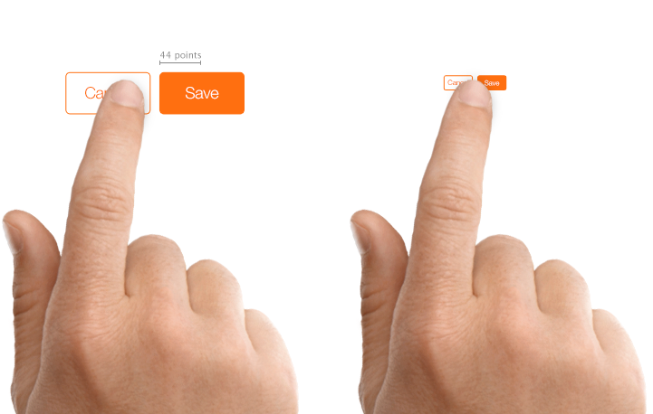
29) Create controls that measure at least 44 points x 44 points so they can be accurately tapped with a finger.
Text
30) Follow font guidelines
31) Font size varies depending on the feel of the app.
32) Pasquale says: “I never really go below 24 or 22pt when it comes to font. Text sizes for apps are surprisingly large. Don’t be caught out.”
33) Bolder large rounded font can give off a sense of fun while thinner smaller fonts give of a sense of sophistication and tend to be a little more elegant and serious.
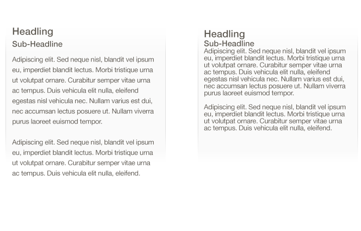
34) Increase line height or letter spacing for more legible text.
Colour
Source: Kuler Colour Wheel Android Police
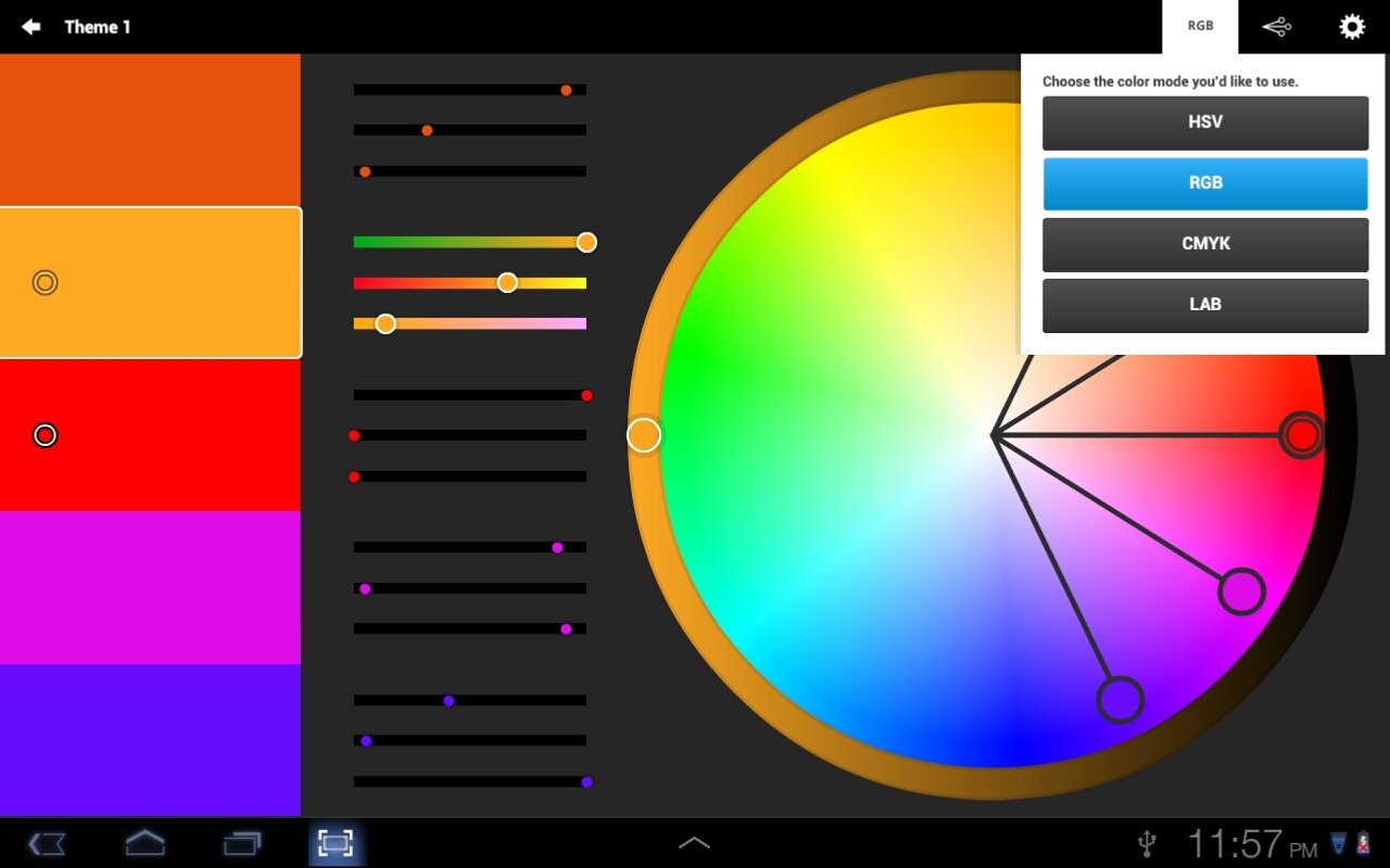
35) Know your colour wheel.
36) Contrast colours – Are next to each other on the colour wheel.
37) Complimentary colours – Are opposite on the colour wheel.
38) e.g.; Use dark text on light backgrounds and light text on dark backgrounds.
39) Reading blue text on a white background is easy, but reading blue text on a red background is difficult.
40) The problem is not enough contrast exists between blue and red to make it easy to read, whereas there is a lot of contrast between blue and white.
41) This is a great tool for learning about contrasting and complimentary colours: Kuler
42) Popular colours at Feb 2015: Pastel colours, the most popular is Mint Green, with complimentary black and white tonal shades (Pasquale’s signature colours)
43) One of Apple’s many design conventions is to have a constant 90-degree light source at the top of the screen, shining down on all interface elements.
44) The angle of this light means that highlights, gradients and shadows on elements are straight up or straight down, never slanted. That’s not to say that 45-degree drop shadows can’t work, but they might make your app feel out of place beside others
Elements
45) If you’re going all-out for a beautiful user interface, always pitch at the highest-level device first. That means really making the most of the retina display with additional textures, details and design nuances, and then scaling these down as required to cater to older devices
46) Always display images at their intended aspect ratio to avoid distortion.
47) Provide high-resolution (@2x) versions of all image assets.Images that are not @2x will appear blurry on the Retina display.
48) Always keep the Constatine and Lockwoods ‘Software to Use’ principles at the front of mind.
The structure principle: Your design should organize the user interface purposefully, in meaningful and useful ways based on clear, consistent models that are apparent and recognizable to users, putting related things together and separating unrelated things, differentiating dissimilar things and making similar things resemble one another. The structure principle is concerned with your overall user interface architecture.
The simplicity principle. Your design should make simple, common tasks simple to do, communicating clearly and simply in the user’s own language, and providing good shortcuts that are meaningfully related to longer procedures.
The visibility principle: Your design should keep all needed options and materials for a given task visible without distracting the user with extraneous or redundant information. Good designs don’t overwhelm users with too many alternatives or confuse them with unneeded information.
The feedback principle: Your design should keep users informed of actions or interpretations, changes of state or condition, and errors or exceptions that are relevant and of interest to the user through clear, concise, and unambiguous language familiar to users.
The tolerance principle: Your design should be flexible and tolerant, reducing the cost of mistakes and misuse by allowing undoing and redoing, while also preventing errors wherever possible by tolerating varied inputs and sequences and by interpreting all reasonable actions reasonable.
The reuse principle: Your design should reuse internal and external components and behaviors, maintaining consistency with purpose rather than merely arbitrary consistency, thus reducing the need for users to rethink and remember
49) An effective way to translate an app across different screen sizes is to design all your graphical elements as vectors in Illustrator, and then import them into Photoshop.
50) There you can fine-tune them for specific screen sizes and resolutions, simplifying or modifying where necessary.
The best-designed apps have virtually no user interface – just content that breathes.
Keep revising your design constantly, and never get complacent – question your approach at every possible stage of the process.
“Put yourself at the forefront of design, immerse yourself in new and innovative trends”- Andre Skupin, UI Specialist.
If you don’t keep questioning everything, you’ll come up with a narrow solution.
Do you have any more tips you want to share? Comment below!

Also have a read of: Infographic: Breathtaking Mobile App UI Inspiration
Latest posts by Pasquale Skupin (see all)
- Infographic: Breathtaking Mobile App UI Design Inspiration - June 12, 2015
- How To Create A Memorable UI Design Concept - June 4, 2015
- 50 UI Tips For Designing Beautiful Android and iOS Apps - February 4, 2015


