
11 Quick Lessons On App User Experience Design
Mobile user experience design is a marketing tool used for engaging users in your mobile app. And without user engagement…you have nothing.
Understanding good mobile user experience design (UX design) is the core of developing successful apps (and other digital products).
With this tool we can design a connection between the user and the app that evokes feeling and builds a long term relationship between the user and your application.
This works an absolute treat for brand marketing as well!
What mobile user experience design?
User experience (UX) involves a person’s emotions about using a particular product, system or service.
It highlights the experiential, affective, meaningful and valuable aspects of human-computer interaction and product ownership.
In essence, with mobile user experience design you need to design how you want the user to feel when interacting with your app. The question is how do you find out how they want to feel?
Let’s explore 11 quick lessons on mobile user experience design.
1. How does the user wants to feel?
In order to identify the key emotions that will drive the experience you first need to get to know your ideal user. We’ve designed a framework that you can use to quickly identify core attributes about your user and their behaviour. Based on this you can make educated assumptions about what emotions they are most attracted to, or what emotions repel them. Check out our Framework for Building a User Persona.

2. Design needs to be ‘Intuitive’
We hear it all the time yet hundreds, if not thousands of app developers get it wrong every single day. The key is to design for the subconscious mind. Navigating through an application should not be a conscious function. If it’s a conscious effort then your users will get tired and frustrated – naturally. The use of cognitive thought (problem solving and front-of-mind-thinking) dispels a tonne of energy and tires your mind.
‘Designing for the sub-conscious mind’ may sound like complex but when you de-construct the processit’s actually quite easy. When designing your screens keep these four ideas in mind:
a) Directive design – Tell your users what you want them to do. Remove the guess work. Use arrows, bold texts, bright colours to show them exactly what you want them to do. If you can’t do this then there is probably too much going on in your app. Go back to the drawing board, strip out non-core-functions and focus on what’s important. Check out this article on 3 Steps for Ensuring Your App is Unique.
b) Familiar framework – Use icons and words that people already know and understand. Look at websites like pttrns.com to gather ideas for styles, frameworks, icons, etc. that have already been used by other popular apps.
c) Beautiful – A beautiful design will go a long way. Just be careful not to trade ‘beauty’ for practicality and ease-of-use.
d) Minimalistic – Less is more. By removing buttons, features and other clutter from your interface design you can draw users attention to the options that are most important.

3. Identifying key features
The first step to designing a beautiful mobile app user experience is by identifying what features are most important, least important and what your overall goals are. I use a technique where I group the features and functions into the following categories:
a) Core functions
b) Other popular options
c) Your goals/key objectives of the app
d) Less popular options
The Core functions need to be accessible from almost any screen because they get used the most.Other popular options aren’t as important but we need to know where they stand in terms of popularity. Your goals (or key initiatives) are what you want the user to do, ultimately.
Generally your key initiative is to either make money directly from the app. Or perhaps your first mission is to build a user base in which your key initiative is to get users to keep using it and invite their friends to the application. Another smart key initiative which is growing in popularity is the aim to first validate the concept by ensuring people love the idea. Take a look at the Startup Guide for a greater insight into this way of thinking.
The aim with the Less popular options is to remove them altogether or to simply find somewhere to hide them in the app.

4. Designing your screens
I get inspiration from other apps. I like to look at different app styles to find a pattern that works in similar ways to the application at hand. This can be tricky at first but after designing apps for long enough you begin to see frameworks that work well for different types of apps based on their core functionality.
Using another pattern (with my own ideas and ideas from my team) I start filling in the most convenient spaces/buttons with the core functions and features. By convenient I mean the areas where your eyes are drawn to first (top) and parts that are easily reachable with the human thumb(s).
Turn your goals into activities, e.g. Share to Facebook, or invite a friend, etc. Use existing patterns and position them so that they are easily accessible from the ‘core functions’ and ‘popular options’. I mean, if your goal was to get users to buy your in-app purchases you wouldn’t hide it in the settings screen…on the other hand, that’s a great place to bury the less popular options.
5. User Scenarios
Put yourself in the users shoes. Run through the process for achieving each of the user’s objectives (their reason for using your app) to get a better understanding of how people will use your application.
If you’re not sold on how it’s currently working then shift some things around. At the end of the day you’ll never really know how people will use your app and what they truly want until you start collecting some feedback. This can be done through a number of means but mobile app analytics is a great way to track user behaviour once the app is live on the App Store.

6. Test all assumptions
Let’s face it, we’re doing a lot of guessing here aren’t we? I mean how do we really know that our design will work for our ideal user? So it’s important that we test our assumptions against real people to find out if our way of thinking resonates with their way of doing.
Be open and ready to act on all negative, positive and constructive feedback. Remove your own emotions – yes it hurts but you need to look at it objectively. If 10 out of 15 people say “You need feature X” then it’s pretty clear what you should do.
Let’s explore 5 Quick Lessons on App User Experience Design, with a short case-study for each, to inspire you with ideas for your own mobile apps.
7. Use Viral Design
Case-study: Badland

Winner of Apple Design Award 2013, Badland is an absolutely stunning and emotionally breathtaking application. Kudos to the development crew (Frogmind) behind this beauty.
The visuals is what makes the problem solving game unique, and the game flows in a seamless motion. It’s simply: ‘An epic mobile application.’
And its beauty is matched only with its popularity…
Why this works
Beautiful design works like a marketing tool. People talk about beautiful things. In this case, the intense attention to detail blows-the-fish-right-out-of-the-water. And it really doesn’t matter that the app costs ($5) because people are still buying it.
8. Give Bite-Sized Information
Case-study: Moves
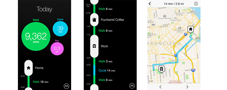
‘Moves’ records your…moves. It tracks your daily commuting, categorises your movements and time spent in important places then creates an infographic which displays all this information in a bite-sized overview.
Why this works
Presenting information in a bite-sized format makes it easier and quicker to digest large concepts. Obviously this makes for a more positive experience. “Fast is good”.
Is your app heavy on information display? Take notes from Moves. These guys have developed dynamic infographics that are both visually grasping and easy to read.
9. Keep it simple
Case-study: Taasky
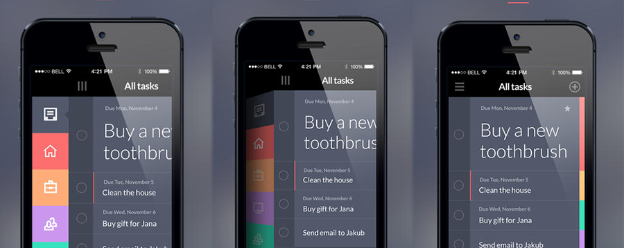
This task management system is COMPLETELY dedicated to JUST TASK MANAGEMENT which makes the experience super-simple, easy and stress free. There are no calendars, no reminders and no fuss. Simple flat design with big beautifully font.
Why this works
By keeping the concept down to a single function (‘managing tasks’) the design can be reduced to a maximum of 4 actions (compared to an average of 15-25):
- View tasks
- Add task
- Edit task
- Remove task
When working with such a scarcity of functions it’s easy to reduce each process down to one or two steps. And that’s the real key behind building INTUITIVE mobile applications.
10. Gamification
Case-study: Foursquare
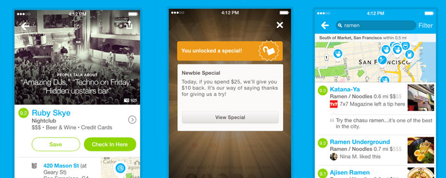
Gamification is the use of game mechanics within a system, app or a process that isn’t a game. Foursquare uses gamification in a clever way by giving users price discounts and special offers based on performance, while creating a social media rich experience.
Why it works?
Gamification plays on our child-like senses and creates a sense of addictiveness that keeps users engaged.
Get the full scoop on how to use gamification in your mobile user experience design toolkit right here.
11. Have a Dynamic Interface
Case-study: SpaLink
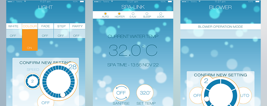
With newer operating systems on the rise such as iOS7 (iPhone, iPad, iPod) and KitKat (Android devices) a new form of design is breaking. This new wave of technology allows us to create a more dynamic mobile user experience design to engage users.
The example above is one of my own designs for an app called SpaLink (by SpaNet). In this project we’ve taken a boring concept of a remote-controlled-spa-unit with a complex interface and created a uniquely interesting and stunningly visual application that speaks directly to the spa unit and gives you full control of all spa functions from the palm of your hand.
SpaLink uses:
- Depth of field technology – background moves when tilting the device
- Dynamic button animations – that resize and turn
- Moving particles – bubbles floating around in the background as you engage with the functions of the app
Why this works
In many industries, cutting-edge-technology is what wins the cake. The same applies in the Spa Industry, and our client SpaNet wanted to stay at the forefront of technology to show their clients that they really are the leaders of Spa.
Let’s do a quick re-cap:
- Keep. It. Simple: By keeping your concept simple you also reduce the complexity in the design which makes the app more intuitive to use
- Gamify your app: People love games.
- Avoid information-overload: Spoon-feed users with information in bite-sized pieces to avoid overwhelming them
- Let the design do the talking: A great design could be your #1 marketing strategy
- Make it marketable, make it beautiful: Every business needs a stunning application
For more inspiration feel free to check out our portfolio of apps to see what you can design.

Latest posts by Pasquale Skupin (see all)
- Infographic: Breathtaking Mobile App UI Design Inspiration - June 12, 2015
- How To Create A Memorable UI Design Concept - June 4, 2015
- 50 UI Tips For Designing Beautiful Android and iOS Apps - February 4, 2015


