Gmail VS Outlook: Which Mobile App Has The Best User Experience?
Email software platforms need great UX. They are used daily, with users checking emails up to 20 times per day and receiving an average of 121 emails per day.
Email isn’t a product that users want to spend time in. The goal of design, in this case, isn’t to prolong session time.
It’s to make it so frictionless that users can get what they want and get the hell out.
For that reason, UX is crucial, especially for such feature-packed platforms. Many users add their own plugins and the result can be confusing to navigate if the UX design isn’t intuitive.
For this review, I compared the mobile apps for Gmail and Outlook.
These are both market leaders in the space, with many people (including myself) using both platforms for different email accounts.
As both email platforms offer a suite of additional features around the core inbox (calendar, scheduling, CRM, etc), for the purpose of this review I have focused on the email function solely.
“Which email app has the simplest process of managing emails?”
To answer the question, we need to break it down into 2 key usage goals:
- Which app makes it easiest to manage your inbox?
- Which app makes it easiest to send an email?
Let’s kick off.
-
Which app makes it easiest to manage your inbox?
First we’ll look at how easy it is the navigate the black hole that is the inbox.
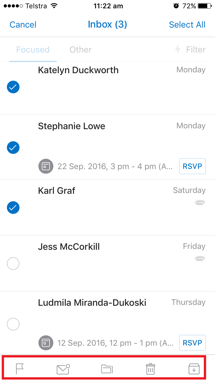
Gmail
Here’s the landing page of my inbox.
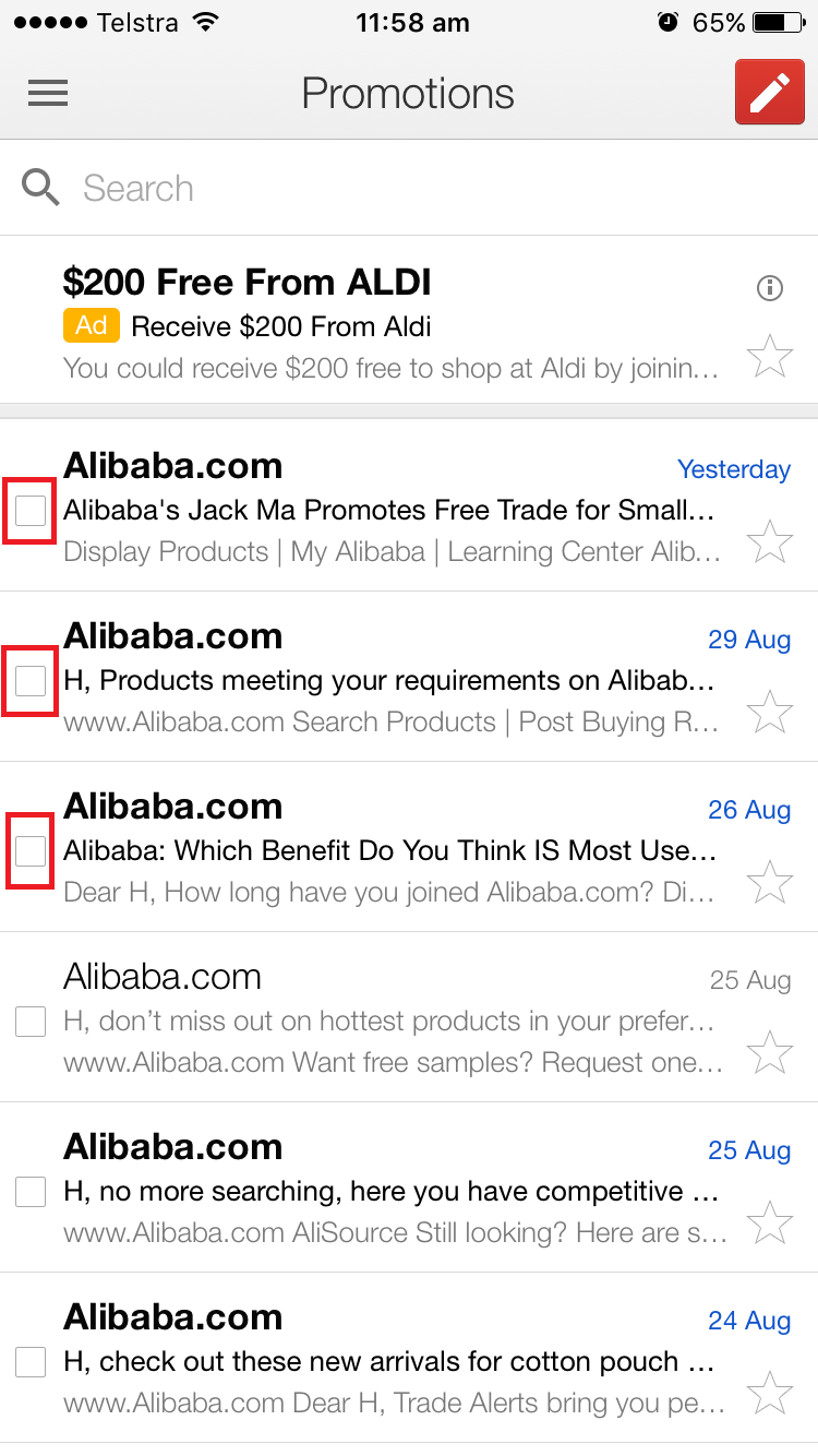
I like the visible checkbox feature to the left of each email. This communicates to me that I can quickly make bulk selections and move them across to another folder.
That being said, there isn’t a ‘select all’ feature. This would be handy if I needed to select more emails than I was unselecting.
Also, the checkboxes are very small. This could be challenging for users to select, let alone select several in a row quickly.
Let’s move on to the hamburger menu – the 3 parallel lines that when tapped open up a side menu.
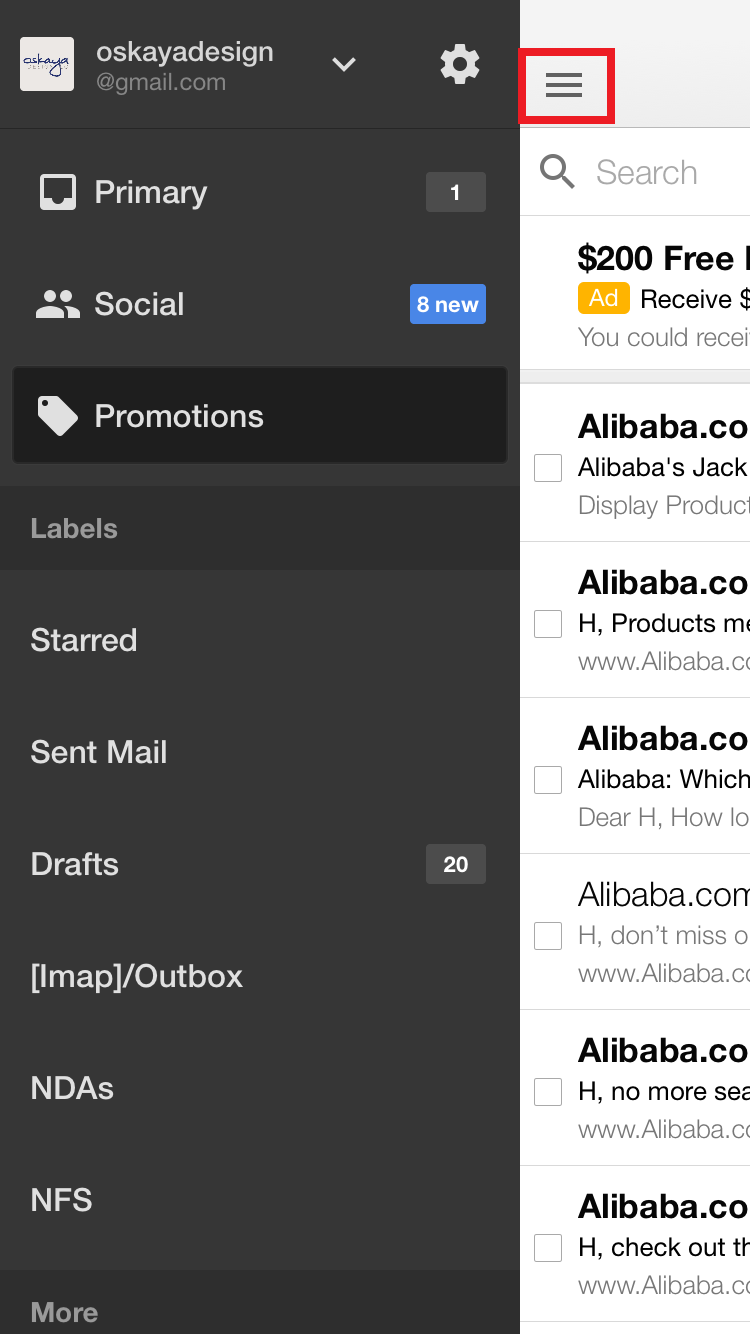
This menu has so many features hidden away. It’s almost overwhelming looking at all the options, half of which I’m not even sure what purpose they serve…
One great Gmail feature is that users can have multiple email accounts attached to the Gmail App and easily switch between them.
It’s obvious by the down arrow near my email address that this is where I can select to view my different accounts.
![]()
Outlook
Outlook’s inbox screen is laid out quite differently to Gmail’s (My email contents have been blocked out).
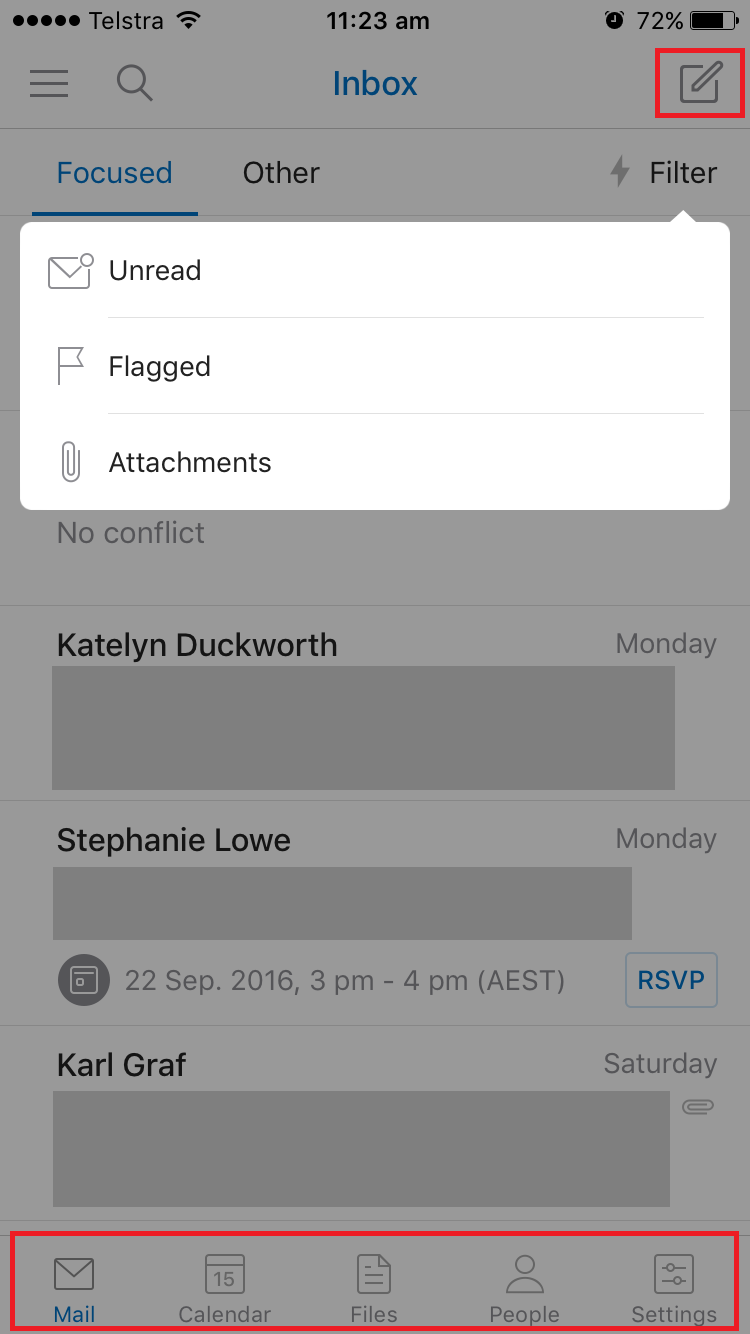
Outlook has a navigation bar AND a hamburger menu (highlighted). The navigation bar presents users with functions they regularly use, while the hamburger menu opens a set of less frequently used options.
This means users are immediately presented with possible actions rather than having to search for them. It also reduces the steps to complete a task.
What’s interesting is that the options in the navigation bar change to actions once an email has been selected.
It took me a while to figure out that to select an email I had to hold my thumb down for the checkboxes to appear.
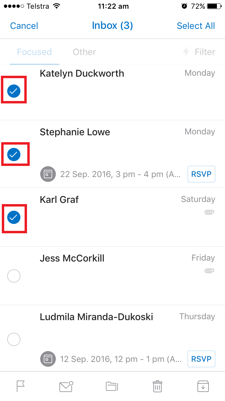
However, after figuring this out, I realised it was very easy to select multiple emails at a time – a feature that Gmail doesn’t include.
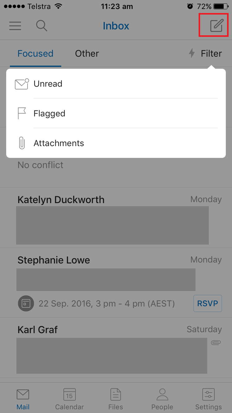
Another cool thing I noticed is the ‘filter’ functionality at the top right.
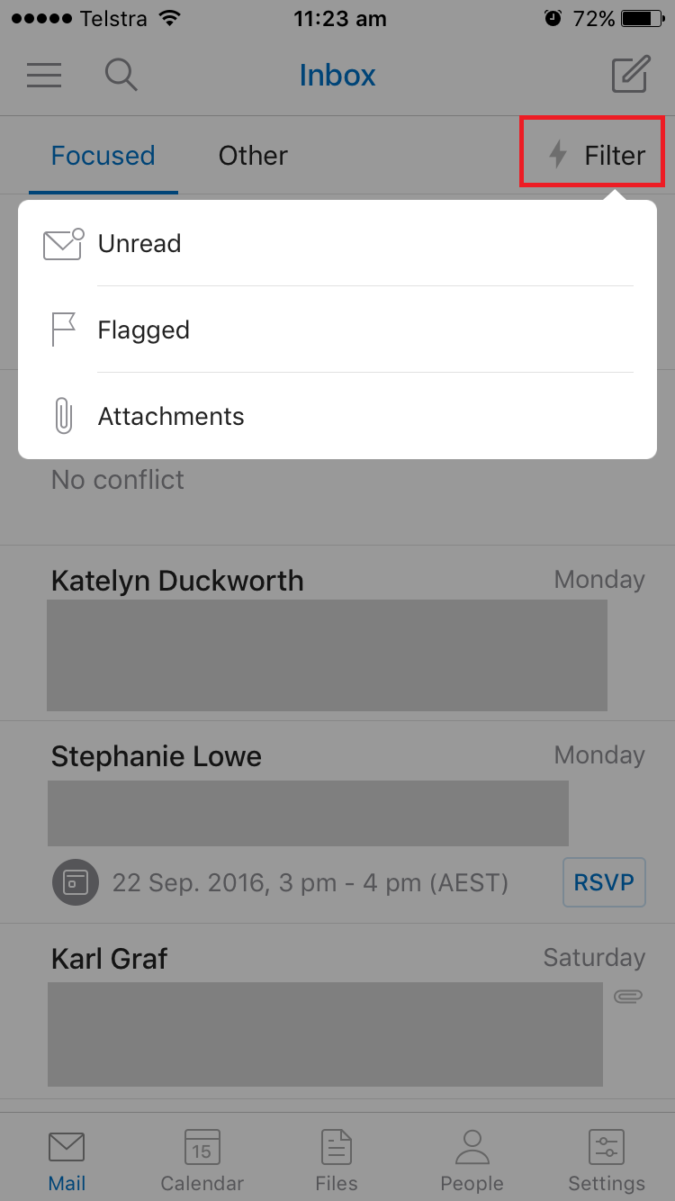
The filter brings up the option to quickly view emails that are unread, flagged, or with attachments.
This is much faster than using the search function, or alternatively having to dive into a folder in a hamburger menu.
Outlook has most likely analysed user’s search queries and found that these 3 are the most frequently selected options in a user’s inbox.
My only other comment is that while the design is considered, there is a lot going on in the inbox itself in terms of information that is presented for each email.
The Winner:
Outlook by a mile!
Users are given all necessary items they need to complete a task within the app. It’s fast, simple and intuitive.
While Gmail may have more options, users are forced to trawl through folders themselves to find what they’re after.
Key Takeaways:
For apps that have A LOT of information it may actually be easier to implement two navigation functionalities as Outlook has done.
This separates functionalities that users use frequently into the main visible navigation bar, and functionalities that users want but don’t access frequently in the hamburger menu.
2. Which app makes it easiest to send an email?
Let’s move on to assessing which app has the best UX and UI design for sending an email.
Gmail
Gmail uses directive design to prompt the user to take the action it wants you to take. The big red ‘create email’ button sticks to the top of the screen even as you scroll.
This button takes you to the screen to ‘compose an email’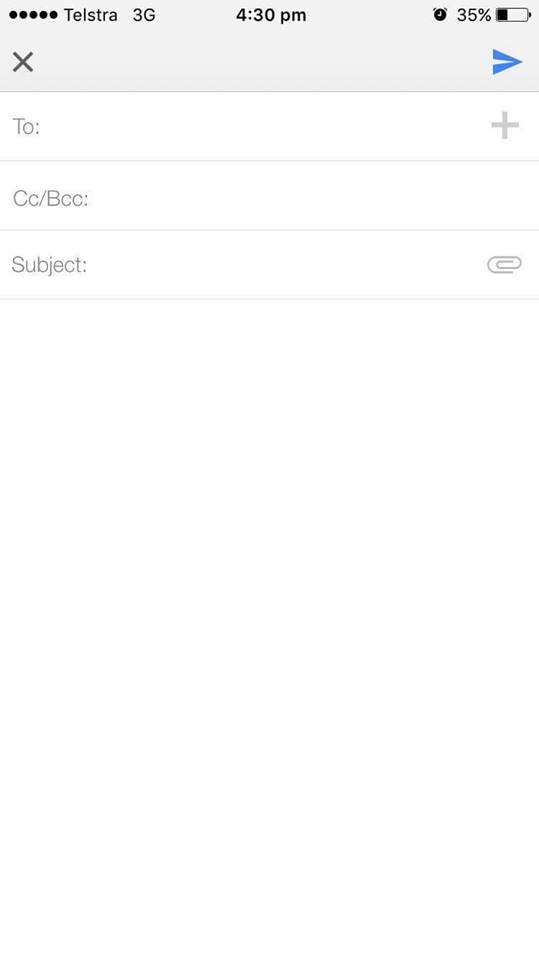 First thing I notice is that it doesn’t show the email account in which the email will be sent from.
This could be problematic for users who have more than one email linked to their Gmail App.
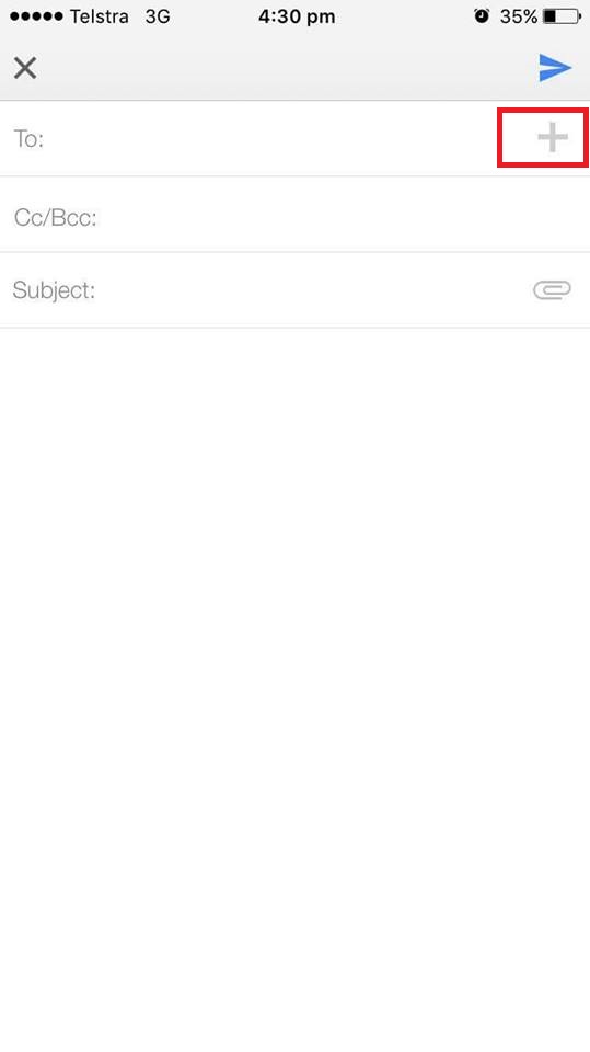
The ‘To’ form uses predictive text to suggest contacts for me, but I also like that there is a + button if I want to search through my recently used contacts instead.
Options!
Moving down the the ‘subject’ form, I like that the attachment icon is right there on the side.
However, when I tap to attach, I then have to tap on an ‘attach method’ before I can include an attachment within the email.
This is an extra step that isn’t really necessary.
Outlook:
From the inbox, to create an email you need to tap on the ‘compose a message’ button on the top right.
I know that Outlook is all about the minimalism, but it took me a while to find this button. It isn’t prominent in the same black and white as the rest of the text.
At least having it in blue, like some of the other page accents, would have given it a bit more visual real estate.
When I tap on it, I’m taken to the ‘new message’ screen.
At first glance, this looks almost identical to Gmail’s ‘compose a message’ screen!
There are a few key UX differences, however, which I think are worth highlighting.
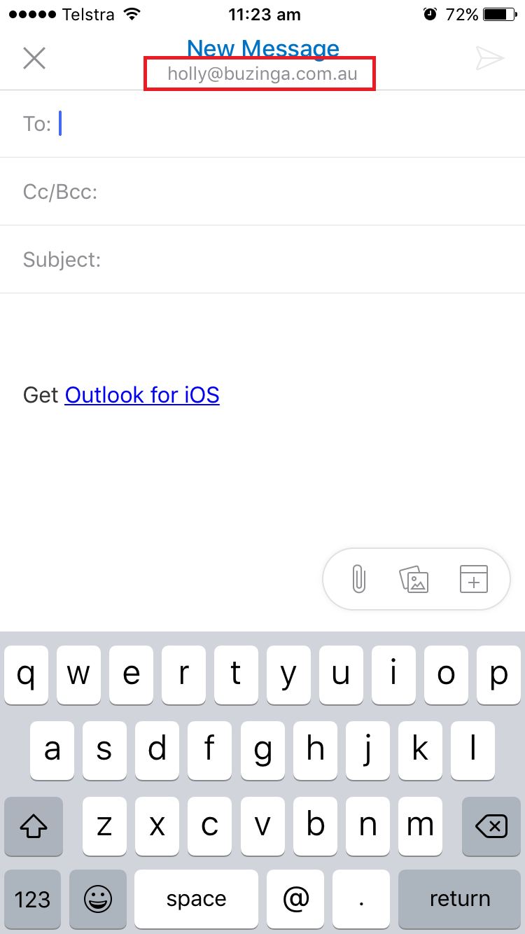
A definite pro is that it shows the email address that the user is sending an email from (highlighted).
I really think this is a key flaw in Gmail’s design, especially as they allow for the ability to swap between accounts!
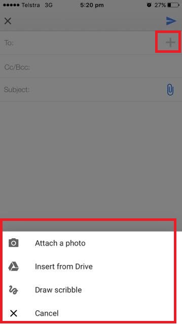
Apart from that, the only distinct difference in Gmail and Outlook’s ‘create a message’ design is Outlook’s floating option menu.
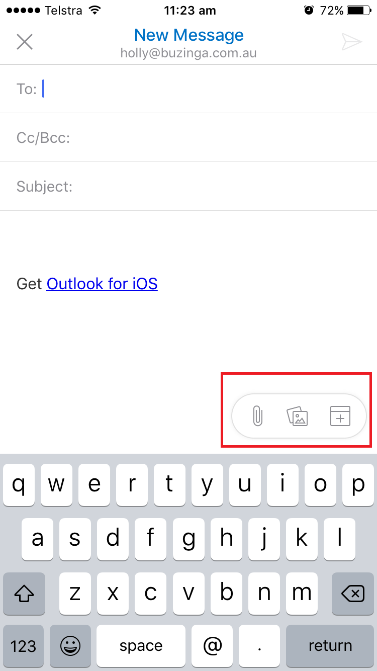
This makes it easy to add a file attachment, picture, or calendar invite at any point in the process of writing an email.
The Winner:
Outlook again. While Gmail’s ‘Create Email’ button stands out more, Outlook’s process to send an email is easier and faster.
I particularly liked Outlook’s floating menu option so users can attach files to the email at any stage in the process.
Key Takeaways:
Floating options are awesome! These could be applied to any process where a user may need to access their device’s native features when completing a task.
So who is the overall winner?
A recap of who won each stage:
- Which app made it easiest to manage the inbox? WINNER: Outlook
- Which app made it easiest to send an email? WINNER: Outlook
Neither app was faultless, but Outlook overall had a more intuitive end-to-end process of managing emails.
Their design was simple and their little touches made a difference when weighing up against an almost identical competitor.
This is something of a surprising outcome. Most UX designers would agree that Google always has the edge when it comes to intuitive design processes.
Do you agree with this result? Let me know in the comments!
Holly McKee
Latest posts by Holly McKee (see all)
- Are you considering ‘Mobile Accessibility’ in your App Product Planning? - May 11, 2017
- 6 Fast Tips For Mobile User Experience Design - April 13, 2017
- UX: 5 Do or Die Tactics for Successful Mobile App Onboarding - February 24, 2017

