How To Create A Stunning App Store Page That Gets Downloads
Are you planning on getting in the Top 10 apps of the week?
Or perhaps using your secret ties with some app store representatives?
Unless you’re one of the lucky few apps who show up in the App Store’s top rankings, featured lists, editor’s mentions, or acquire thousands upon thousands of downloads, chances are most of your users (an average of 63% of them) are reaching your app via organic search.
And, with over 1.5 million apps in the app store (and growing), standing out becomes a bit difficult, but not impossible!
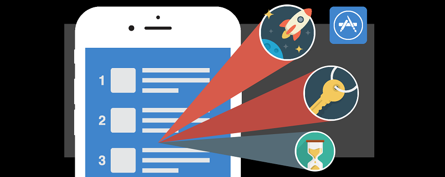
Through App Store Optimization (ASO)—the process of improving the visibility of your app in the app store—you can create a quality app store listing page that will get noticed and gain your app more (valuable) downloads.
So how do you create a quality app store page that can help your app succeed? By focusing on key elements of ASO, including app name, icon, screenshots, and app preview.
Here are some tips on how to help you optimize each one of these elements for your app in the app store.
Step 1: Choose app keywords
That’s right, you don’t start with the app name!
In November 2015, Apple changed the way in which apps are returned based on what a user enters in their search.
Now apps show up based on keywords, rather than rankings and reviews (which is how Apple previously ranked apps).
If you want your app to show up in search at the top, your app name needs to be strategically chosen.
Here are some guidelines to help you find the right keywords for your app:
- Come up with keywords that correspond to your app and its category.
- Enter your primary keywords in app store search to see your competition.
- Find low competition keywords that have high or medium search volume.
Some great keyword search tools out there include Google AdWords for search volume and competition level, App Annie for trending search terms, and SensorTower for help identifying keywords other developers are using, just to name a few.
Step 2: Create an unforgettable app name
Now that you have your keywords, the next step is to create your app name. Below are some things to note when creating your app name:
- Apple allows you to use up to 255 characters for your app name, so choose wisely, but don’t go on a keyword stuffing binge (or else you’ll get penalised)!
- Users only see about 30 characters in search, so most apps tend to stay within this limit.
- You want to make sure your app’s title is catchy, simple and relevant to your app.
- Be careful using trademarks or trademark names because Apple will not approve your app if you do this.
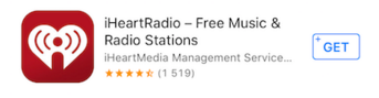
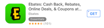
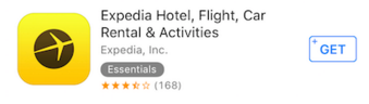
A few examples of apps with great names and keywords in the title are the following:
- iHeartRadio – Free Music & Radio Stations
- Ebates: Cash Back, Rebates, Online Deals, & Coupons at Your Favorite Stores
- Expedia Hotel, Flight, Car Rental & Activities
- StubHub – Sports, Concert, Theatre & Festival Tickets. Find Seats for Upcoming Local Events
- Runtastic GPS Running, Jogging and Fitness Tracker
Remember, you can have a good quality app name as long as you find a balance with the app name and the keywords that follow.
Step 3: Designing a stunning app icon
Along with your app name, your app’s icon becomes the second most important element when it comes to grabbing a user’s attention. The average smartphone user has 42 apps on their phone, but only uses 10 of them on a daily basis. As such, designing an effective app icon will make your app stand out among all the others, both before and after the download.
Here are some basic guidelines to help you design an effective app icon:
- Be consistent with the core value of your app. The icon should provide a fluid understanding of what your app is about, and should be uniform with other elements like the screenshots and app name.
- Follow the app store guidelines. The App Store has their own set of rules for developers and designers to follow in order to get their app approved.
- Design an icon that will fit all smartphone screens. You won’t know ahead of time the screen size of your users smartphones, so make sure your icon is in a vector format to fit all screens.
- Keep it simple and don’t use words. The phone screens can be small and large, so the icon should be easily enough to see all graphics no matter the screen size.
- Check your competitors. Make sure that your icon doesn’t look like theirs. You want it to stand out, not blend in with everyone else’s.
- Use bright colors. Many apps use blue, which is fine, but you wouldn’t want to drown in all the other blue apps, so use some vibrant colors (thoughtfully).
- Use emotions (if applicable). If your app is some sort of a game, for instance, then use expressions and faces. It’s true, people make decisions based on emotions, so get your user to fire up some feelings that will trigger downloads!
Angry Birds 2, Clash Royale and Facetune do an outstanding job with their icons. They are consistent with their app, are simple, evoke emotion, and use bright colors, all of which grabs a user’s attention from the get-go.
![]()
Think of it this way, the app icon should be interesting and clear enough to stand on it’s own, without a name to identify its purpose. When an app is searched in the app store, it’s the icon and the name that shows up first, so be creative!
Step 4: create an app preview video
The third most important element in ASO is the video (a.k.a app preview), which allows you to showcase how your app works in 15-30 seconds. App previews remove any hurdles of unnecessary time and money that the customer may spend in order to see if they will or will not utilize the app. One thing to keep in mind, you don’t want to treat the video as an ad, but instead as a captivating story about your app.
Here are some tips to help you create an app preview:
- Highlight 3-5 best features of your app.
- Be minimal with graphics and copy. If you use copy, make separate text cards between slides that are no more than 75 words or less for the entire video.
- For gaming apps, consider showing more gameplay.
- Add some music to give it some extra excitement.
- Use voiceovers if needed, but make sure they are professional and keep in mind that only one language will be used globally.
- Every video has to be compatible with an iPhone, iPad or iPod touch with a 4” Retina display in order to be submitted.
- Apple only allows one language that’s used globally, so be mindful of any voiceovers or text.
- QuickTime Player, TechSmith, AppShow and iMovie are great tools to use for capturing and editing.
- Any login, registration or sign up requirement should be mentioned.
- Format your video for correct playback on the right devices, which may require different video file sizes.
Overall, you want your video to be unique! If you need some inspiration, check out these videos from Clear, Tango and Grubhub. These guys have nailed it, from beginning to end—their app preview displays great visuals, perfect music and correct use of copy.
If you need some help creating your video (or maybe you just don’t have the time or skillset), there are services such as Apptamin, AppVJ or CrazyMikesApps that can do everything for you from start to finish.
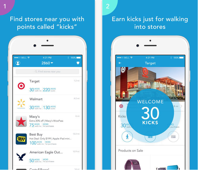
Step 5: Design app screenshots
Last but not least, screenshots! These are just as important as the other elements of ASO, especially since they make up about 75% of the app listing in the app store search results. (Note: not all apps have an app preview, which is always displayed before the first screenshot). Screenshots are another way to captivate and intrigue your audience enough to have them download your app.
Here are some tips to help you create screenshots for app success:
- Showcase your best screenshots first. Your first 2 screenshots show up in search results.
- Make a descriptive image of your app that guides the user by using up all 5 of the available screenshots.
- If you’re adding copy, make it short but sweet.
- Show off unique features that sets you apart from other apps.
- Be mindful of all screenshot dimensions. Use the iOS developer guide to make sure you got all the screen sizes covered.
- Avoid busy screenshots as to not overwhelm and confuse your users.
- Don’t waste screenshots by showing login or sign up information.
- Think about doing a landscape version versus a portrait, just don’t do both!
Ultimately, screenshots should scream ‘download me!’ They offer a value proposition and key selling points for your app. Some great examples can be found from apps like Shopkick, Clash Royale and Face Swap Live.
Step 6. A/B test for best results
Once you have come up with a brilliant app name, designed an eye-catching icon, produced an app preview that is both fun and exciting, and created screenshots that capture your app’s main purpose, the next step is to A/B test variations of each one.
You can’t simply guess what actually is working for your app unless you run variation tests to figure out what is and is not converting.
There are tools like TestNest that allow you to set up experiments for all elements of your app store listing page, and help you understand user behavior to make optimized data-driven decisions.
Kristina Altman
Latest posts by Kristina Altman (see all)
- How To Create A Stunning App Store Page That Gets Downloads - April 27, 2016

